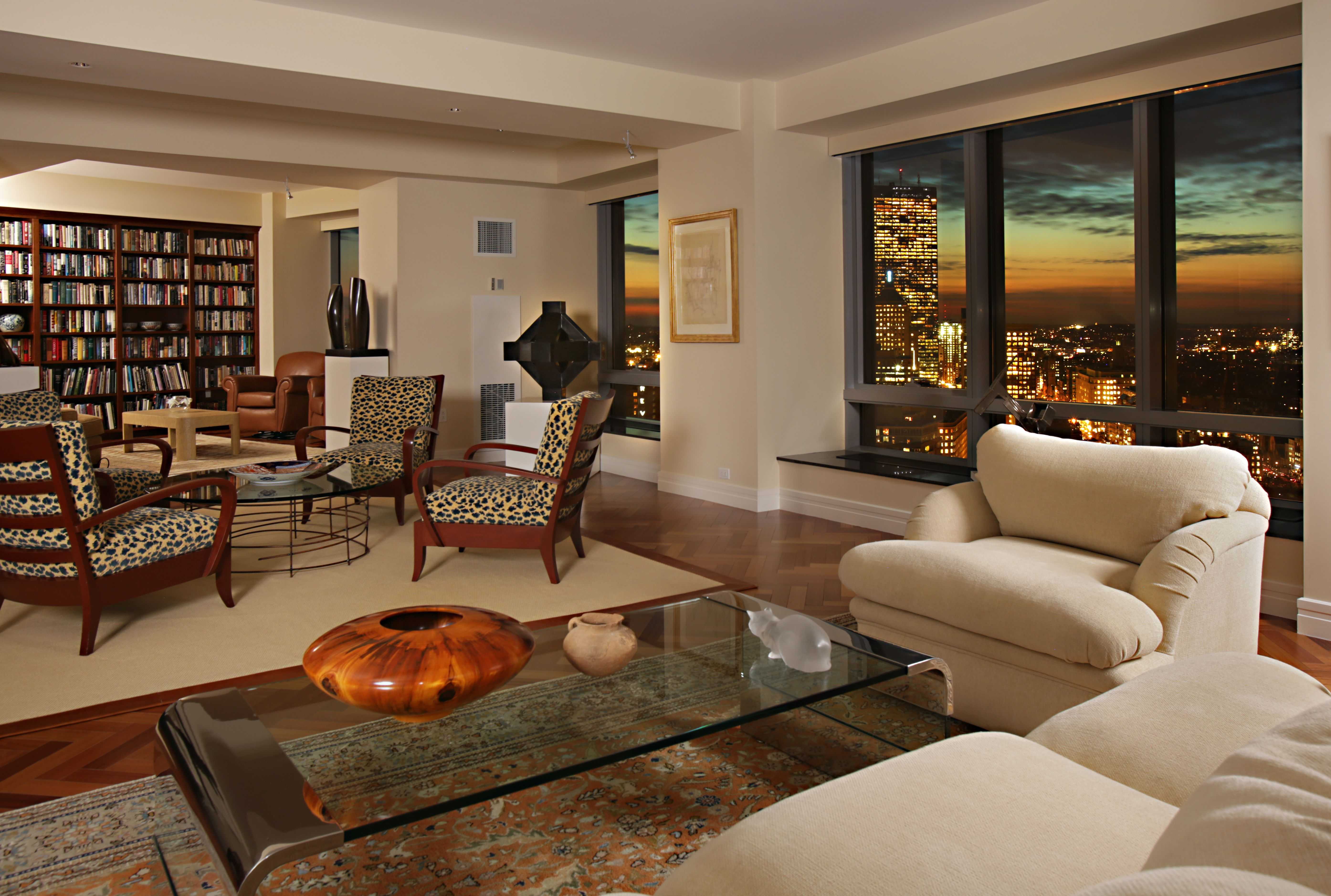
Living Room Design Ideas & Inspiration
Kumpulan Informasi, Tips dan Trik Terlengkap dan Terpercaya — explore curated ideas for sofas, storage, decor, and every style in between.
Explore Ideas →Get Design Inspiration
Tell us what you're looking for and we'll point you to the best articles.
Using Color Blocking to Define Different Living Room Zones
An open-plan living room can feel spacious, yet its generous footprint often creates a decorating dilemma. Without visual boundaries, the sofa, television, reading chair, and dining area can appear to float together without a clear purpose. Color blocking offers a simple way to organize the room while adding personality and architectural interest.
This technique uses deliberate blocks of color on walls, ceilings, furniture, rugs, or accessories to distinguish one activity from another. It does not require major construction or permanent partitions. With a thoughtful palette and a few well-placed accents, color can guide movement and make a multifunctional room feel more composed.
The best schemes balance contrast with continuity. Each zone should have its own identity, while shared tones, materials, or patterns keep the entire living space connected.
Start With The Room’s Natural Functions
Begin by identifying what happens in each part of the room. A conversation area may center on a sofa and coffee table, while another corner might serve as a work station, reading nook, or children’s play space. Marking these purposes first prevents color from becoming an attractive but confusing layer.
Observe architectural features that can support your layout. A recessed wall, chimney breast, alcove, or change in flooring already suggests a natural boundary. Use a stronger shade inside an alcove or behind a desk to reinforce that function instead of forcing a color division across the middle of an uninterrupted wall.
Furniture placement also helps define the zones before paint is added. Position seating to create a conversational island, then use a rug or painted backdrop to make that arrangement feel intentional. In a narrow room, color blocking at one end can visually anchor the main seating area without making the space feel divided.
Choose A Palette With A Shared Thread
A successful living room color scheme usually includes a dominant neutral, a supporting shade, and one or two accent colors. The dominant color can cover most walls and larger furnishings. The supporting shade may appear in a painted zone, curtains, or an area rug, while the accent works best in smaller decorative details.
For a calm result, select colors from the same family, such as warm white, sand, terracotta, and muted rust. A more energetic interior can combine related contrasts, such as navy with ochre or forest green with blush. Keep the undertones consistent: a cool gray beside warm beige can look accidental unless another element bridges the difference.
Repeat each significant color at least twice. If a blue reading nook includes a blue cushion on the main sofa or a blue detail in artwork, the zone feels linked to the rest of the room. Repetition makes bold color blocking feel considered rather than fragmented.
Use Walls To Frame Activity
Painting a single wall is the most direct way to establish a living room zone. A deep tone behind a sofa can create a cozy lounge, while a pale, contrasting block behind a writing desk can give that smaller area a sense of importance. The color does not have to cover the entire wall; an oversized rectangle, arch, or horizontal band can produce a more tailored effect.
For a modern look, align the edges of the painted block with furniture or architectural lines. A rectangle that begins at the floor and rises slightly above a console can act like a visual backdrop. Rounded edges and painted arches introduce softness, especially in rooms with many straight lines.
Do not overlook the fifth wall. Painting a ceiling above a reading corner or dining extension can define it without interrupting wall art or shelving. If you plan a statement fixture, review this guide to choose the right chandelier size so the lighting scale supports the colored zone rather than overwhelming it.
Connect Color With Furniture And Textiles
Paint alone may look disconnected from the room unless furnishings repeat its visual message. A rust-colored wall can be echoed with a warm leather chair, a patterned cushion, or subtle threads in a rug. In a blue television area, a navy ottoman or framed artwork can carry the shade across the room without excessive matching.
Rugs are especially useful for defining zones in open-plan layouts. Choose a large enough design to hold at least the front legs of the main seating pieces. If two rugs are needed, keep their tones related but vary their texture or pattern so the areas feel distinct rather than identical.
Furniture can create color blocks without a paintbrush. A green sofa, pale wood coffee table, and cream rug establish a clear lounge palette, while a nearby mustard chair signals a separate reading area. Keep the silhouettes compatible so the color contrast feels intentional and the room remains comfortable to use.
Balance Contrast, Light, And Scale
Color blocking changes how large or bright a room appears. Dark shades visually pull a wall forward and can make a seating nook feel intimate. Light colors recede and are useful for keeping a work or dining area airy. In a compact living room, reserve the deepest tone for a limited surface and allow generous neutral space around it.
Natural light should guide your choices. North-facing rooms often suit warm greens, clay, caramel, and creamy neutrals, while sun-filled spaces can handle cooler blue, charcoal, or soft lilac. Test large samples at different times of day before committing, since artificial light can shift the appearance of saturated colors.
Use lighting to clarify the boundaries after sunset. A pendant can center a dining zone, a floor lamp can identify a reading chair, and wall lights can highlight a painted feature. Shelving can reinforce the same structure; consider wall shelves for displaying decor within a contrasting zone to combine storage with a strong vertical accent.
Compare Color Blocking Approaches
Different methods create different moods and levels of commitment. Choose the approach that suits your room’s architecture, daily routines, and willingness to make a bold change.
| Approach | Best For | Visual Effect | Practical Note |
|---|---|---|---|
| Full feature wall | Sofa or media zone | Strong and grounded | Easy to repaint later |
| Painted arch or rectangle | Desk or reading nook | Decorative and focused | Align with furniture edges |
| Ceiling block | Dining or conversation area | Distinctive and enveloping | Test color in changing light |
| Rug-led color zone | Rental or flexible room | Soft and adaptable | Use a generous rug size |
| Furniture-led contrast | Subtle zoning | Layered and portable | Repeat colors in accessories |
Layering two or more approaches can be effective when each has a clear role. For example, a painted wall may establish the lounge while a rug defines the seating footprint. Avoid giving every zone a dramatic treatment, since too many competing blocks can make the room feel busy.
Keep Transitions Deliberate
The edges between zones deserve as much attention as the colors themselves. A narrow strip of neutral wall can separate two bold shades, while a timber console, open bookcase, or tall plant can act as a soft divider. These transition elements prevent the palette from looking like disconnected patches.
Decorate each area according to its purpose, but borrow one feature from a neighboring zone. A reading nook might share the lounge’s metal finish, while the desk area repeats the sofa’s accent color in a pinboard or vase. This controlled overlap creates rhythm across the room.
Edit the scheme after living with it for a few days. If one color dominates from every viewpoint, reduce it through cushions or artwork rather than repainting immediately. If a zone lacks definition, add a lamp, rug, or small piece of furniture before introducing another paint color.
Apply The Scheme With Confidence
A focused plan makes color blocking easier to execute and easier to adjust. Prioritize the boundaries that solve a real layout problem, then add decorative color only where it supports comfort and flow.
- Map each activity zone before selecting paint or furnishings.
- Limit the main palette to three or four coordinated colors.
- Repeat accent shades through rugs, artwork, cushions, and storage.
- Use lighting to make each zone functional after dark.
- Leave some neutral space so bold blocks can breathe.
When the colors, furniture, and lighting work together, zoning feels natural rather than forced. Refresh one clearly defined area first, then carry its palette through the rest of the living room for a cohesive result. Begin with the zone that needs the most structure, and let that color decision guide the room’s next layer.
What We Cover
Living Room Topics & Ideas
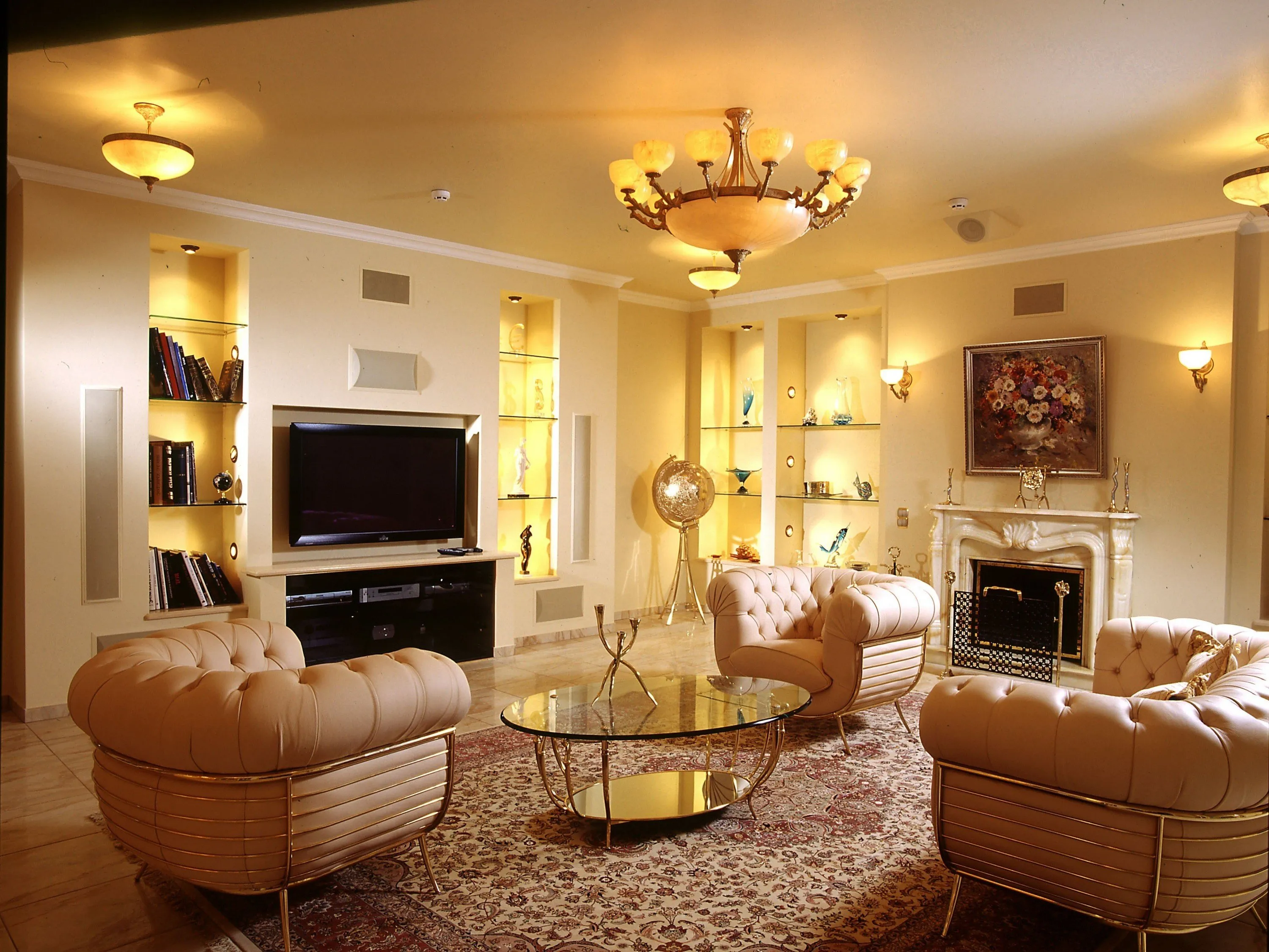
Luxury Living Room Furniture
High-end pieces spanning modern, neo-classical, and Italian Gothic styles — craftsmanship, leathers, and refined artistry.
Read More →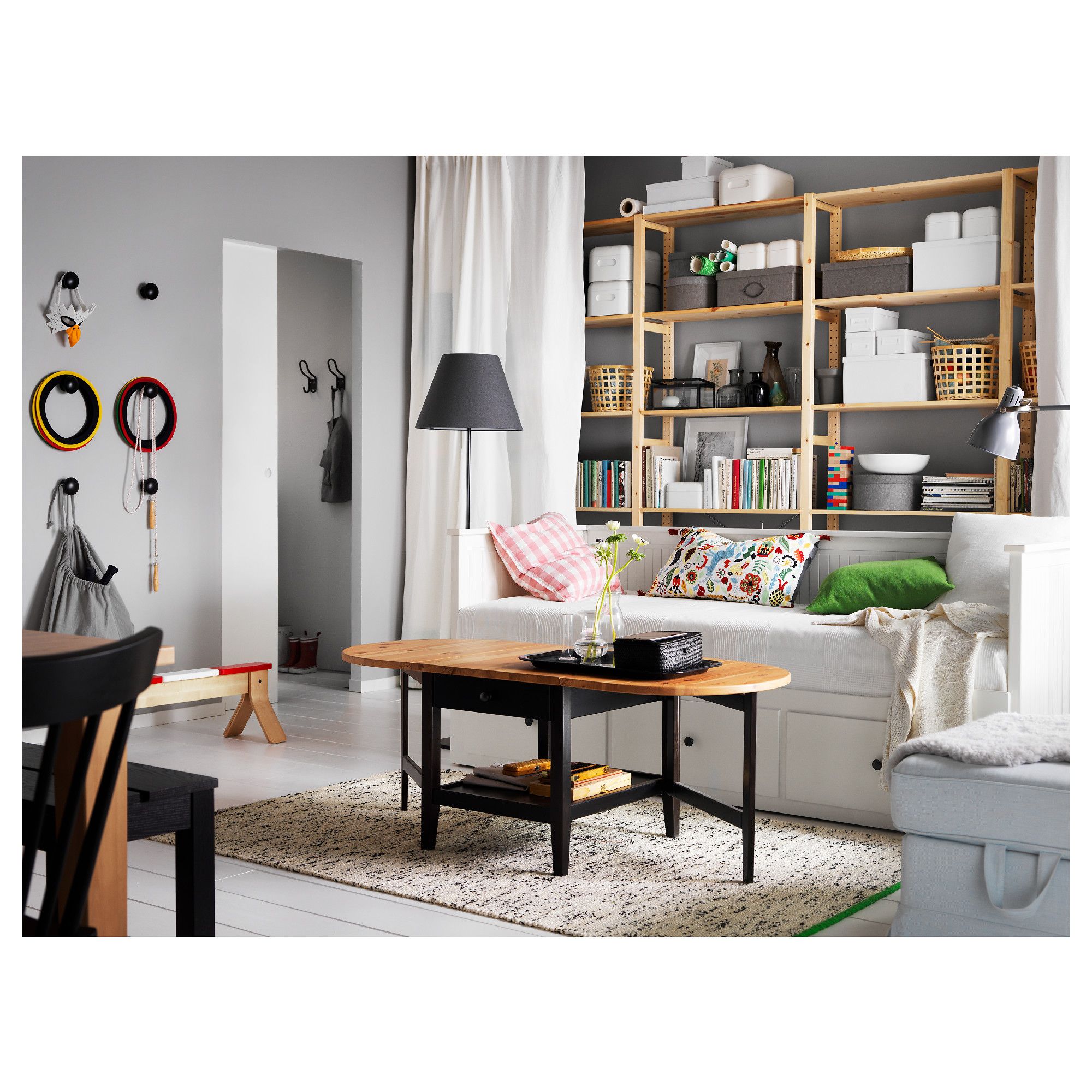
White Living Room Storage Cabinets
Sideboards, curio cabinets, and high-gloss storage units that blend practical organization with decorative appeal.
Read More →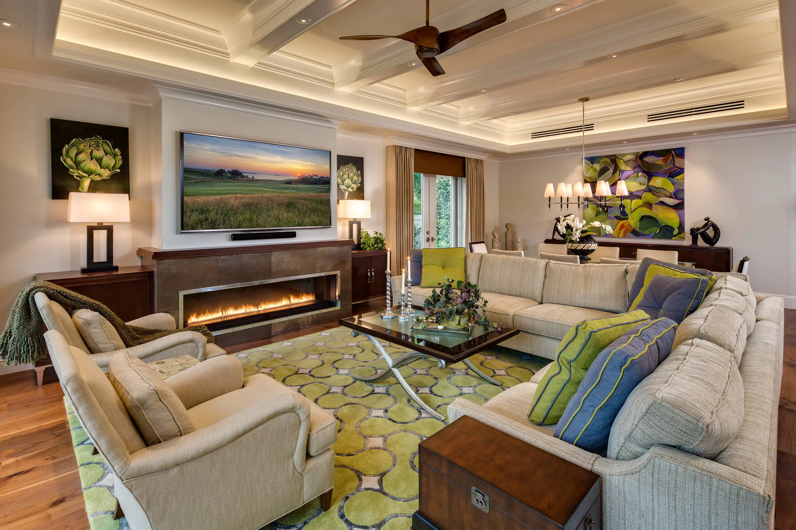
Living Room Decor Essentials
Rugs, pillows, art, lamps, and accent pieces that add layers of color, texture, and personality to any living space.
Read More →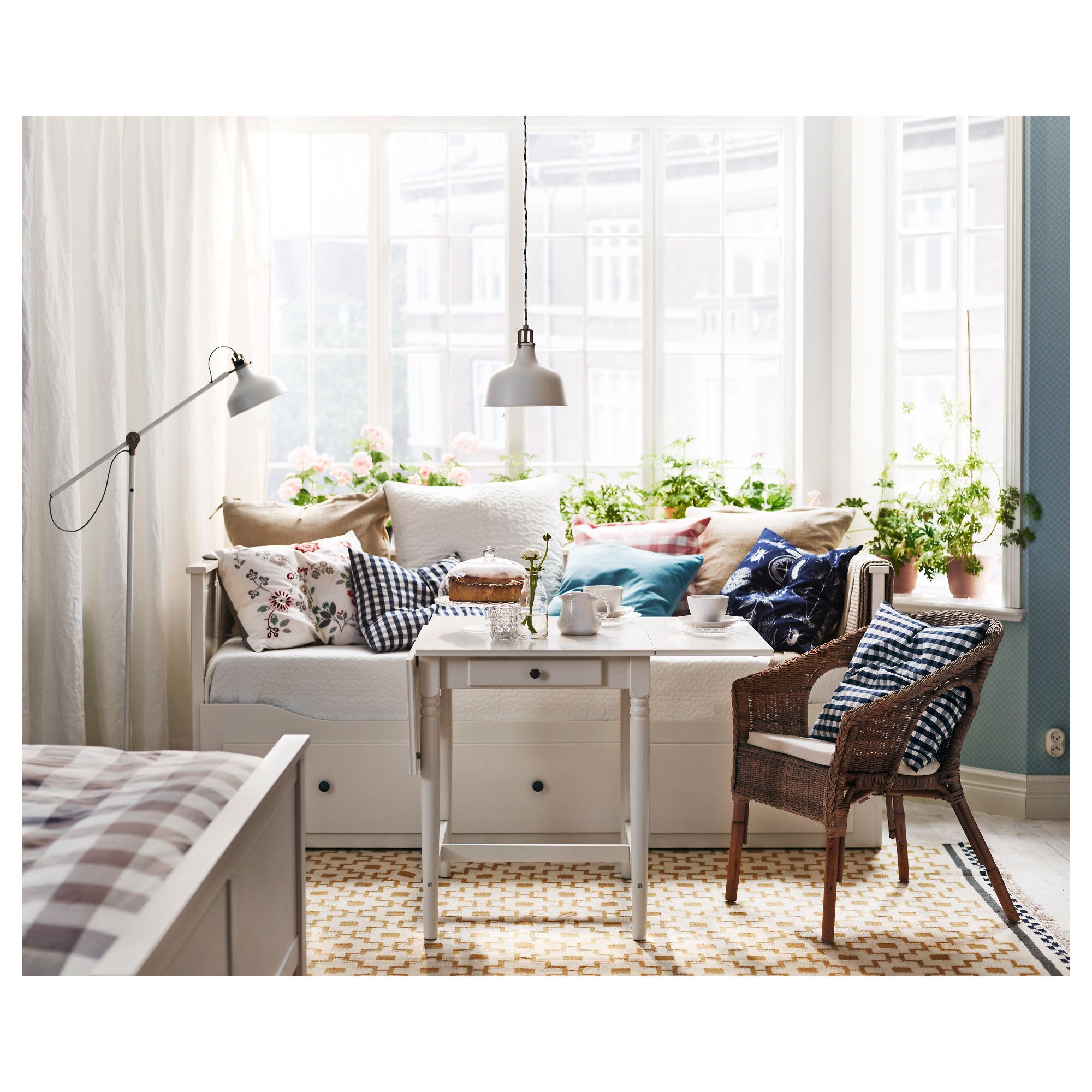
Natural Living Room Decor
Earthy elements, house plants, rustic touches, and organic materials that bring warmth and nature indoors.
Read More →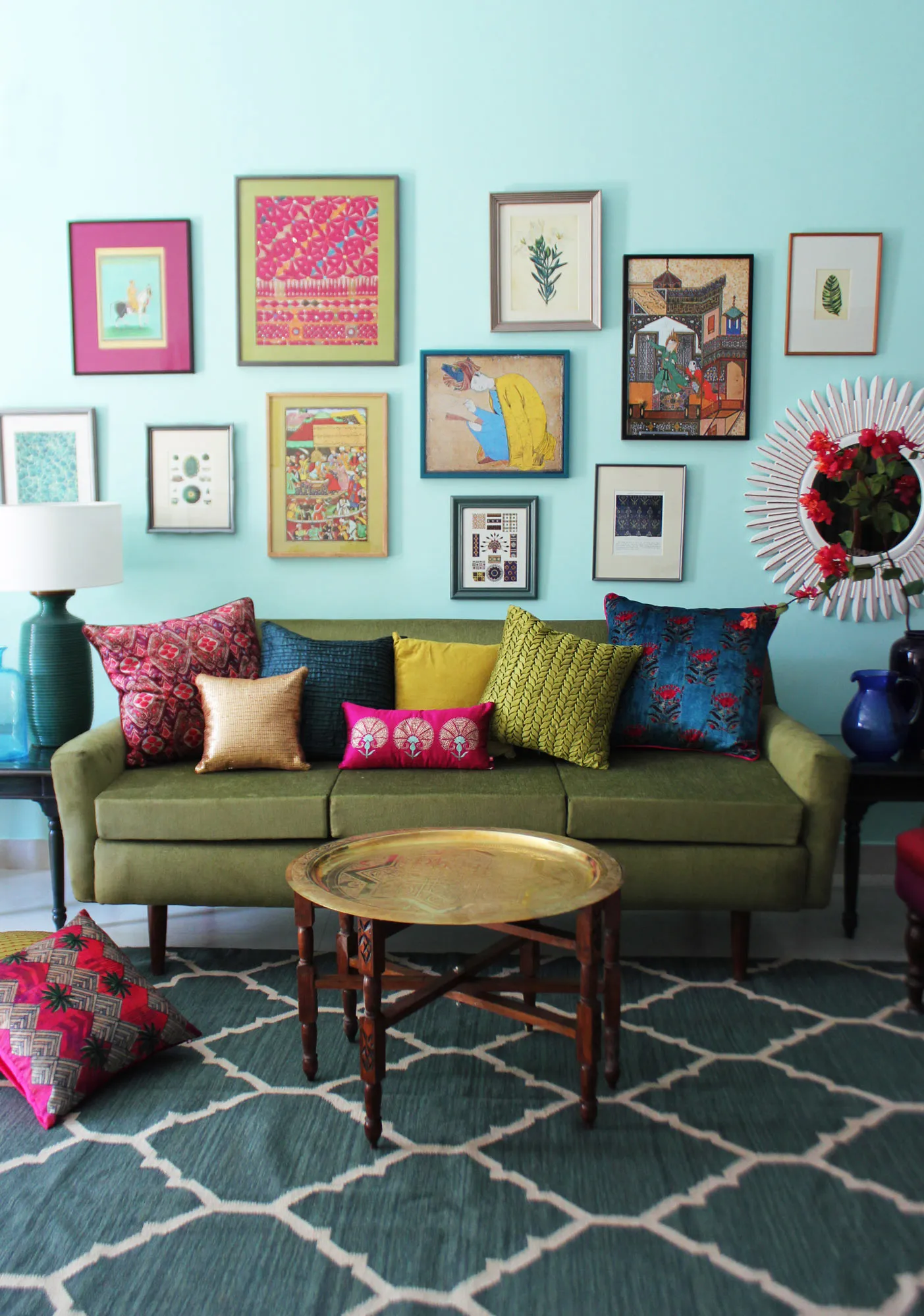
Living Room Ideas: Velvet Sofa
From classic red to trending green and blue, explore how a velvet sofa can transform your living room's character.
Read More →