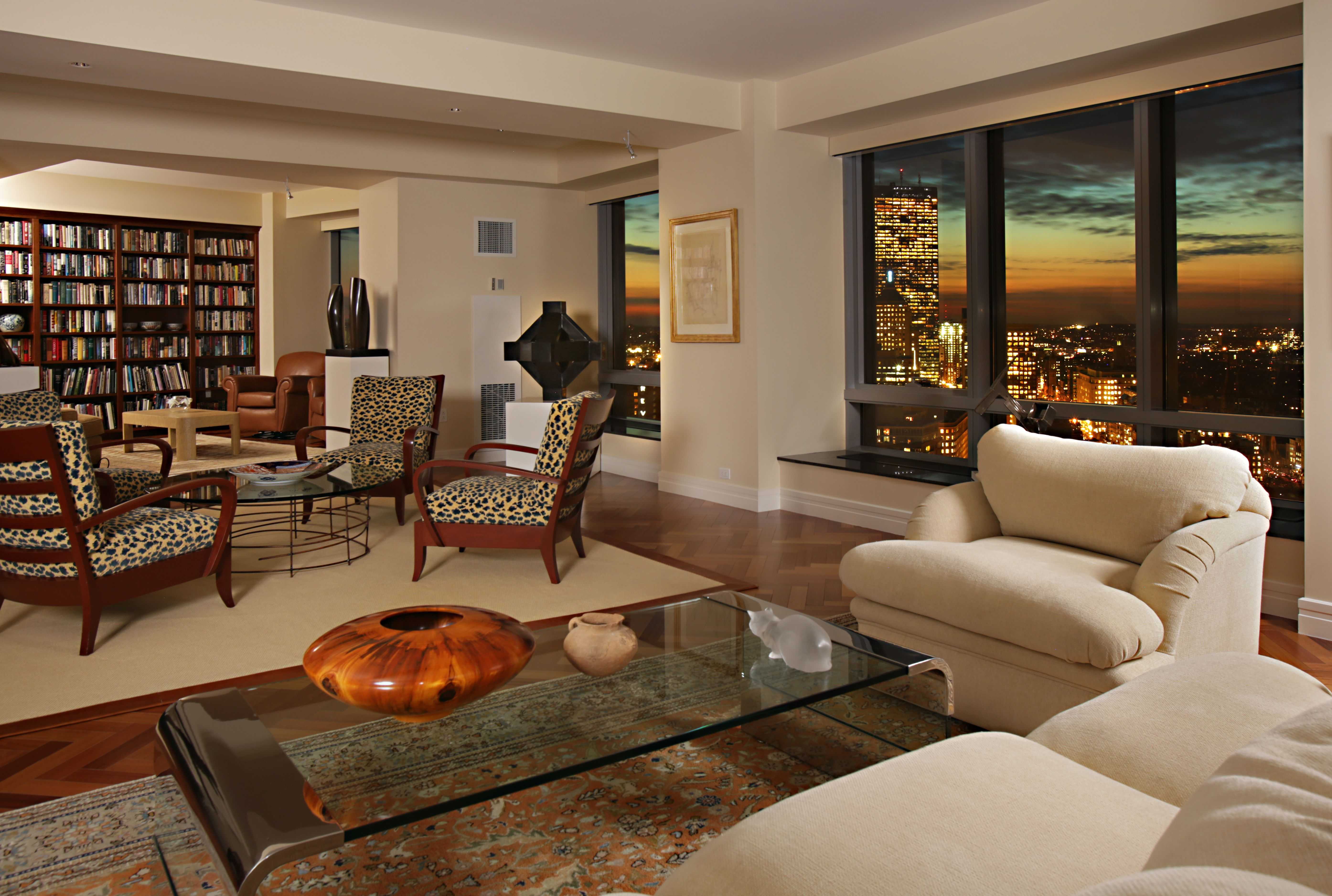
Living Room Design Ideas & Inspiration
Kumpulan Informasi, Tips dan Trik Terlengkap dan Terpercaya — explore curated ideas for sofas, storage, decor, and every style in between.
Explore Ideas →Get Design Inspiration
Tell us what you're looking for and we'll point you to the best articles.
How to Use a Large Infographic or Map as Living Room Wall Art
A large infographic or map can give a living room an immediate focal point while adding personality, colour and a sense of place. It may show the world, a favourite city, native Australian wildlife, a historical timeline or even the anatomy of a classic car. Unlike a small framed print, an oversized graphic has enough visual weight to shape the entire room.
The key is to treat the artwork as part of the furniture layout rather than an item added at the end. Its size, colours and subject should relate to the sofa, rug, shelving and lighting. When these elements share a visual connection, the wall feels considered rather than crowded.
A map can suit many decorating styles. A muted topographic print works in a coastal or minimalist space, while a bold travel map can energise an eclectic room. An infographic with crisp typography fits a contemporary apartment, especially when displayed in a simple black, white or timber frame.
Australian homes often have open-plan living zones, generous natural light and flexible spaces used for relaxing and entertaining. These features make a statement wall especially effective, provided the artwork is positioned carefully and protected from harsh sun.
Choose the Right Visual Story
Start with the meaning behind the piece. A map of a place connected to your family, travels or heritage will feel more enduring than a graphic chosen only because it fills a wall. Australian options could include a detailed map of the coastline, a vintage Sydney tram route, a Great Barrier Reef illustration or a diagram of native flora.
Consider how quickly the information can be understood. A highly detailed infographic rewards close viewing, so it belongs where people can pause and inspect it. A bold map with strong outlines works better behind a sofa or across from the television, where it will be seen from a distance.
Colour is just as important as subject. A sepia map may complement leather seating and warm timber, while navy, ochre and eucalyptus green can connect naturally with an Australian-inspired palette. If the design contains many labels, keep surrounding decor quiet so the typography remains legible.
Match the Scale to the Room
An oversized piece should generally be wider than a console or roughly two-thirds the width of the sofa beneath it. If it is too small, the wall can make the artwork look insignificant. If it is too large, it may dominate the room and compete with windows, doors or architectural details.
Hang the lower edge around 15 to 25 centimetres above a sofa, sideboard or console, adjusting slightly for particularly tall furniture. In an apartment with high ceilings, a stacked pair of map panels or a wide panoramic print can fill vertical space without requiring a single enormous frame.
Open-plan homes need extra care because the artwork may be visible from the dining area, kitchen and hallway. Use the main seating position as the starting point, then check that the piece does not clash with sightlines or obstruct a staircase. For rooms with unusual transitions, ideas from open staircase styling can help balance the wall with nearby architectural features.
Build a Supporting Colour Palette
Pull two or three colours from the map or infographic and repeat them through cushions, ceramics, curtains or a small accent chair. This creates cohesion without making the room look themed. A graphic containing terracotta, cream and charcoal might work with a natural linen sofa, dark timber and clay-toned accessories.
Let the largest neutral surface remain calm. A beige, oatmeal or soft grey sofa gives a colourful map room to breathe, while a restrained artwork can sit comfortably above a richer upholstery colour. Avoid matching every shade exactly; slightly varied tones look more natural and layered.
A rug can help anchor the wall art by connecting the seating zone to the colours above it. For a room with neutral furniture, these bold patterned rugs can introduce movement without forcing the map to carry all the visual interest.
Select a Frame and Mounting Style
A frame changes the character of the artwork. Slim black metal gives an infographic a gallery-like, modern finish, while pale oak or walnut makes a map feel warmer and more relaxed. A wide white mount can improve readability around dense labels and prevent the graphic from looking pressed against the glass.
For a very large print, consider lightweight aluminium composite, acrylic glazing or a professionally stretched canvas. These materials reduce the strain on plasterboard and are practical for broad wall surfaces. In rental properties, a modular multi-panel design may be easier to transport when moving between Sydney, Melbourne or Brisbane apartments.
Sun protection matters in Australia. Strong north- and west-facing light can fade paper, especially in rooms with large glass doors. Use UV-filtering acrylic or glass, install blinds or position the work away from direct afternoon sunlight. Secure heavy frames with appropriate wall anchors rather than relying on a single small hook.
Keep the Wall Visually Calm
When one large map serves as the focal point, the rest of the wall should support it rather than compete. A low sideboard, a pair of simple sconces or one sculptural vase can provide balance. Avoid placing a gallery wall directly beside a busy infographic unless the room is intentionally maximalist.
Lighting should reveal details without causing glare. Adjustable picture lights are effective for framed prints, while ceiling spotlights can wash the surface evenly. Warm white globes around 2700K to 3000K suit living rooms and soften the harder lines of charts, diagrams and cartography.
Use nearby objects to create a sense of scale. A tall indoor plant can soften one edge, and a compact reading chair can make the wall feel connected to everyday use. In Queensland or other humid areas, leave a little space between framed work and an exterior wall to encourage airflow and reduce moisture concerns.
Adapt the Idea to Your Decorating Style
In a coastal room, choose a pale blue nautical chart, a washed timber frame and woven textures. For a mid-century space, look for a clean atomic-era infographic, teak furniture and a low-profile sofa. Industrial interiors suit monochrome transit maps, exposed shelving and dark metal details, while Hamptons rooms benefit from restrained navy, cream and crisp white.
A map does not have to describe geography. A wine-region diagram, a botanical classification, a local road network or a vintage sporting illustration can provide the same large-scale impact. This is useful when you want the wall to reflect Australian life without using predictable travel imagery.
Before committing, tape the proposed dimensions onto the wall with masking tape. View the outline from the sofa, dining table and entry point at different times of day. The simple test reveals whether the piece feels balanced, whether glare will be a problem and whether nearby furniture needs to move.
| Artwork style | Best room character | Frame choice | Supporting details |
|---|---|---|---|
| Detailed world map | Eclectic or travel-inspired | Dark timber or black metal | Neutral upholstery, leather and collected objects |
| Minimal city map | Contemporary apartment | Slim black frame | Clean-lined furniture and restrained accessories |
| Native flora infographic | Coastal, Australian or relaxed | Pale oak or white | Linen, woven baskets and eucalyptus tones |
| Vintage transport chart | Mid-century or industrial | Walnut or aged metal | Sculptural lighting and retro furniture |
| Bright educational graphic | Family living room | Simple white frame | Plain rug, low clutter and repeated accent colours |
A large infographic or map works best when it has a clear relationship with the room’s scale, light and daily routines. Choose a subject with personal meaning, frame it for the conditions of the space and repeat its colours in small, practical ways.
Give the wall a deliberate role in your next living room refresh. Measure the available area, test the composition with masking tape and choose a map or graphic that you will enjoy discovering for years.
What We Cover
Living Room Topics & Ideas
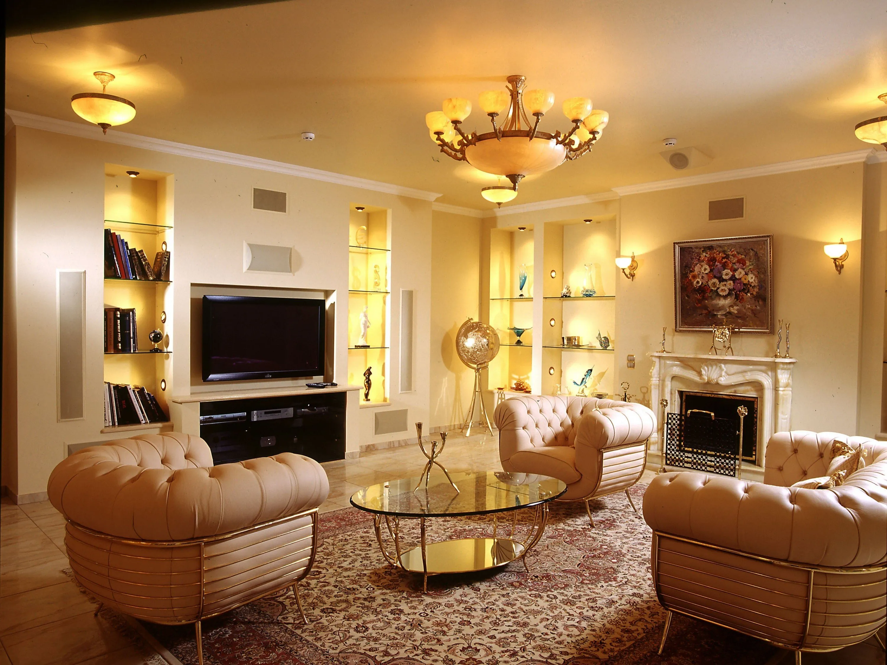
Luxury Living Room Furniture
High-end pieces spanning modern, neo-classical, and Italian Gothic styles — craftsmanship, leathers, and refined artistry.
Read More →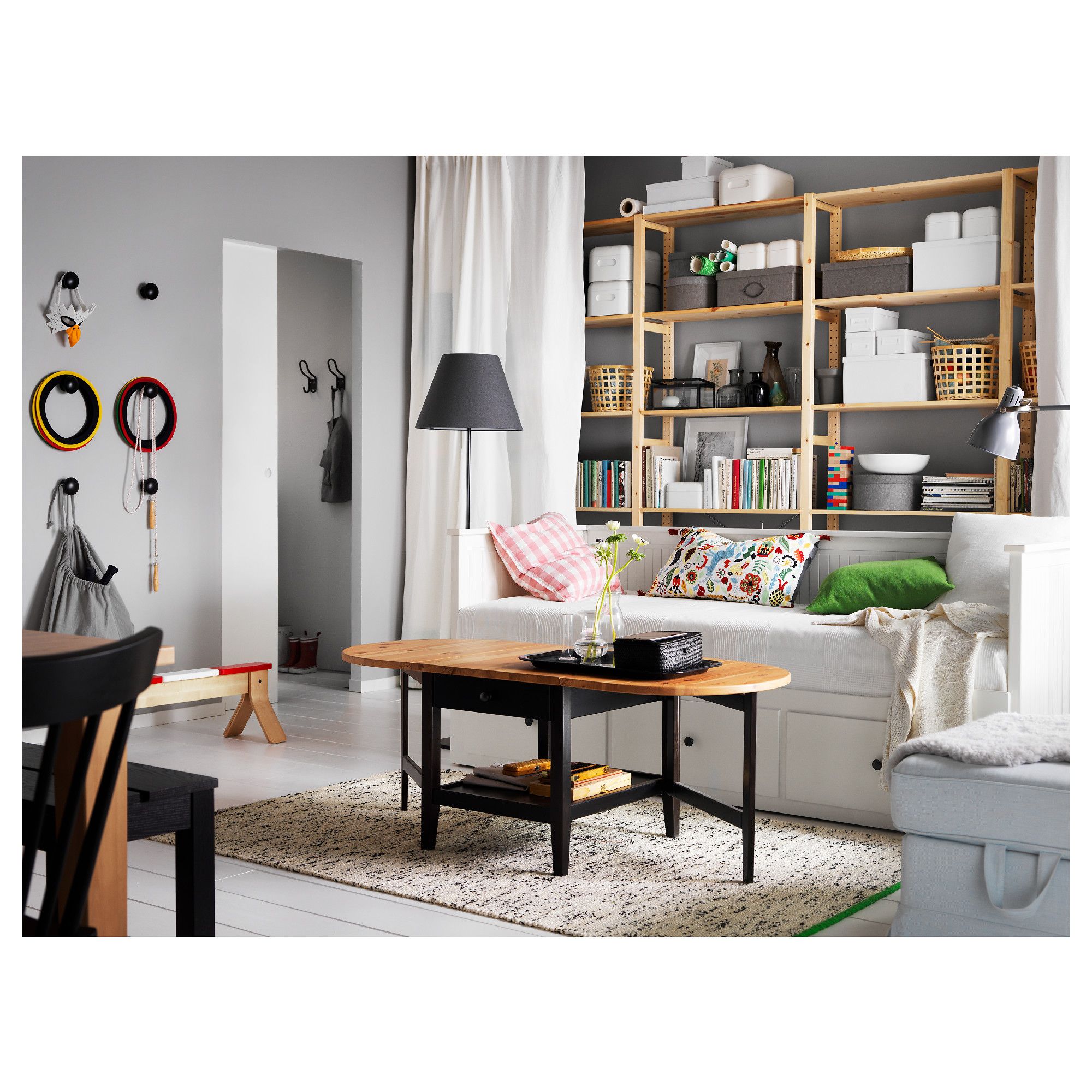
White Living Room Storage Cabinets
Sideboards, curio cabinets, and high-gloss storage units that blend practical organization with decorative appeal.
Read More →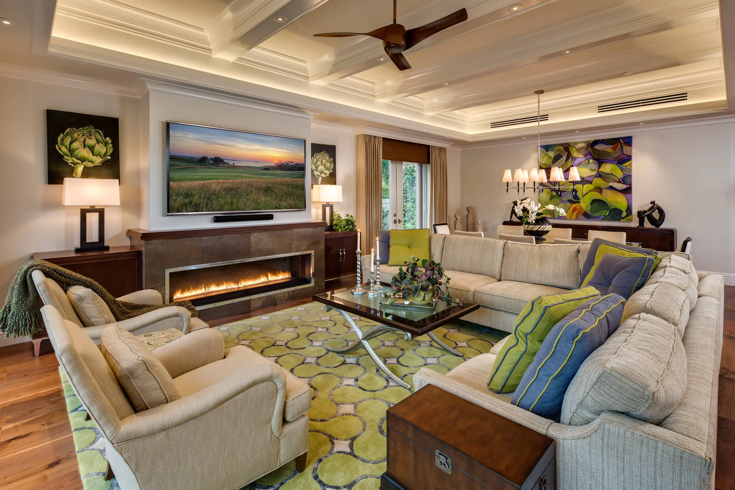
Living Room Decor Essentials
Rugs, pillows, art, lamps, and accent pieces that add layers of color, texture, and personality to any living space.
Read More →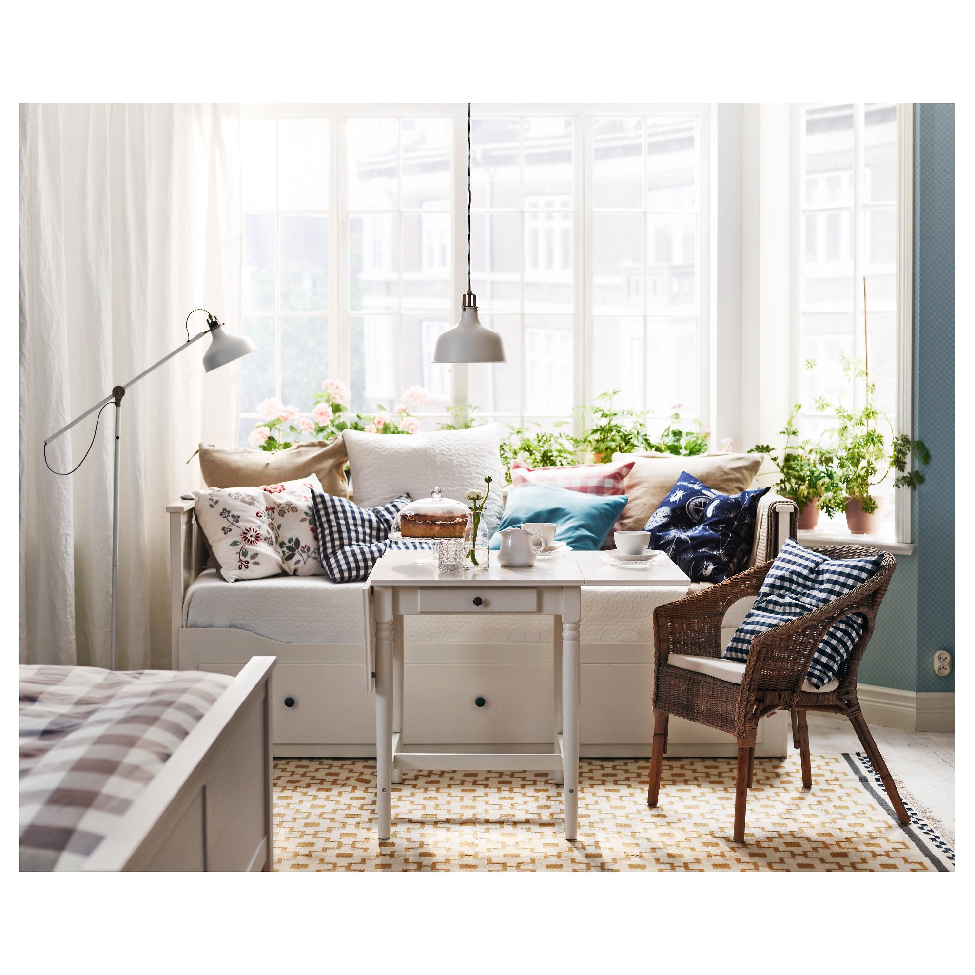
Natural Living Room Decor
Earthy elements, house plants, rustic touches, and organic materials that bring warmth and nature indoors.
Read More →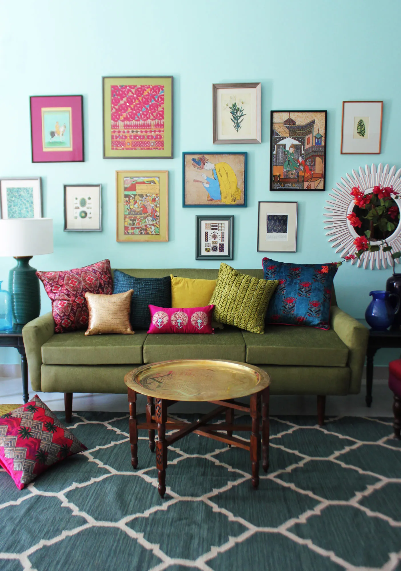
Living Room Ideas: Velvet Sofa
From classic red to trending green and blue, explore how a velvet sofa can transform your living room's character.
Read More →