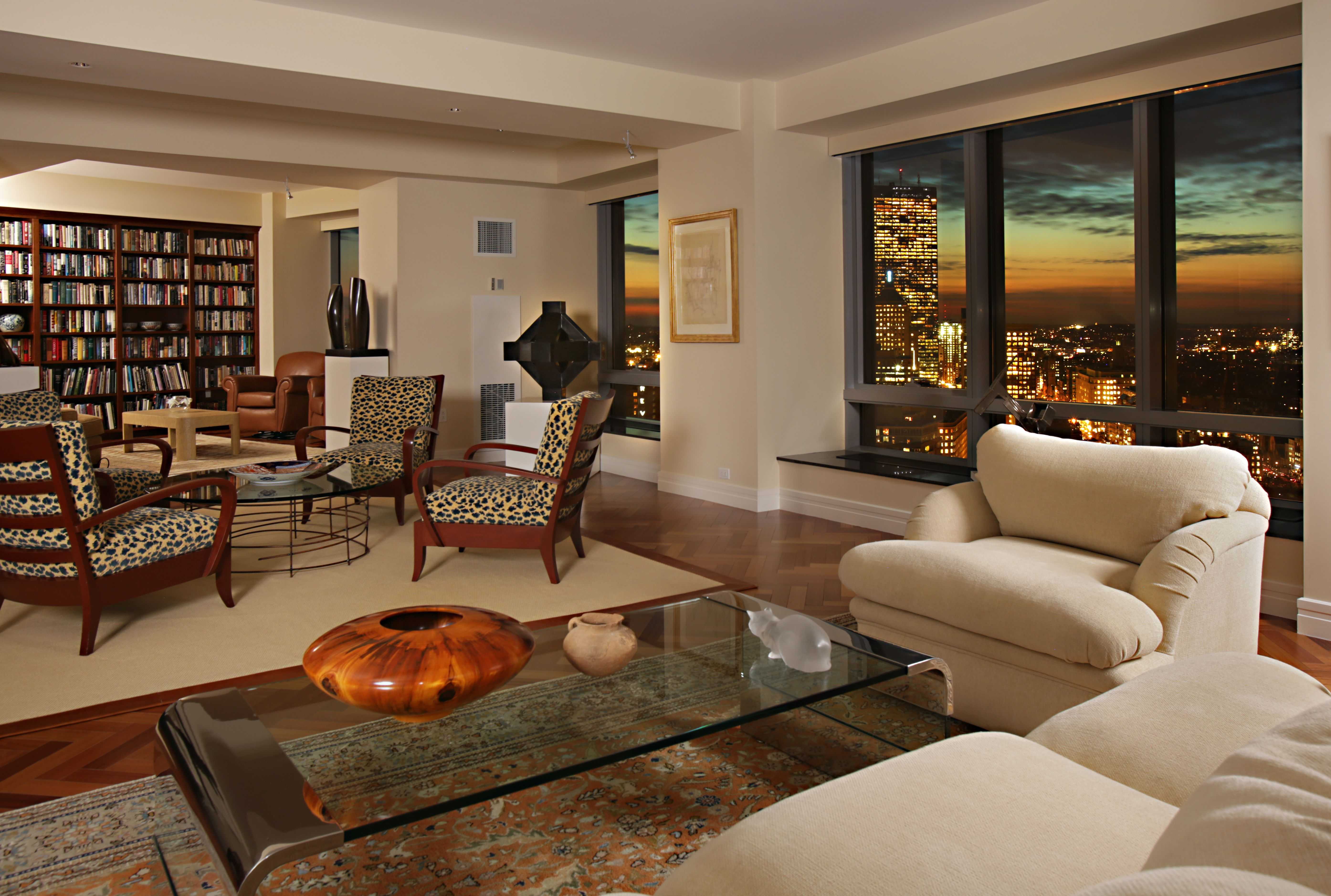
Living Room Design Ideas & Inspiration
Kumpulan Informasi, Tips dan Trik Terlengkap dan Terpercaya — explore curated ideas for sofas, storage, decor, and every style in between.
Explore Ideas →Get Design Inspiration
Tell us what you're looking for and we'll point you to the best articles.
How to select artwork for your living room color scheme
Artwork can define the atmosphere of a living room as strongly as a sofa, rug, or lighting fixture. A carefully chosen painting, print, photograph, or textile wall hanging can pull scattered colors together and give the space a deliberate, finished appearance.
The best choice does not always repeat the wall color or match every cushion exactly. Instead, it usually creates a conversation between the room’s existing palette and a few carefully selected tones. Understanding contrast, proportion, and visual weight makes the process easier and prevents expensive pieces from looking disconnected.
Before shopping, study the colors already present in the room. Consider the walls, flooring, upholstery, curtains, wood finishes, metal accents, and decorative objects. These details create the foundation for artwork that feels naturally integrated rather than added at the last minute.
Read the room’s existing palette
Start by identifying the dominant, supporting, and accent colors. The dominant shade may come from a large sofa, wall treatment, or area rug. Supporting colors often appear in smaller furniture pieces and window treatments, while accent tones are found in cushions, vases, books, or lamps.
Take photographs of the room in daylight and under artificial lighting. Colors can appear warmer or cooler depending on the time of day, and artwork that looks balanced in a store may feel too bright or dull at home. A small collection of paint swatches and fabric samples can also help you compare potential artwork with the room’s actual finishes.
Neutral living rooms offer considerable flexibility, but they still benefit from a defined color direction. In a beige or cream space, muted greens, terracotta, charcoal, and dusty blue can add depth. Gray rooms may suit soft blush, ochre, navy, or warm wood tones, depending on whether the desired mood is calm, dramatic, or inviting.
Decide whether to coordinate or contrast
Coordinating artwork uses colors already present in the room, creating a calm and cohesive effect. This approach works particularly well when the furniture has strong shapes or the space already contains several patterns. A landscape with related green and brown tones, for example, can reinforce a room decorated with olive upholstery and natural wood.
Contrasting artwork creates a focal point. Complementary colors, such as blue and orange or purple and yellow, can add energy without requiring a complete redesign. The contrast should be intentional rather than overwhelming. If the painting has a saturated background, keep surrounding accessories quieter so the wall remains the visual destination.
A useful method is to choose one major color from the room and pair it with an artwork that includes that shade in a small detail. The painting may introduce new colors, but the repeated tone gives the composition a subtle connection to the furniture and decor.
Consider size, placement, and visual weight
Color harmony cannot compensate for artwork that is too small or poorly positioned. Above a sofa, the artwork or grouped arrangement should generally occupy around two-thirds to three-quarters of the furniture’s width. This proportion creates balance while leaving enough wall space around the display.
The center of the artwork should usually sit close to eye level, with the lower edge positioned roughly 15 to 25 centimeters above the sofa back. For a gallery wall, treat the entire arrangement as one visual unit rather than aligning every frame individually. Consistent spacing will help the display feel organized.
Visual weight matters as much as physical size. A dark, richly colored painting can appear heavier than a pale abstract print of identical dimensions. If the room already has a substantial fireplace, dark cabinetry, or a large sectional, distribute strong tones carefully. Furniture placement around a fireplace can affect the ideal position and scale of wall decor, so review these corner fireplace arrangement ideas before finalizing the display.
Compare color approaches before buying
Use the following guide to match the artwork’s color strategy with the atmosphere you want to create. The same room can feel relaxed, sophisticated, lively, or dramatic depending on how much contrast appears on the walls.
| Living room palette | Artwork color direction | Resulting atmosphere | Useful style |
|---|---|---|---|
| White, cream, and light wood | Sage, sand, pale blue, or soft black | Airy and relaxed | Scandinavian, coastal |
| Beige, camel, and warm wood | Terracotta, rust, olive, or muted teal | Warm and grounded | Organic, rustic |
| Gray, black, and metal | Cobalt, burgundy, mustard, or emerald | Dramatic and polished | Contemporary, industrial |
| Navy, walnut, and cream | Ochre, blush, copper, or ivory | Rich and welcoming | Traditional, transitional |
| Blush, white, and brass | Forest green, plum, charcoal, or clay | Refined with contrast | Modern, eclectic |
Sample the artwork from different distances before committing. A piece that looks subtle close up may become visually flat across the room, while a bold print may dominate when viewed from the entryway. Digital mock-ups, removable hooks, or taped paper templates can help test proportion and placement without damaging the wall.
Match the artwork to the room’s style
The subject, medium, and frame should support the living room’s design language. Abstract art works well in modern and minimalist interiors, particularly when its shapes echo the geometry of the furniture. Botanical prints, landscapes, and woven pieces complement natural materials and relaxed decorating schemes.
Traditional rooms often benefit from portraits, classic still lifes, architectural prints, or artwork in ornate frames. An eclectic space can combine different periods, but a shared color thread or similar frame finish will keep the arrangement from appearing random. In a small living room, one substantial piece may create more impact than several unrelated decorations.
Lighting also influences the artwork’s appearance. Natural light can intensify pale backgrounds and fade certain colors over time, while warm lamps may enrich reds and mute cool blues. Avoid placing valuable art in direct sunlight, and consider adjustable picture lights or track lighting when the wall is dim.
Use frames and mats as connecting details
Frames offer another way to link artwork with the wider interior. A black frame can echo window trim, a walnut frame can repeat wooden furniture, and brushed brass can relate to lighting or hardware. Matching every frame is unnecessary, but a controlled finish palette creates cohesion across multiple pieces.
Mats change the visual distance between the artwork and the wall. White or warm ivory mats provide breathing room around detailed images, while dark mats make a pale print feel more dramatic. For colorful artwork, a simple frame is usually preferable; elaborate framing can compete with the image and make the wall feel crowded.
When combining several pieces, repeat at least one characteristic, such as color, subject, frame material, or orientation. This principle allows variety without sacrificing unity. It is especially useful when building a gallery wall from artwork collected over time.
Follow a practical selection checklist
Before purchasing, use a short evaluation process to ensure the piece will work beyond the showroom.
- Identify two or three room colors that the artwork can echo or complement.
- Check the artwork’s size against the wall, sofa, console, or fireplace below it.
- View the piece in both daylight and evening lighting.
- Compare its frame with nearby wood, metal, and architectural finishes.
- Leave enough visual breathing room so the wall does not feel overcrowded.
Trust the emotional response as well as the technical details. Artwork should suit the room’s function and create a feeling you will enjoy seeing every day. A calm abstract may be ideal for a restful family room, while a vivid graphic print can energize a social entertaining space.
Give yourself time to live with temporary samples or printed approximations. Once the colors, scale, and placement feel right, select a durable hanging method and position the artwork securely. Choose a piece that strengthens your living room’s personality, then let it guide smaller decisions about cushions, throws, accessories, and lighting.
What We Cover
Living Room Topics & Ideas
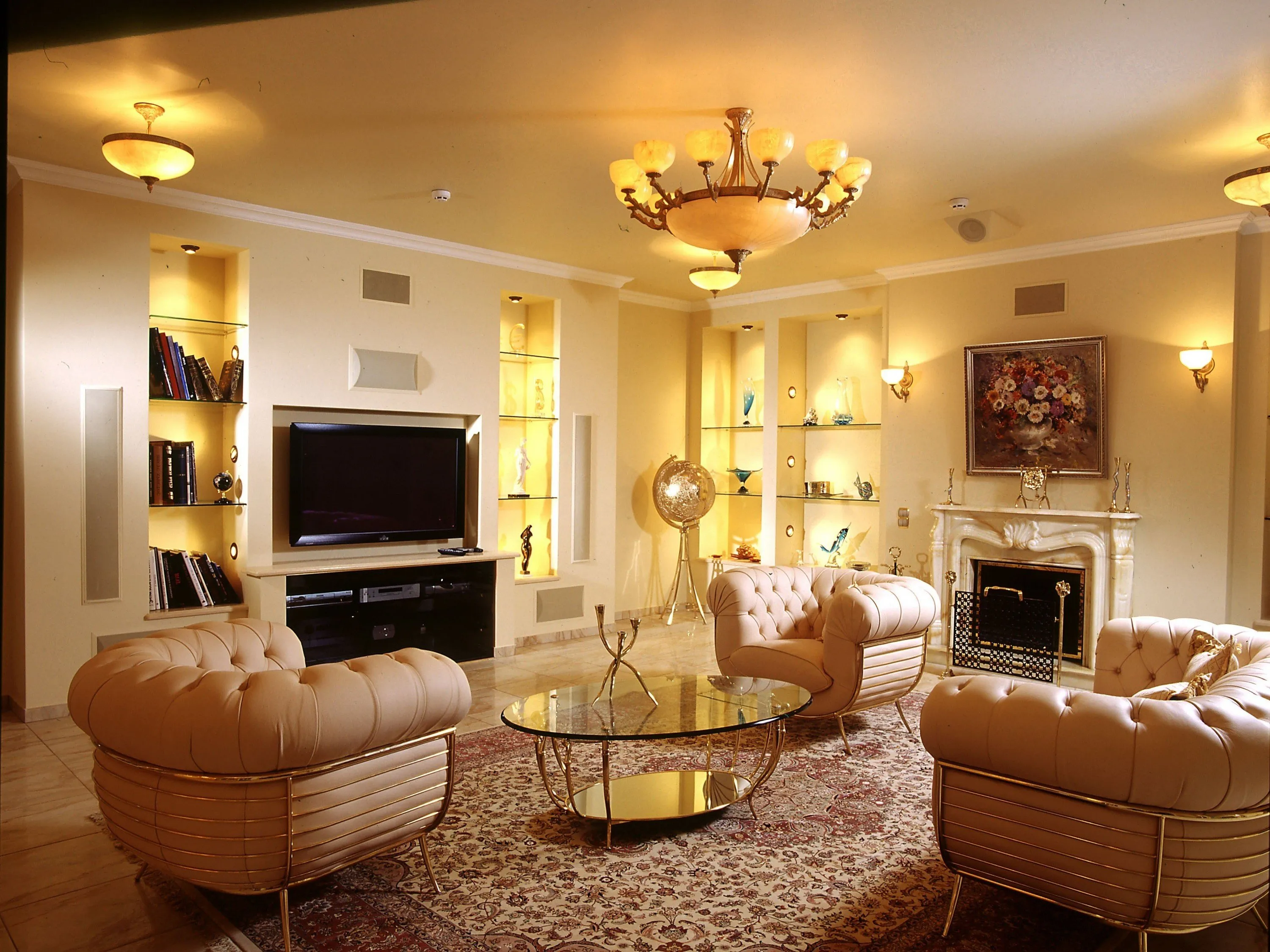
Luxury Living Room Furniture
High-end pieces spanning modern, neo-classical, and Italian Gothic styles — craftsmanship, leathers, and refined artistry.
Read More →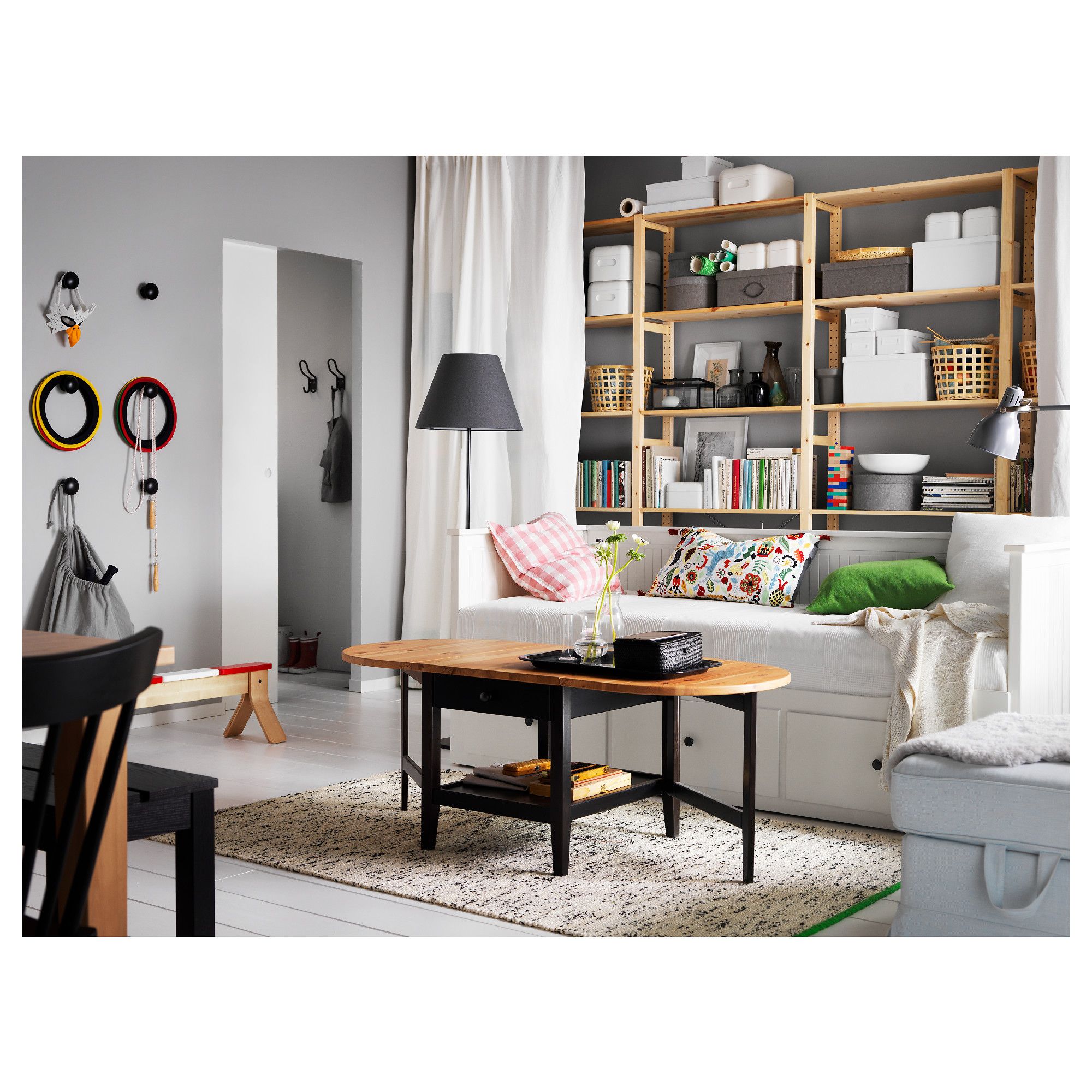
White Living Room Storage Cabinets
Sideboards, curio cabinets, and high-gloss storage units that blend practical organization with decorative appeal.
Read More →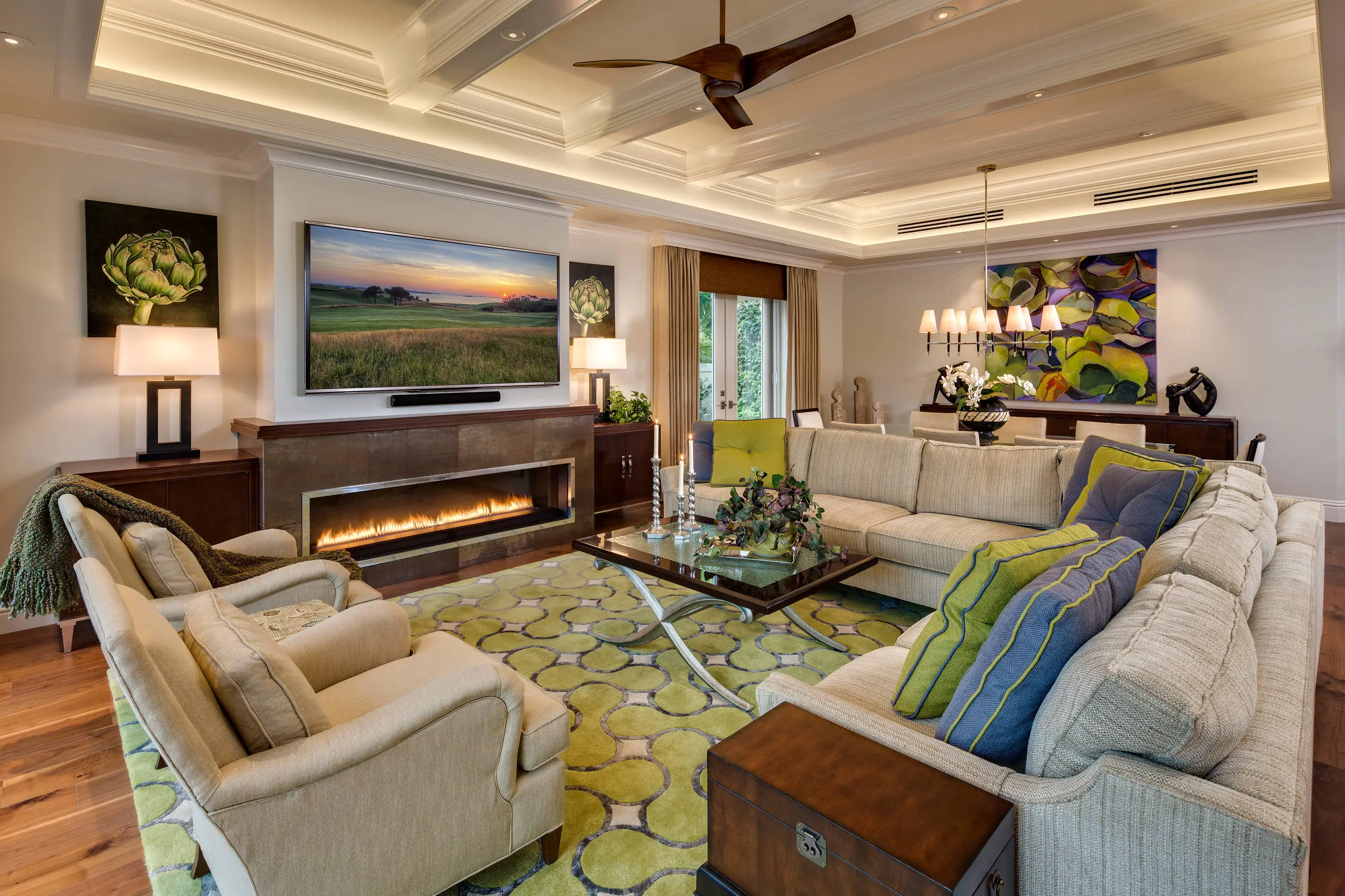
Living Room Decor Essentials
Rugs, pillows, art, lamps, and accent pieces that add layers of color, texture, and personality to any living space.
Read More →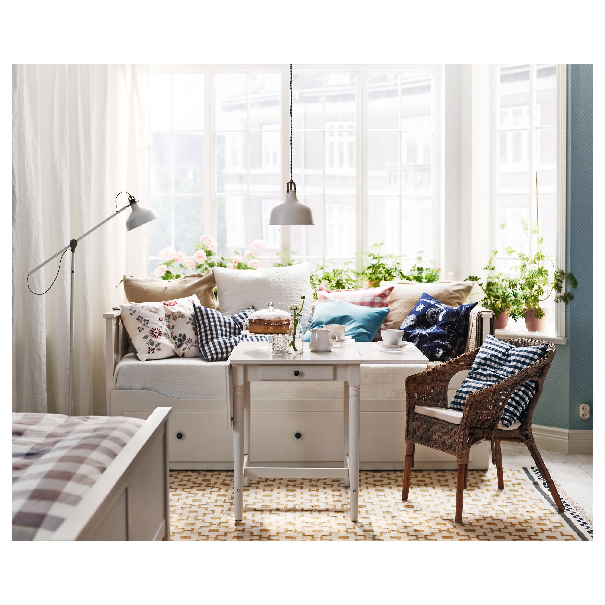
Natural Living Room Decor
Earthy elements, house plants, rustic touches, and organic materials that bring warmth and nature indoors.
Read More →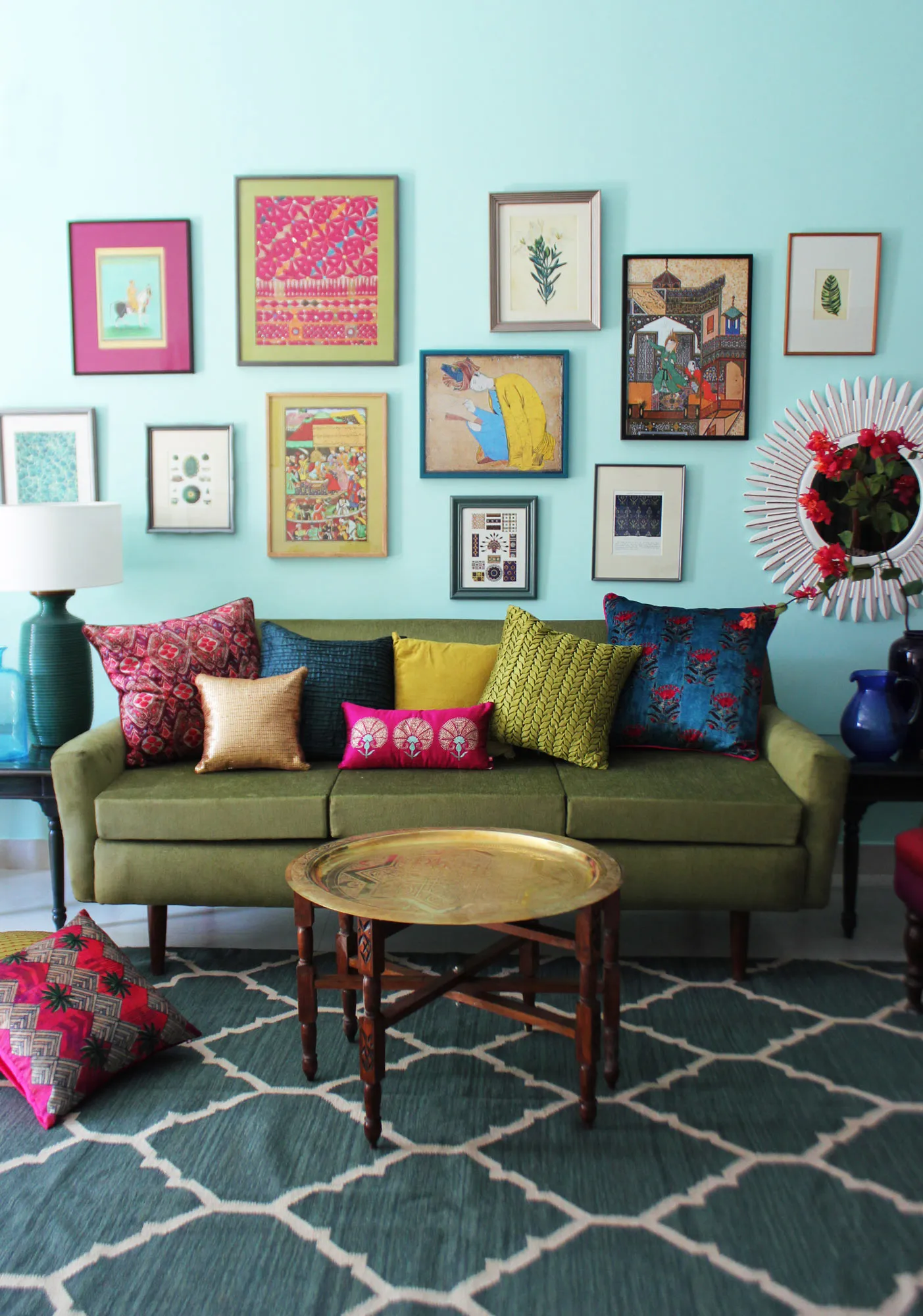
Living Room Ideas: Velvet Sofa
From classic red to trending green and blue, explore how a velvet sofa can transform your living room's character.
Read More →