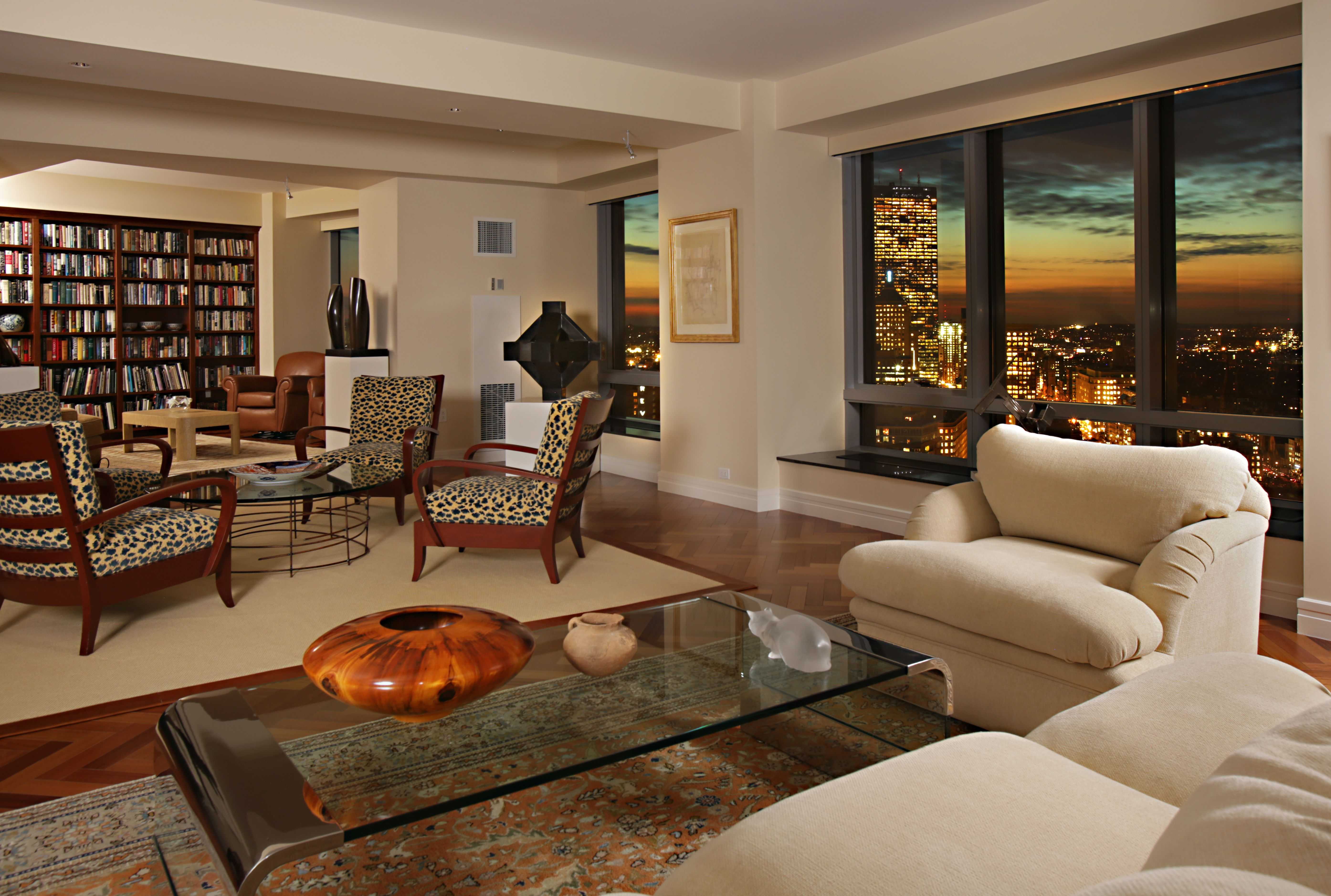
Living Room Design Ideas & Inspiration
Kumpulan Informasi, Tips dan Trik Terlengkap dan Terpercaya — explore curated ideas for sofas, storage, decor, and every style in between.
Explore Ideas →Get Design Inspiration
Tell us what you're looking for and we'll point you to the best articles.
Choosing the perfect paint color for a north-facing living room
A north-facing living room receives cool, indirect daylight for much of the day. Unlike a sunlit south-facing space, it rarely benefits from warm golden rays that naturally soften wall color. As a result, pale shades can appear bluer, gray paint may feel steely, and some whites can look flat or slightly lavender.
The right wall color can balance that cooler light and make the room feel comfortable, spacious, and intentional. The best choice depends on the size of the room, flooring, furniture, window treatments, and the atmosphere you want to create. A warm neutral is often a reliable starting point, but richer colors can work beautifully when their undertones are chosen with care.
Understand how northern light changes color
North-facing windows usually provide consistent light, but it tends to be soft and cool. This can be an advantage because colors remain relatively stable throughout the day. However, the room may lack the warmth that helps creamy whites, beige tones, and muted pastels look inviting in other orientations.
Before selecting a sample, observe the space in the morning, afternoon, and evening. Pay attention to the color of nearby buildings, trees, and outdoor surfaces because reflected light can influence the walls. A shade that looks balanced at noon may seem noticeably cooler after sunset when the room depends on lamps.
Room size also matters. A small living room with limited daylight may benefit from a light warm neutral, while a large space can support mid-tone taupe, olive, clay, or dusty blue. The goal is not necessarily to make the room look brighter; it is to create a balanced feeling that suits the way the room is used.
Look for warm and balanced undertones
Undertones are often more important than the main color name. “White,” “gray,” and “beige” can each contain blue, green, pink, yellow, or violet influences. In a north-facing room, cool undertones are intensified, so blue-gray or icy white may make the walls feel colder than expected.
Warm whites with subtle cream, sand, or ivory notes can soften the daylight without making the room appear yellow. Greige is another versatile option because it combines the calm quality of gray with the warmth of beige. Choose a restrained greige rather than one with a strong purple undertone, which can become more noticeable in cool light.
Muted shades with an earthy base are equally useful. Soft sage, mushroom, warm stone, oatmeal, and dusty terracotta bring visual warmth while retaining a sophisticated appearance. If you prefer blue, consider a smoky blue with gray or green undertones instead of a bright, clear blue.
Compare paint families for a cooler room
The perfect paint color should support the room’s existing features rather than fight them. Warm neutrals are generally the safest choice, but several other palettes can create a distinctive and welcoming living room. Use large samples because a small swatch rarely reveals how a color will behave across an entire wall.
| Paint family | Effect in north-facing light | Best with | Potential concern |
|---|---|---|---|
| Warm white | Brightens while reducing a stark appearance | Natural wood, linen, brass | Can look yellow beside very cool finishes |
| Soft greige | Creates a calm, adaptable backdrop | Stone, leather, black accents | Purple undertones may become visible |
| Pale sage | Adds gentle color and an organic mood | Oak, rattan, cream textiles | Green can look dull in low light |
| Dusty blue | Feels restful and layered | Warm metals, tan, walnut | Clear blue may appear icy |
| Mushroom taupe | Adds depth without overwhelming the room | Bouclé, wool, dark wood | May feel heavy in a small space |
| Muted terracotta | Brings warmth and personality | Ivory, natural fibers, aged brass | Strong orange tones can dominate |
A warm white is especially effective when the room contains dark flooring or substantial furniture. It reflects available light while preventing the high-contrast effect that a brilliant white can create. For a more enveloping look, choose a mid-tone taupe or clay shade and balance it with lighter upholstery and reflective accessories.
If your room already has colorful furniture, keep the walls understated. When the furnishings are mostly neutral, a muted green, blue, or earthy pink can provide character without making the space feel busy.
Test samples beside permanent features
Paint samples should be viewed next to the floor, sofa, curtains, trim, and largest pieces of furniture. A color that appears attractive by itself can clash with yellow-toned wood or emphasize the blue cast of a cool gray rug. Place samples on more than one wall, including the wall opposite the window.
Paint large boards or poster panels instead of relying only on small paper swatches. Move them around the room during the day and examine them under the lamps used in the evening. This method makes it easier to compare colors without committing to several test patches on the wall.
Sheen affects the result as well. Matte and eggshell finishes soften reflections and are usually flattering for living room walls. Satin can be useful for trim or areas that require easier cleaning, but it may highlight uneven surfaces and reflect cool light more strongly.
Coordinate furniture, lighting, and finishes
Wall color should form part of a complete living room palette. Warm paint becomes especially convincing when repeated in small details such as cushions, ceramics, artwork, and woven accessories. If you are furnishing the space from scratch, consider how the wall tone will interact with seating scale, wood finishes, and metal accents. Refined pieces from a luxury living room furniture collection can look more inviting when paired with a softly balanced backdrop rather than a cold, high-contrast white.
Lighting can change the apparent temperature of paint after dark. Bulbs around 2700K generally create a warm glow that complements beige, taupe, clay, and warm white walls. If you use cooler bulbs, test the samples under those exact lamps before making a decision. A combination of ceiling lighting, floor lamps, and table lamps will create more depth than one central fixture.
Window treatments also influence the room. Cream, flax, oatmeal, and warm gray fabrics can filter daylight gently, while stark white curtains may reinforce a cool cast. Natural wood, leather, aged brass, and woven fibers are effective ways to introduce warmth without relying solely on paint.
Avoid common color selection mistakes
Choosing the lightest possible color is not always the best way to make a dim room feel brighter. Very pale cool shades can look washed out and may leave the room feeling less comfortable. A slightly deeper warm neutral often gives the walls more presence and makes the available light feel intentional.
- Test colors at several times of day and under evening lighting.
- Select undertones that balance existing floors, upholstery, and window treatments.
- Use large movable samples rather than judging tiny paint cards.
- Repeat the wall color in textiles or accessories for a cohesive scheme.
- Consider a slightly richer shade if the room feels flat after testing pale options.
Another common mistake is choosing color from a photograph or online palette alone. Screens display color differently, and the same paint can vary according to room size, bulb temperature, and surrounding finishes. Use inspiration images to identify the mood you like, then verify the actual color in your own home.
Create a welcoming final palette
A north-facing living room does not need to be forced into a bright white scheme. Its cooler daylight can support elegant, restful interiors when balanced with warm undertones, layered lighting, and tactile materials. Start by identifying the colors already present, then narrow your options to samples that complement those fixed elements.
For a timeless result, try warm white, gentle greige, mushroom taupe, or pale sage. For more drama, consider muted terracotta or a smoky blue with a warm gray base. The most successful choice will look comfortable in daylight, attractive under lamps, and harmonious with the furniture you plan to keep for years.
Gather several large samples, live with them through a full day, and assess the room as a whole before buying paint. Once the color feels balanced in every lighting condition, use it as the foundation for a living room that feels warm, considered, and genuinely yours.
What We Cover
Living Room Topics & Ideas
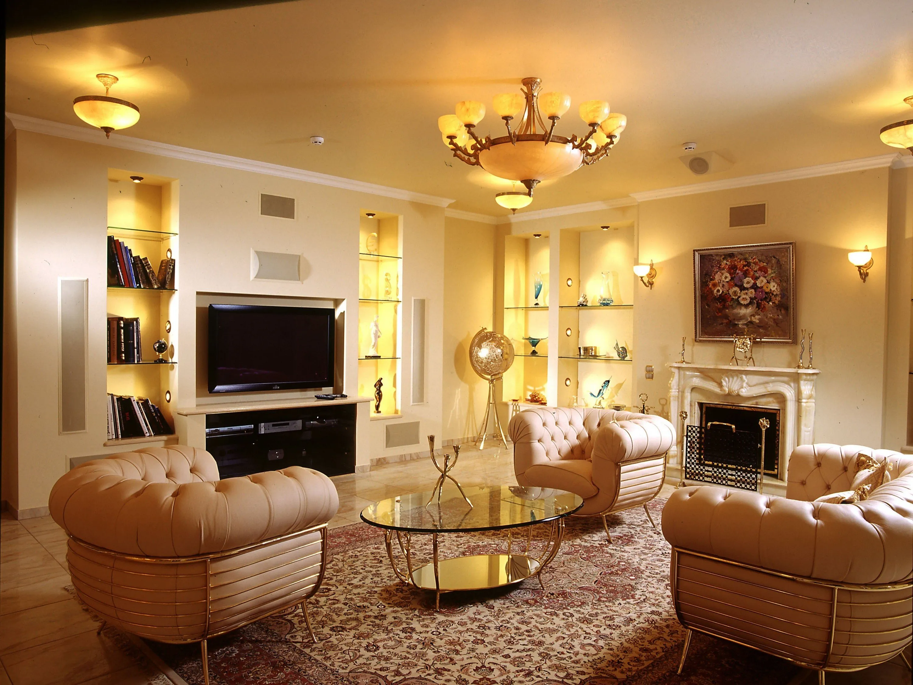
Luxury Living Room Furniture
High-end pieces spanning modern, neo-classical, and Italian Gothic styles — craftsmanship, leathers, and refined artistry.
Read More →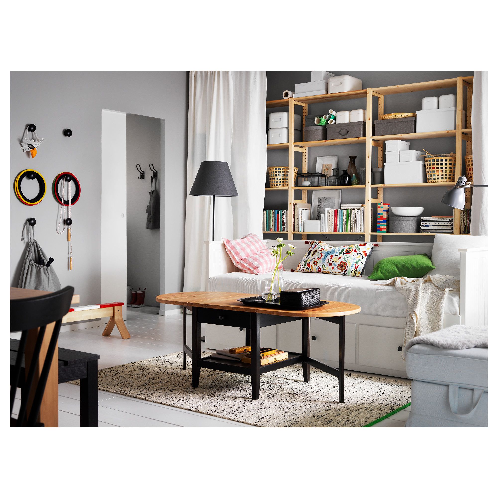
White Living Room Storage Cabinets
Sideboards, curio cabinets, and high-gloss storage units that blend practical organization with decorative appeal.
Read More →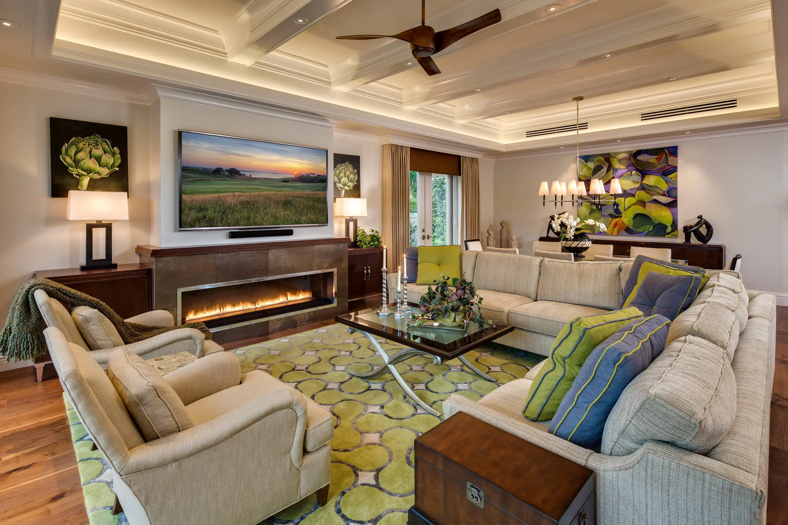
Living Room Decor Essentials
Rugs, pillows, art, lamps, and accent pieces that add layers of color, texture, and personality to any living space.
Read More →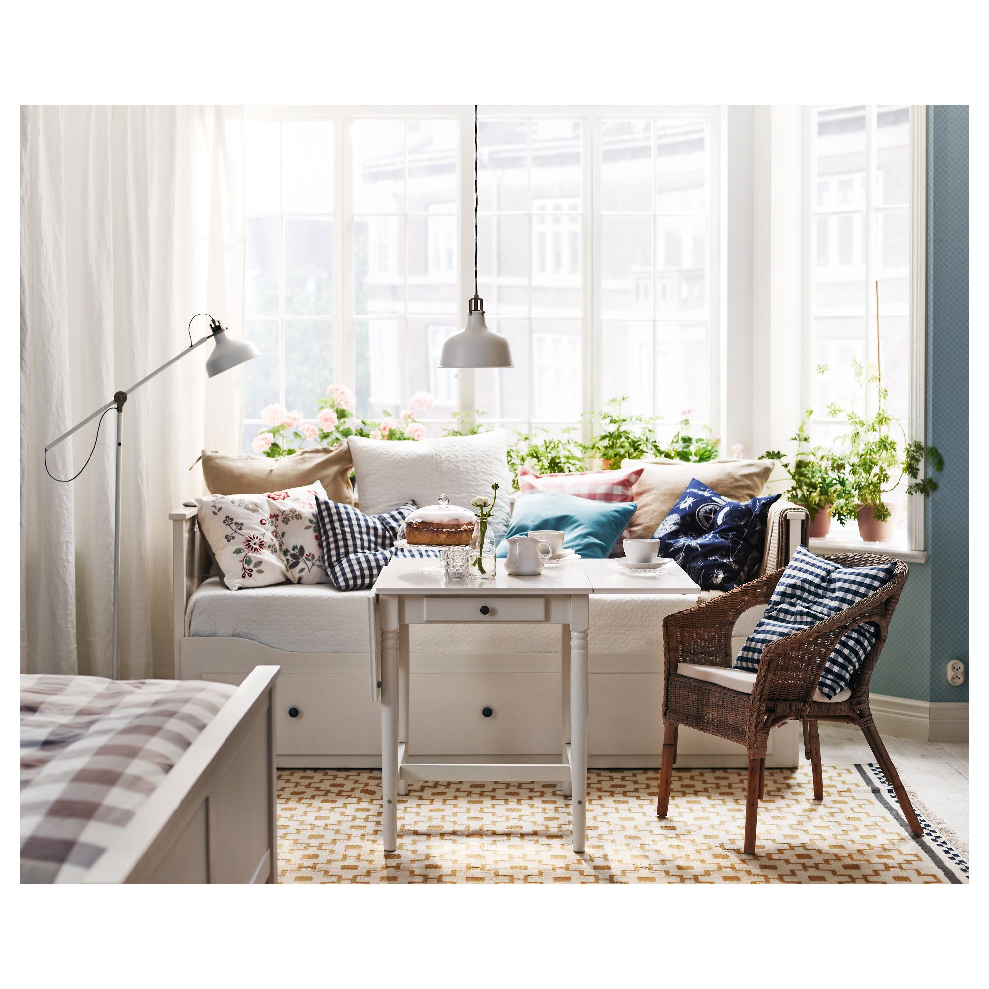
Natural Living Room Decor
Earthy elements, house plants, rustic touches, and organic materials that bring warmth and nature indoors.
Read More →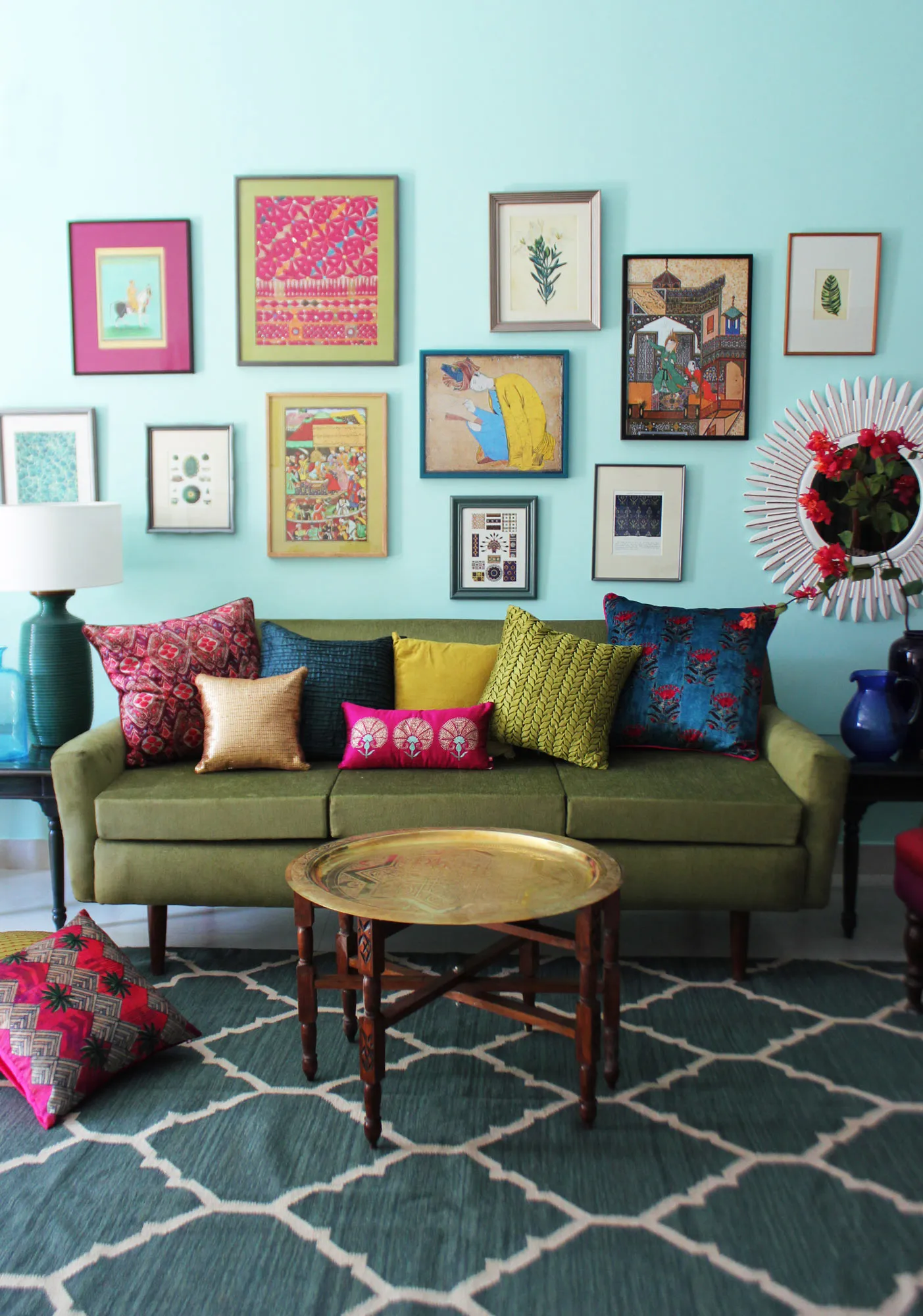
Living Room Ideas: Velvet Sofa
From classic red to trending green and blue, explore how a velvet sofa can transform your living room's character.
Read More →