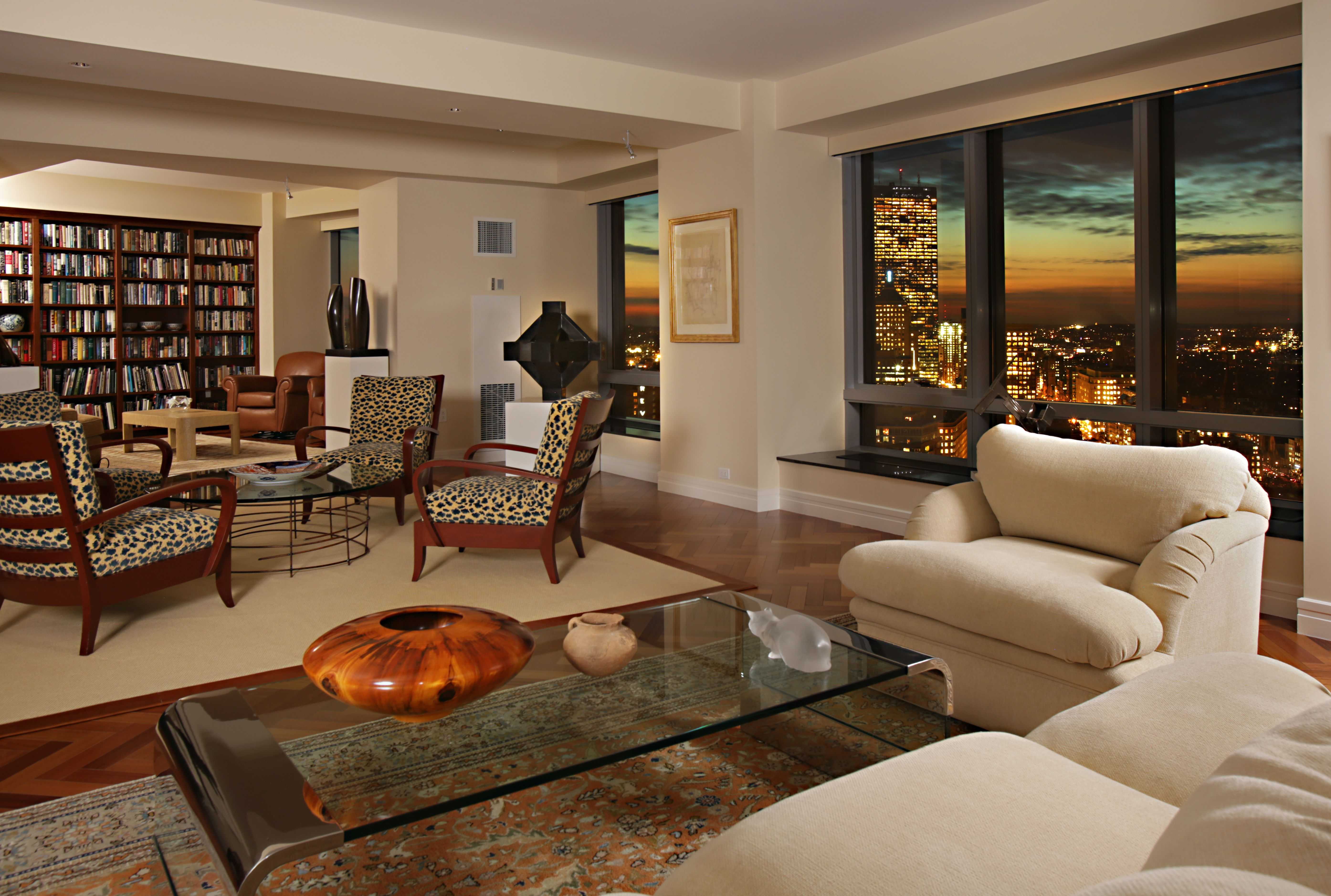
Living Room Design Ideas & Inspiration
Kumpulan Informasi, Tips dan Trik Terlengkap dan Terpercaya — explore curated ideas for sofas, storage, decor, and every style in between.
Explore Ideas →Get Design Inspiration
Tell us what you're looking for and we'll point you to the best articles.
Choosing the Best Paint Color for a Living Room with No Natural Light
A living room without windows can feel flat, enclosed or cooler than the rest of the home. The right paint colour can change that impression, making the space feel brighter, softer and more welcoming without relying on stark white walls. Colour, lighting, ceiling height, flooring and furniture all influence how the room is perceived.
Australian homes often combine living, dining and kitchen areas, so a dark lounge may need to feel connected to brighter zones. Whether you are updating a Melbourne terrace, a Brisbane apartment or a Sydney family home, the best wall colour will depend on the room’s artificial lighting and the undertones already present in your furnishings.
Read the Room Before Choosing
Start by identifying what makes the space feel dark. A room may lack windows, face a shaded courtyard or receive very little daylight because of an adjoining hallway. Dark timber flooring, charcoal sofas and heavy curtains can absorb additional light, while glossy surfaces may create distracting reflections from ceiling fittings.
Check the room at different times of day, even when direct sunlight never reaches it. Switch on every lamp and overhead fitting, then place white paper beside the walls to see whether the current colour appears yellow, blue or grey. This simple test helps you understand the existing light rather than choosing paint from a showroom display.
Use Undertones to Control Mood
Pure white is rarely the easiest option for a light-starved lounge. Against warm LED bulbs, a brilliant white can look harsh or slightly green, while a cool white may make the room feel clinical. Soft whites with beige, cream or muted grey undertones usually create a gentler backdrop.
Pale greige, warm stone, oatmeal and light mushroom are versatile choices for Australian interiors. They reflect enough light to open up the room while adding depth to white trim and pale flooring. If the space already contains blue-grey upholstery, choose a balanced grey rather than a strongly yellow beige, which can make the furniture appear mismatched.
Select Colours That Add Warmth
Warm neutrals are a dependable starting point, but a soft colour can provide more personality. Dusty sage, pale eucalyptus, muted apricot and subdued clay can bring life to a dark room without overwhelming it. These shades work particularly well when repeated in cushions, artwork or a rug.
For a stronger statement, consider a light olive, smoky blue or warm terracotta on one wall. Keep the remaining surfaces lighter so the room does not feel visually compressed. A feature wall behind a television or sofa can anchor the layout, while painting all walls in a mid-tone shade may suit a large room with generous ceiling height.
Test Paint in Australian Conditions
Paint swatches are useful, but they cannot show how a colour will behave across an entire wall. Buy sample pots from retailers such as Bunnings or compare Australian ranges from Dulux, Taubmans and Haymes. Apply broad test patches rather than small squares, and leave them visible for at least two days.
Consider the local climate as well as the room’s direction. Bright Queensland light can make warm colours appear stronger near connected spaces, while Melbourne’s overcast winter conditions may emphasise cool undertones. In coastal areas, pale sandy neutrals can connect naturally with relaxed Australian decor, especially when paired with timber, linen and woven textures.
Coordinate Lighting and Furnishings
Paint cannot create light where there is none, so use layered lighting to support the chosen colour. Combine ceiling lights with floor lamps, table lamps and concealed LED strips on shelving. Warm-white bulbs around 2700K to 3000K generally make a living room feel comfortable, while very cool bulbs can exaggerate blue or green undertones.
Furniture placement also affects brightness. Keep bulky pieces away from the main light sources and choose upholstery in oatmeal, ivory, tan or soft grey to reflect illumination. If the room includes several seating pieces, this guide to a comfortable conversation area can help balance function with an open visual flow.
Avoid Common Dark-Room Mistakes
Painting every surface a stark white is a common response to a gloomy room, yet it can highlight shadows and make dark corners look more noticeable. A slightly tinted neutral usually offers greater visual comfort. Similarly, using a very dark feature wall can make a narrow lounge feel shorter unless the room has strong layered lighting.
Be cautious with too many competing undertones. A pink-beige wall beside blue-grey seating, yellow timber and cool white lighting can create a restless effect. Choose one dominant temperature, then introduce contrast through artwork, greenery, metal finishes and textiles rather than adding several unrelated paint colours.
Mirrors can help distribute lamp light, but their placement matters. Position one opposite a lamp or near a brighter adjoining area instead of expecting it to brighten a blank, unlit wall. Light-coloured curtains, reflective ceramics and glass side tables can add small highlights without making the room feel overly polished.
Compare Reliable Colour Directions
The following options suit different furniture schemes and decorating goals. The most successful choice is usually the colour that works with your fixed finishes, rather than the shade that appears brightest on a sample card.
| Paint direction | Best suited to | Effect in a dark room | Pair with |
|---|---|---|---|
| Warm white | Minimal or coastal interiors | Softens shadows and keeps the room open | Pale timber, linen, black accents |
| Light greige | Contemporary homes | Adds depth without becoming heavy | Grey sofa, oak, brushed metal |
| Pale sage | Natural or relaxed interiors | Brings a gentle sense of freshness | Eucalyptus tones, rattan, cream |
| Dusty blue | Rooms with warm furnishings | Creates calm contrast | Tan leather, warm white, brass |
| Soft mushroom | Cosy, layered schemes | Makes the space feel intimate and grounded | Bouclé, walnut, terracotta |
| Light clay | Rooms needing personality | Adds warmth while remaining muted | Ivory, natural fibres, dark timber |
Paint the ceiling a lighter version of the wall colour if the room has a low ceiling. This reduces a harsh visual break and can make the upper part of the space recede gently. For skirting boards and architraves, use a similar undertone in a slightly stronger white so the detailing remains defined without creating sharp contrast.
Choose the final colour after considering your largest furnishings, flooring and light sources. Order sample pots, test generous patches and live with them through several lighting conditions before committing. Once the walls are ready, finish the transformation with layered lamps, reflective accessories and seating that encourages people to use the room.
What We Cover
Living Room Topics & Ideas
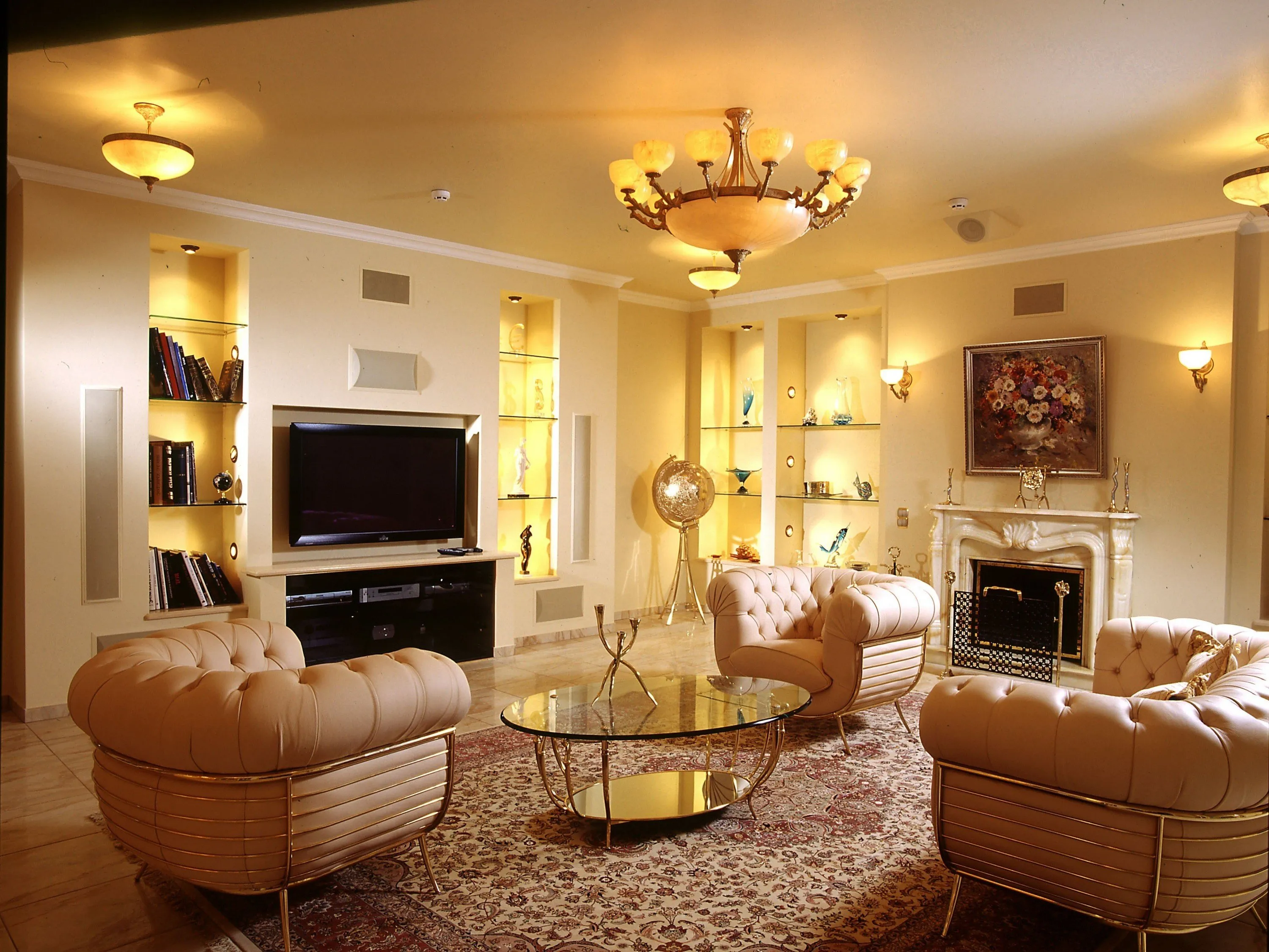
Luxury Living Room Furniture
High-end pieces spanning modern, neo-classical, and Italian Gothic styles — craftsmanship, leathers, and refined artistry.
Read More →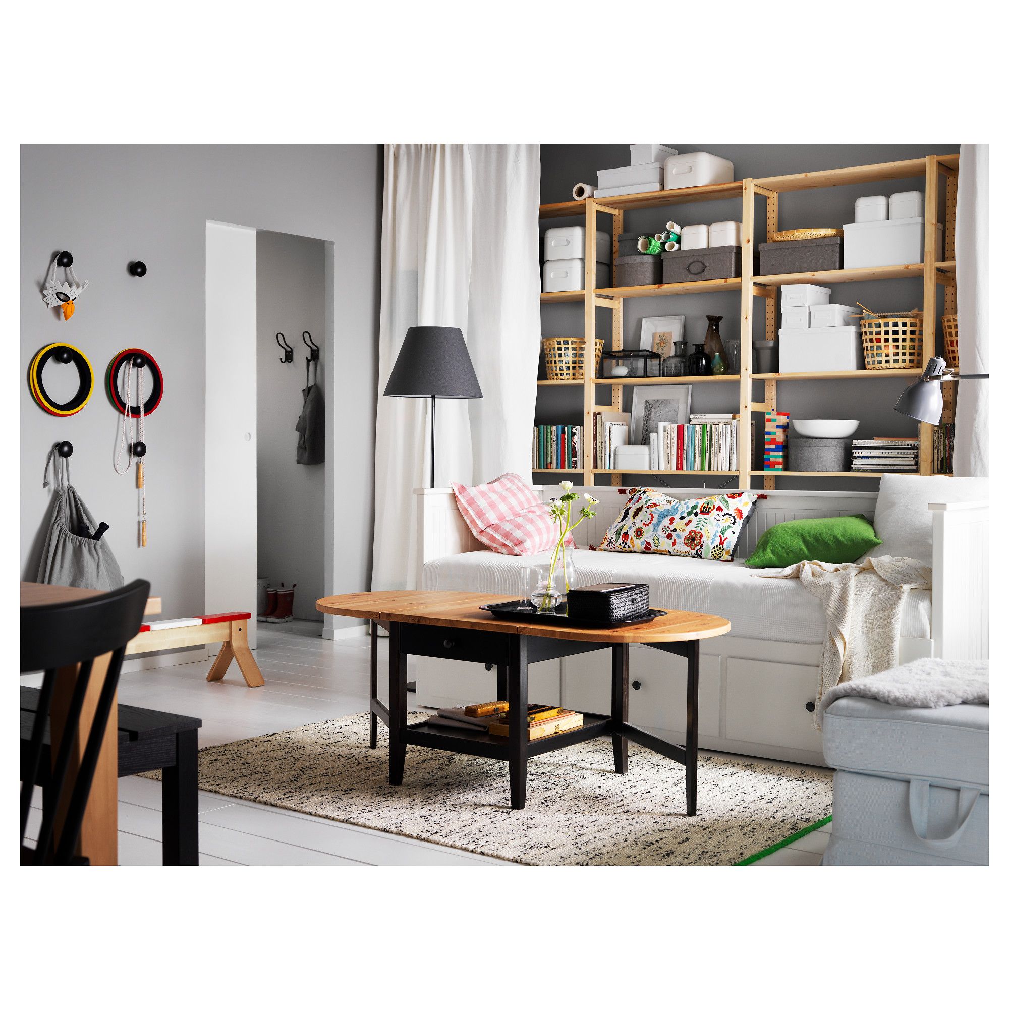
White Living Room Storage Cabinets
Sideboards, curio cabinets, and high-gloss storage units that blend practical organization with decorative appeal.
Read More →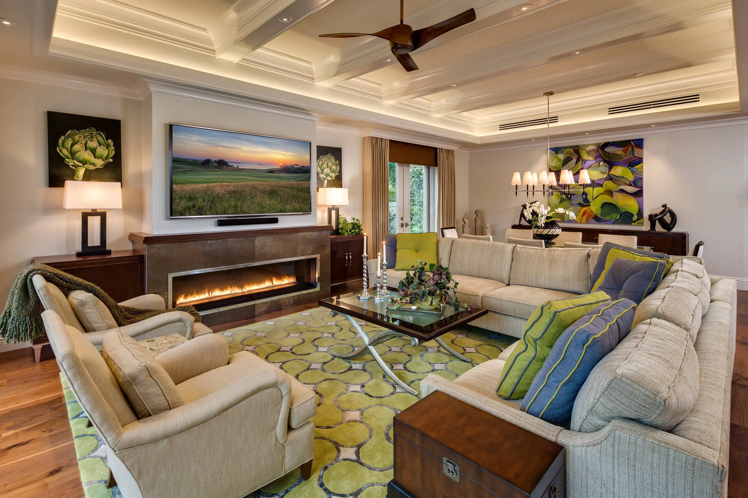
Living Room Decor Essentials
Rugs, pillows, art, lamps, and accent pieces that add layers of color, texture, and personality to any living space.
Read More →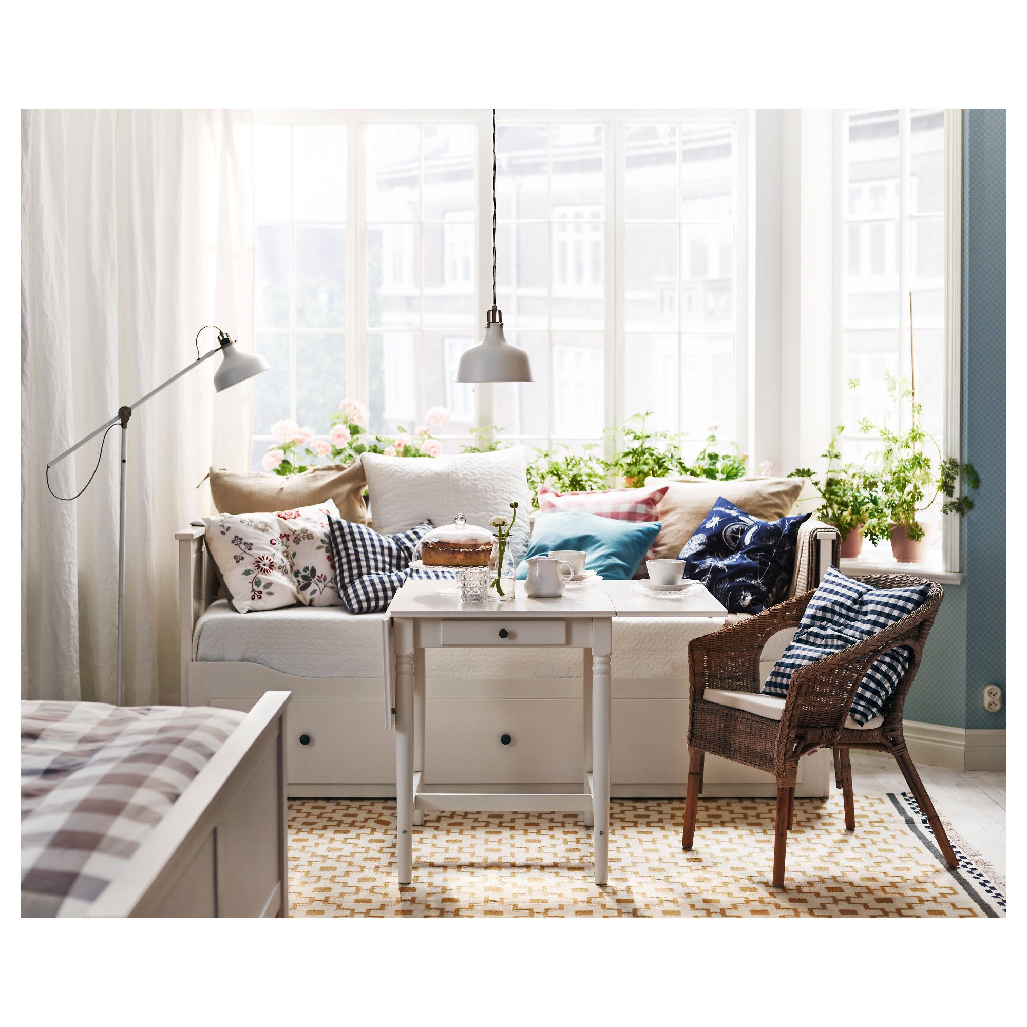
Natural Living Room Decor
Earthy elements, house plants, rustic touches, and organic materials that bring warmth and nature indoors.
Read More →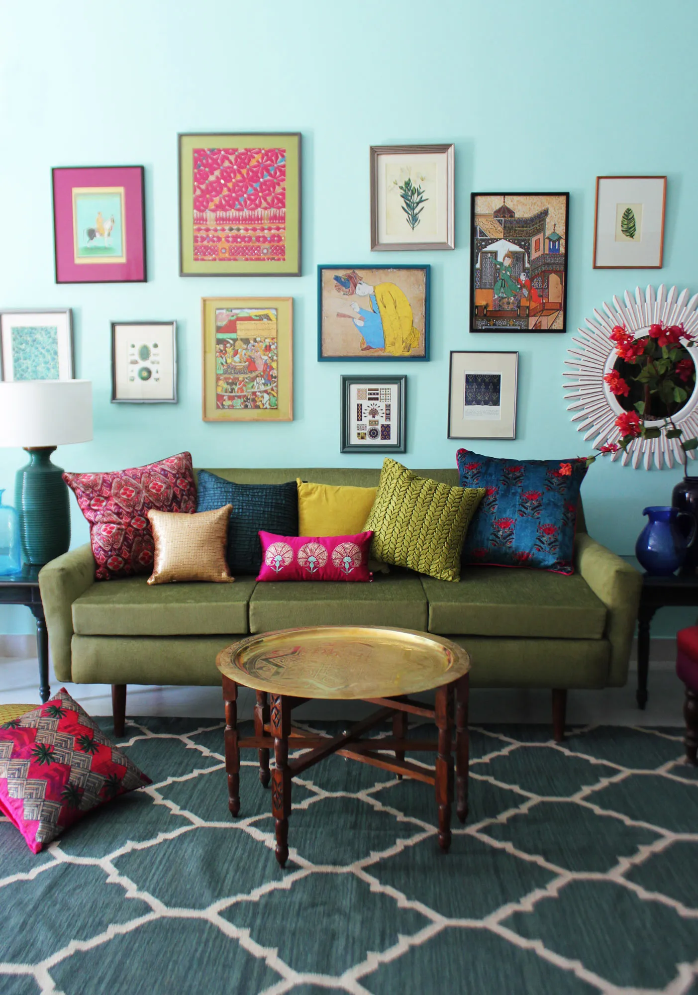
Living Room Ideas: Velvet Sofa
From classic red to trending green and blue, explore how a velvet sofa can transform your living room's character.
Read More →