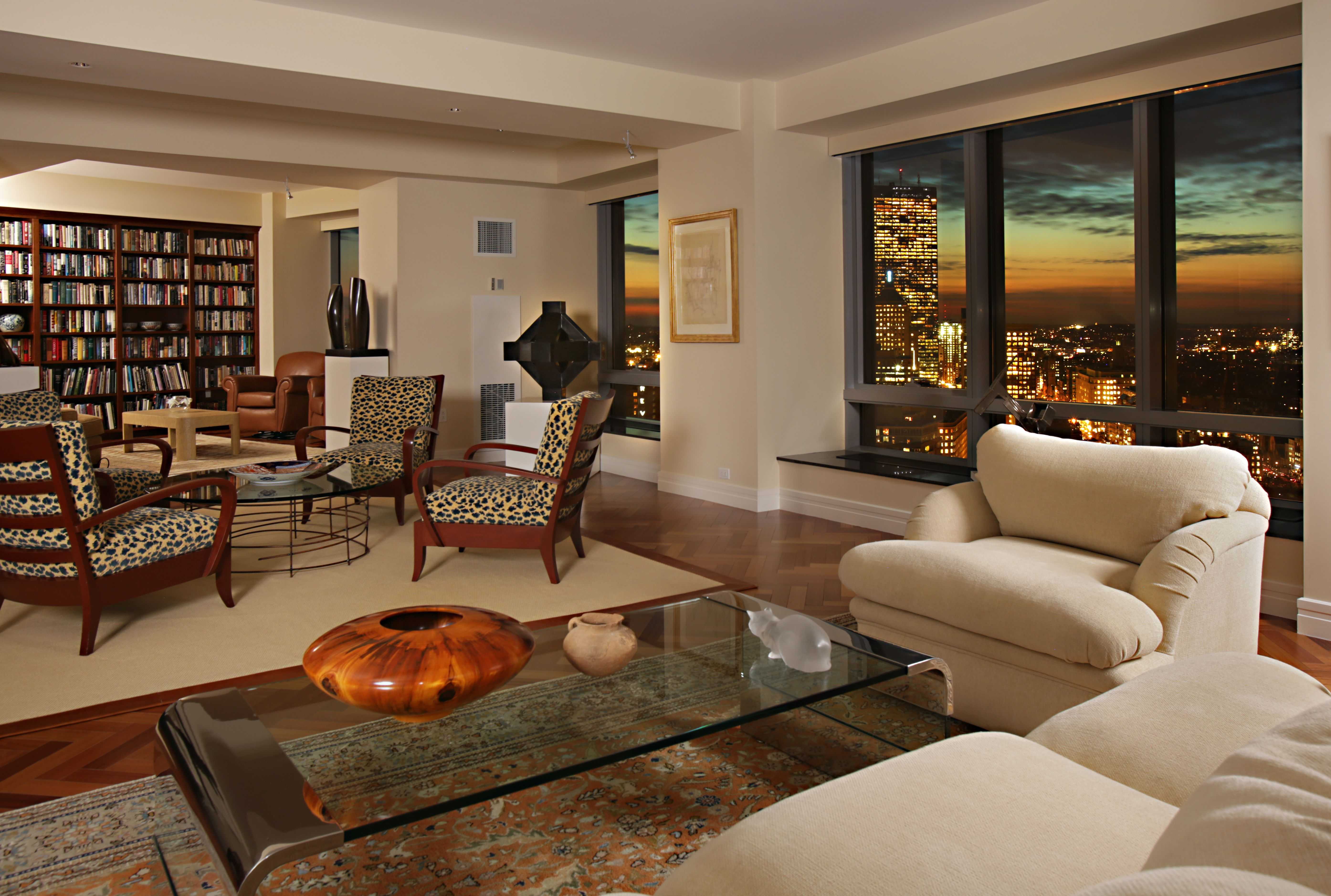
Living Room Design Ideas & Inspiration
Kumpulan Informasi, Tips dan Trik Terlengkap dan Terpercaya — explore curated ideas for sofas, storage, decor, and every style in between.
Explore Ideas →Get Design Inspiration
Tell us what you're looking for and we'll point you to the best articles.
Best Paint Colors for a South-Facing Living Room
A south-facing living room receives generous daylight for much of the day, making it feel open, warm, and inviting. That abundant sunshine can also intensify paint colors, bring out yellow or red undertones, and make pale shades appear brighter than they looked on a store card.
The right wall color depends on the mood you want, the direction of the light, and the room’s existing finishes. Flooring, upholstery, curtains, wood tones, and artificial lighting all influence how a shade behaves from morning to evening.
Before committing to a full gallon, test large swatches on more than one wall. Watch them in direct sunlight, filtered daylight, and after sunset with the lamps switched on. This simple step reveals whether a color becomes too warm, washed out, gray, or unexpectedly saturated.
Why Southern Light Changes Paint Color
South-facing windows produce warm, direct light that can amplify golden, peach, terracotta, and creamy undertones. A neutral beige may look almost honey-colored at midday, while a warm white can become intensely luminous. This effect is attractive when balanced with cooler fabrics and natural textures, but it can feel overpowering in a room with orange-toned flooring or walnut furniture.
Cooler colors often benefit from this exposure. Soft blue, sage, blue-gray, and muted green can look balanced rather than chilly. The sunlight takes the edge off their coolness and gives them a relaxed, livable quality. Very cool grays, however, may still feel stark if the room receives little light outside sunny hours.
Reflectiveness matters as much as undertone. Glossy or satin paint bounces sunlight around the room and highlights wall imperfections, whereas eggshell offers a gentle glow with a softer appearance. Matte finishes absorb more light and create a calm, enveloping effect.
Warm Whites And Creamy Neutrals
Warm white is a dependable choice for a bright sitting room because it keeps the space airy without the blue cast that some crisp whites develop. Look for shades with subtle beige, ivory, or greige undertones rather than strong yellow. These colors pair easily with linen, oak, rattan, stone, and black metal accents.
Cream works especially well when the room has traditional details, exposed beams, or a relaxed farmhouse character. In intense sunlight, select a restrained cream instead of a deep buttery shade. A lighter neutral will preserve visual freshness and prevent the walls from competing with upholstery and artwork.
For a budget-friendly room refresh, warm white walls can create a flexible backdrop for layered accessories. A guide to modern farmhouse decor can help coordinate painted walls with rustic wood, woven baskets, and comfortable seating without making the space feel themed.
Soft Greens And Sun-Washed Blues
Sage green is among the most adaptable colors for a sun-filled living room. Its gray or earthy undertones temper the brightness of southern exposure, while the green adds a natural connection to plants, gardens, and timber furnishings. Pale sage feels peaceful; olive-leaning sage creates a richer, more grounded atmosphere.
Muted blue is another strong option, particularly when the room includes white trim, pale wood, or coastal-inspired fabrics. Dusty blue, mineral blue, and blue-gray tend to be more successful than vivid turquoise because they remain restful under strong daylight. A shade with a small amount of gray will usually look more sophisticated throughout the day.
These colors work well with warm accents. Add camel leather, terracotta ceramics, brass lighting, or rust-colored cushions to keep a blue or green palette from becoming too cool. If the room already contains colorful artwork, choose a quiet, desaturated wall shade that supports the display.
| Paint color family | Daylight effect | Best paired with | Overall mood |
|---|---|---|---|
| Soft warm white | Bright and gently glowing | Oak, linen, black accents | Airy and versatile |
| Pale greige | Balanced with subtle warmth | Stone, cream, walnut | Refined and calm |
| Sage green | Earthy and softened by sun | Rattan, tan leather, plants | Natural and relaxed |
| Dusty blue | Cooler but softened by light | White trim, brass, pale wood | Fresh and peaceful |
| Muted terracotta | Rich and highly saturated | Ivory, charcoal, woven textures | Welcoming and energetic |
| Light taupe | Warm without strong color | Layered neutrals, textured fabrics | Quiet and sophisticated |
Greige, Taupe, And Balanced Neutrals
Greige combines gray and beige, making it useful when you want a neutral that is warmer than gray but less yellow than cream. In southern light, a pale greige can retain its understated character while reflecting enough brightness to keep the room open. It is especially effective in contemporary, transitional, and minimalist interiors.
Taupe offers a slightly deeper alternative. Choose a shade with balanced brown and gray undertones if the room has bright white trim or cool stone surfaces. A pink or purple undertone can become more visible in strong light, so sample carefully beside the sofa, flooring, and window treatments.
Layering several neutral tones prevents the room from looking flat. Combine a greige wall with a warmer rug, creamy curtains, and darker wood furniture. Differences in texture—bouclé, linen, jute, leather, and woven cotton—add depth without introducing too many competing colors.
Deeper Accent Colors For A Bright Room
A sunny living room can support more saturated paint than a darker space. Deep olive, muted teal, charcoal, and clay can create a dramatic feature wall, define a reading corner, or frame built-in shelving. Because southern light reveals color strongly, select complex, softened versions rather than highly vivid tones.
A dark accent wall works best when the room has enough visual balance. Repeat the color in cushions, artwork, ceramics, or a patterned rug so it feels intentional. If the wall faces the windows directly, expect the color to appear lighter and warmer during peak daylight.
Terracotta and clay shades are particularly appealing with natural materials. They bring warmth and personality to a neutral sofa, although large rooms with red brick, orange wood, or warm leather may need a dustier version to avoid an overly fiery effect.
Choosing Sheen, Trim, And Window Treatments
Eggshell is a practical finish for most living room walls because it offers mild reflectivity and can be wiped clean. Matte paint is attractive in a room where you want a soft, cocooning effect, but it may require more care on frequently touched surfaces. Satin is useful for trim, doors, and architectural details rather than broad walls.
Trim color can shift the appearance of the main paint. Soft white trim creates a gentle, coordinated look with warm neutrals, while bright white produces sharper contrast. Painting trim in a related shade can make a small room feel calmer and give architectural features a more integrated appearance.
Window treatments help regulate the strongest rays. Light-filtering curtains soften glare while preserving brightness, and woven shades introduce texture without blocking every view. If the walls are pale, adding new throw blankets in rust, moss, navy, or caramel can bring seasonal color into the room without repainting.
A Practical Color-Testing Checklist
Use these steps before painting the entire room:
- Sample at least three shades with different undertones, including one option slightly lighter than your first choice.
- Paint large boards or broad wall sections so the color can be viewed from across the room.
- Check the samples in morning, midday, late afternoon, and artificial evening light.
- Place furniture, rugs, and fabric swatches beside the samples before deciding.
- Observe how the color looks near both the windows and the darkest corner.
A south-facing room gives you plenty of creative freedom, from barely-there greige to expressive olive or clay. The safest choices are shades with softened undertones that can handle intense daylight without becoming overly yellow, gray, or saturated. Once the wall color is settled, coordinate the sofa, lighting, textiles, and artwork around the same temperature for a cohesive living space.
Gather your paint samples, observe them through a full day, and choose the shade that makes the room feel most comfortable in every kind of light.
What We Cover
Living Room Topics & Ideas
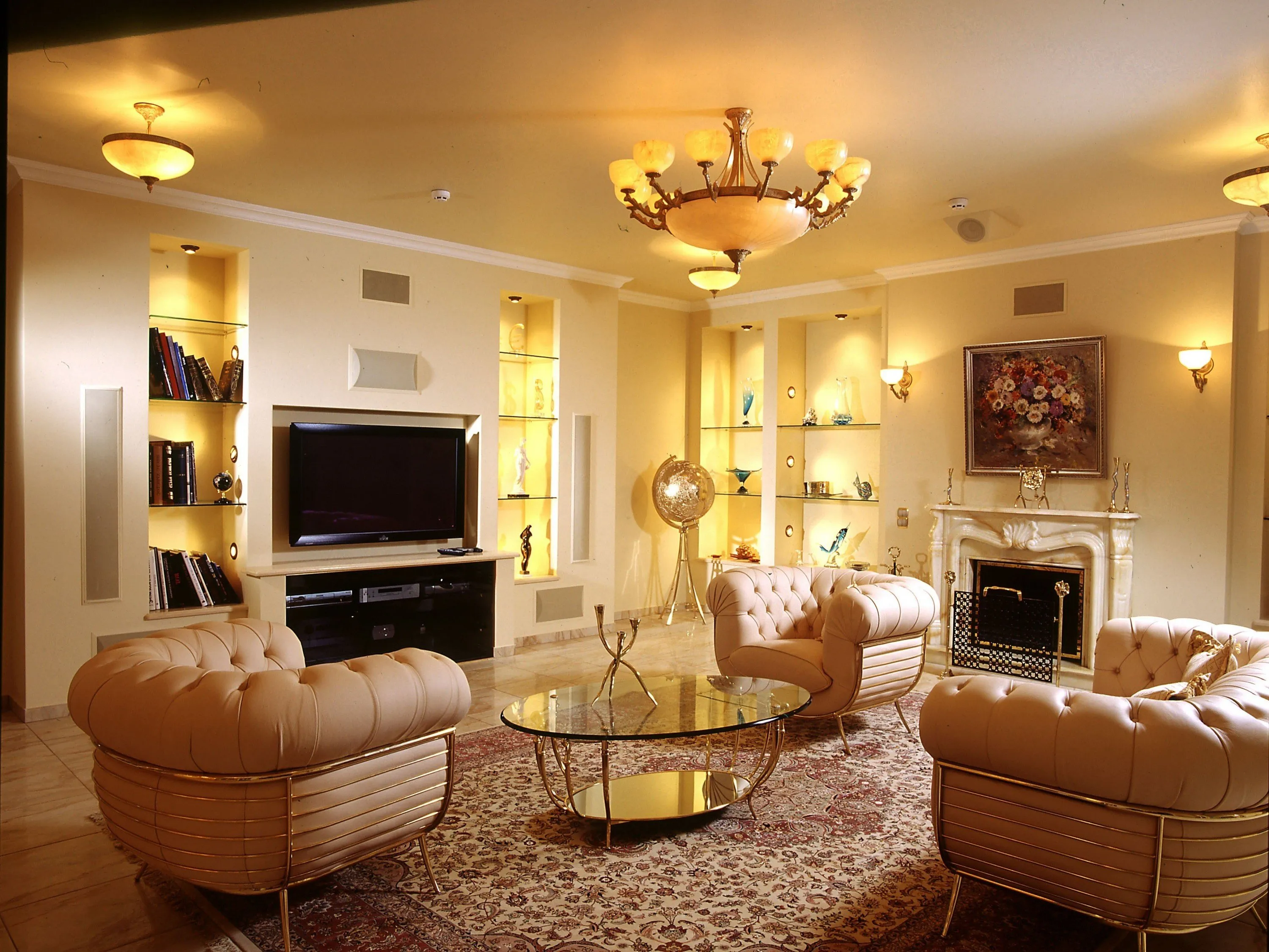
Luxury Living Room Furniture
High-end pieces spanning modern, neo-classical, and Italian Gothic styles — craftsmanship, leathers, and refined artistry.
Read More →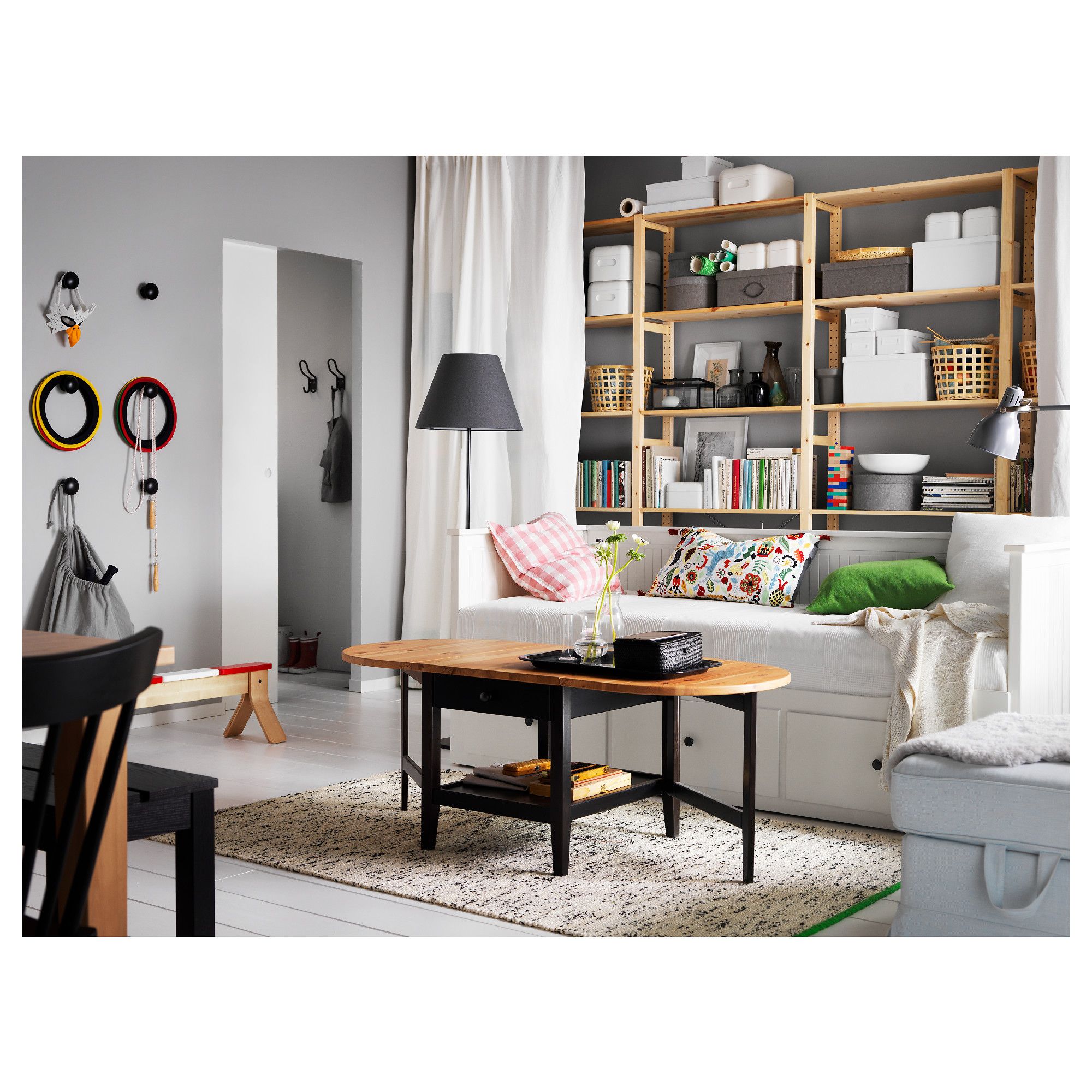
White Living Room Storage Cabinets
Sideboards, curio cabinets, and high-gloss storage units that blend practical organization with decorative appeal.
Read More →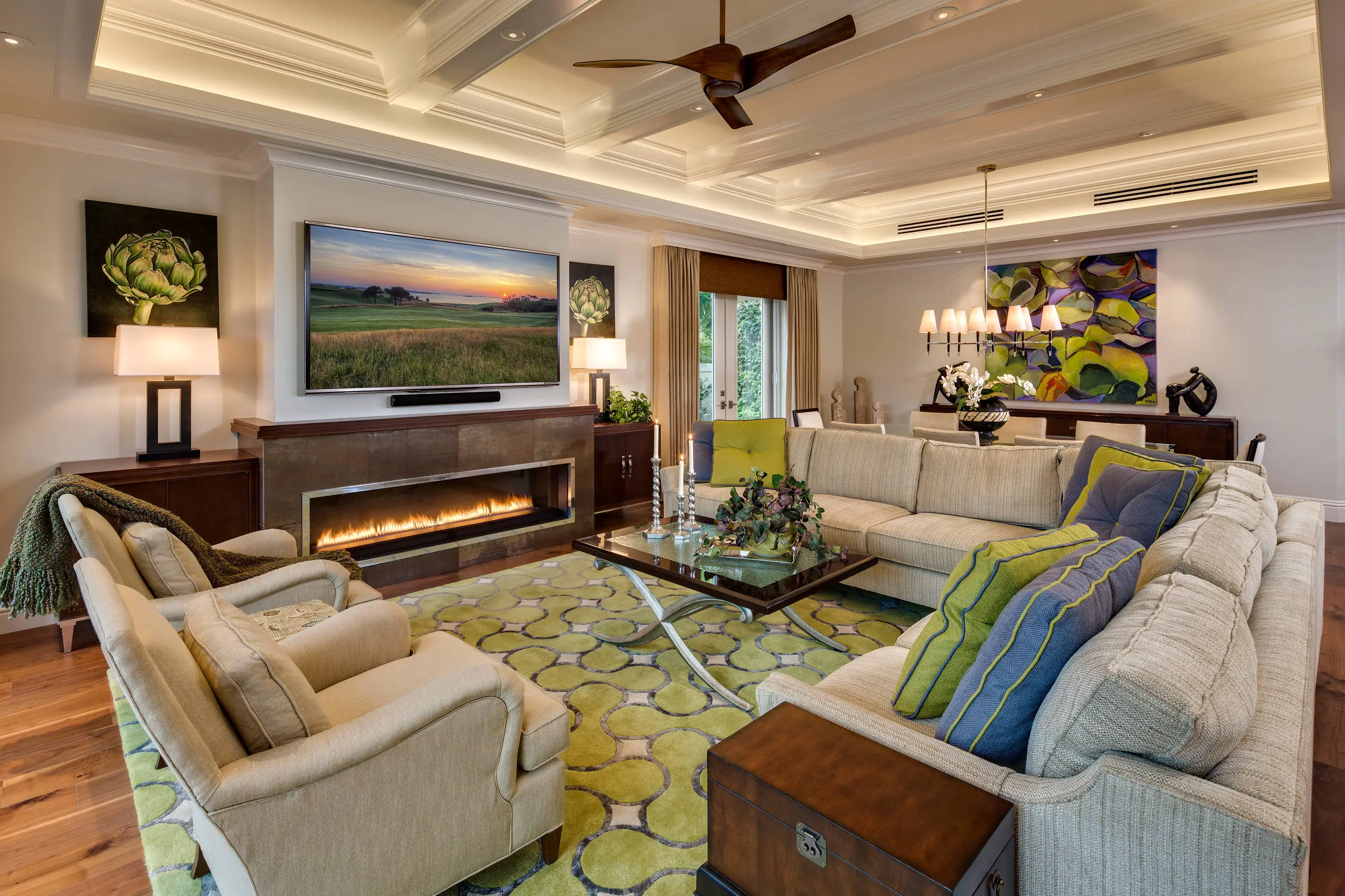
Living Room Decor Essentials
Rugs, pillows, art, lamps, and accent pieces that add layers of color, texture, and personality to any living space.
Read More →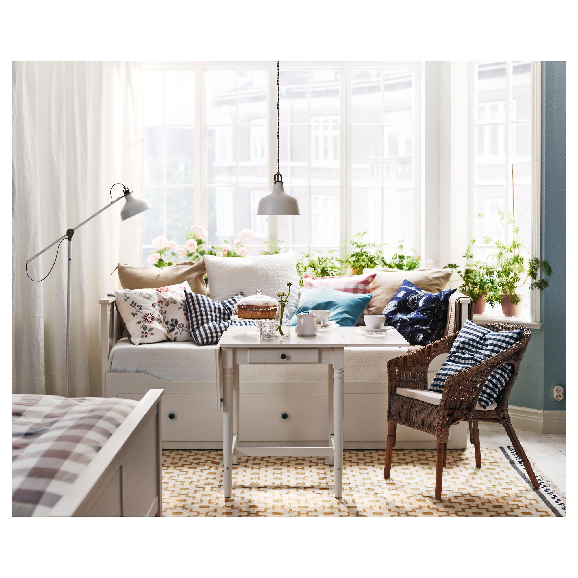
Natural Living Room Decor
Earthy elements, house plants, rustic touches, and organic materials that bring warmth and nature indoors.
Read More →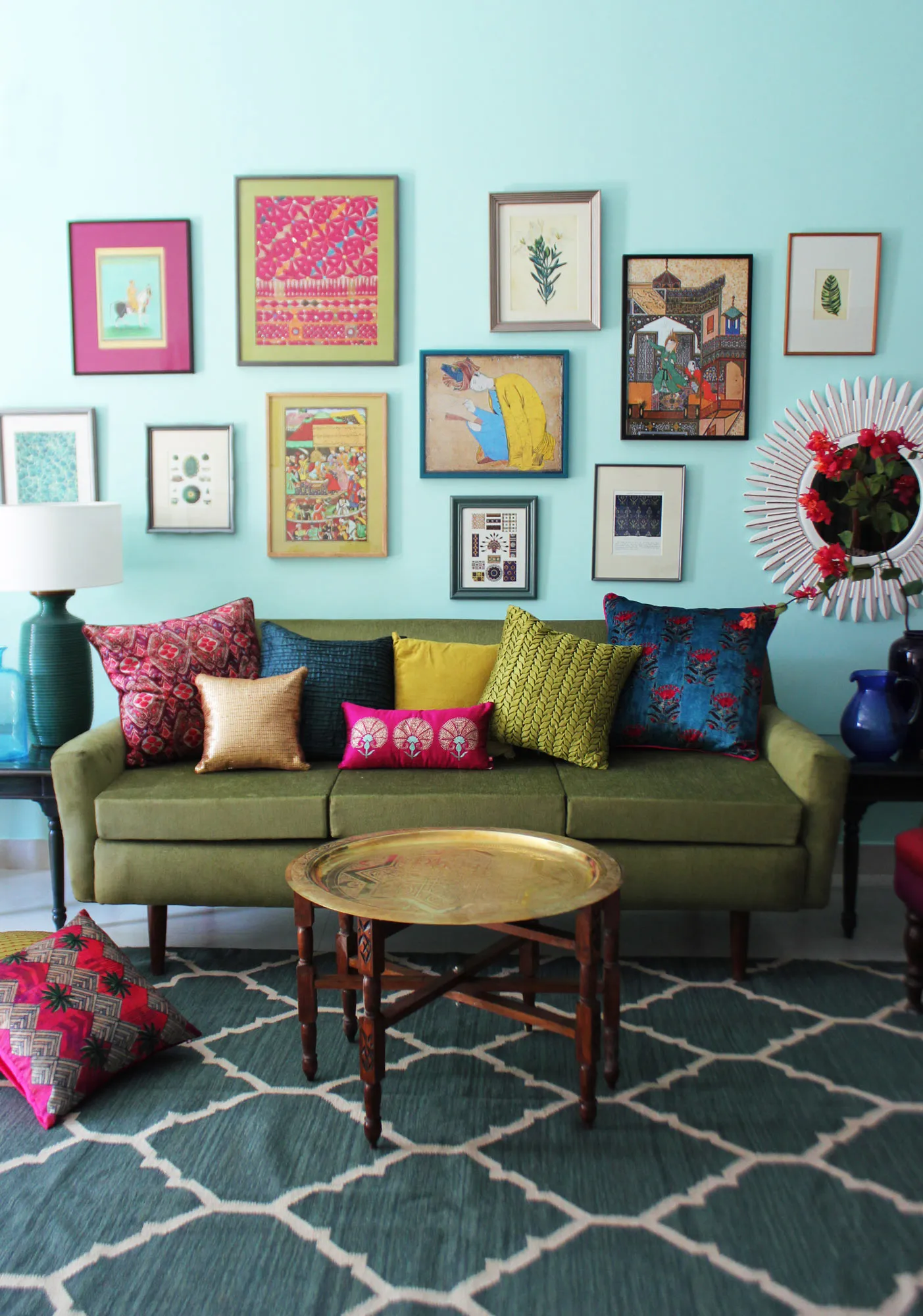
Living Room Ideas: Velvet Sofa
From classic red to trending green and blue, explore how a velvet sofa can transform your living room's character.
Read More →