Living Room Design Ideas & Inspiration
Kumpulan Informasi, Tips dan Trik Terlengkap dan Terpercaya — explore curated ideas for sofas, storage, decor, and every style in between.
Explore Ideas →Get Design Inspiration
Tell us what you're looking for and we'll point you to the best articles.
Best paint colours for a living room with north-facing light
A north-facing living room in Australia can receive some of the home’s most generous natural light, especially in Sydney, Brisbane and Perth. In Melbourne and Hobart, however, the light may feel cooler and less consistent through winter. The right wall colour should respond to that changing quality rather than simply relying on a paint card viewed under shop lighting.
The best paint colours for a living room with north-facing light usually have a gentle warmth, a muted undertone or enough depth to remain balanced throughout the day. The aim is a room that feels welcoming in morning light, comfortable during bright afternoons and cohesive with timber flooring, sofas, rugs and artwork.
Read the room before choosing a colour
North-facing windows in the Southern Hemisphere generally receive direct sunlight during the day, giving interiors a warmer, brighter atmosphere than south-facing rooms. This can make crisp whites appear stark, pale greys look slightly blue and cool beige feel unexpectedly flat. A soft off-white, warm stone or restrained mushroom shade is often easier to live with.
The amount of glass, the direction of nearby walls and the presence of trees or neighbouring buildings all affect the result. An apartment in inner-city Melbourne may have a narrow outlook and limited winter sun, while a Queensland home with wide windows may receive intense brightness and stronger heat. Australia’s National Construction Code includes energy-efficiency provisions that influence glazing, shading and insulation in new homes, but wall paint remains a practical way to fine-tune the room’s visual temperature.
Consider existing finishes as well. Orange-toned timber, terracotta tiles and brass fittings usually sit comfortably with warm neutrals, while blue-based upholstery may need a balanced white or quiet greige rather than a yellow cream.
Warm whites create a calm foundation
A warm white is one of the most versatile choices for a north-facing lounge room. Look for whites with subtle ivory, oatmeal or sandy undertones instead of strong yellow. These shades preserve a clean appearance while preventing the room from feeling clinical when sunlight becomes intense.
Soft whites work particularly well in open-plan Australian homes, where the living area connects to a kitchen and dining zone. They reflect daylight without creating a sharp visual break between spaces. A warm white ceiling can also make a room feel more unified, although using a slightly lighter version on the ceiling can add height.
If the room already contains pale furniture, choose a white with enough depth to create definition around skirting boards and architraves. A barely tinted neutral can make white linen curtains, light oak furniture and stone surfaces look more considered than a brilliant white would.
Muted neutrals add warmth without heaviness
Greige, putty, mushroom and light taupe are strong options when a white living room feels too bare. These colours combine beige warmth with a restrained grey quality, helping them adapt to both golden sunshine and overcast conditions. They are also forgiving around everyday dust, fingerprints and the marks that come with family living.
A muted neutral is useful for homes with open windows, ceiling fans and a relaxed indoor-outdoor routine. It creates a soft backdrop for tan leather, boucle seating, woven baskets and native greenery without competing with the view. In a compact room, keep the shade light and repeat it in a rug or cushion to maintain visual flow.
| Paint family | Best effect in north-facing light | Works well with | Watch for |
|---|---|---|---|
| Warm white | Bright, relaxed and spacious | Linen, pale timber, brass | Yellowing in strong afternoon sun |
| Soft greige | Balanced and adaptable | Charcoal, oak, leather | Looking muddy in a dim room |
| Pale sage | Calm and nature-inspired | Rattan, cream, terracotta | Grey undertones becoming cool |
| Dusty blue | Fresh and sophisticated | White, walnut, black accents | Appearing icy under winter light |
| Clay or muted terracotta | Cosy and expressive | Natural fibres, tan, olive | Feeling intense across all four walls |
Gentle greens and blues bring balance
Pale sage is particularly effective in a sunlit living room because it connects the interior with gardens, courtyards and the Australian landscape. Choose a greyed eucalyptus, olive mist or soft lichen rather than a bright mint. These colours can make a large room feel more grounded while keeping the atmosphere airy.
Blue can work too, provided its undertone is carefully selected. A dusty blue, blue-grey or faded denim shade can temper the warmth of direct sunlight. It is especially attractive with white upholstery, dark timber and brushed nickel, though a very cool blue may look chilly in a Melbourne winter or in a room shaded by balconies.
For a stronger colour story, paint only the TV wall, fireplace wall or a recessed nook. This approach gives the living room personality without allowing a saturated colour to dominate every surface. It also makes it easier to coordinate the room with artwork and seasonal textiles.
Deeper colours suit larger or layered spaces
North-facing light can support richer shades that might overwhelm a darker room. Olive, muted ochre, warm charcoal, tobacco and deep clay can create a sophisticated backdrop for a large sofa or generous wall of shelving. They are especially effective where the room has high ceilings, substantial furniture or a strong connection to outdoor entertaining.
Use deeper colours with a considered finish. A low-sheen or washable matt paint absorbs some glare and tends to look more refined than a high-gloss surface on broad walls. In busy households, a durable low-sheen finish is practical for wiping away scuffs without producing distracting reflections.
If you prefer a dramatic feature, balance it with lighter upholstery and plenty of texture. A clay wall paired with a cream sofa, jute rug and timber coffee table feels warm rather than dark. To soften a strong colour between seasons, consider refreshing with throw blankets in oat, olive or faded rust.
Test samples through the whole day
Paint samples should be viewed in the actual room, not selected from a small card alone. Apply large sample areas to more than one wall, including the wall opposite the window. Watch them in early morning, bright midday, late afternoon and under artificial lighting after sunset.
Leave the samples in place for at least two days and observe them beside the sofa, flooring and curtains. A colour that looks creamy at 9 am may become noticeably yellow at 3 pm. Likewise, a neutral that appears soft in sunlight can turn grey beneath warm LED bulbs.
Finish matters as much as colour. Matt hides minor wall imperfections, while low-sheen provides a practical balance for living areas. Keep in mind that Australian homes can experience strong UV exposure, so ask a local paint retailer about fade resistance and choose a quality product suited to the room’s conditions.
Coordinate the walls with the whole scheme
Wall colour should support the fixed elements that are expensive or difficult to replace. Start with flooring, built-in cabinetry, stone, curtains and the largest sofa before deciding on accent cushions or decorative objects. A room with red gum flooring may need a cooler neutral to prevent an overly orange effect, while pale ash timber can welcome warmer walls.
Lighting will shape the final impression after sunset. Layer ceiling fixtures, floor lamps and table lamps so the paint does not have to carry the entire atmosphere. If space is limited, small-space chandelier ideas can add a sculptural focal point while warm bulbs reinforce soft beige, sage and clay tones.
For a flexible Australian living room, begin with a warm white, light greige or muted sage, then build contrast through furniture and accessories. Choose a deeper shade when the room is spacious and well furnished, and always test the colour against real daylight before committing. Visit a local paint supplier or hardware store with fabric and flooring samples, then create a living room that feels comfortable in every season.
What We Cover
Living Room Topics & Ideas
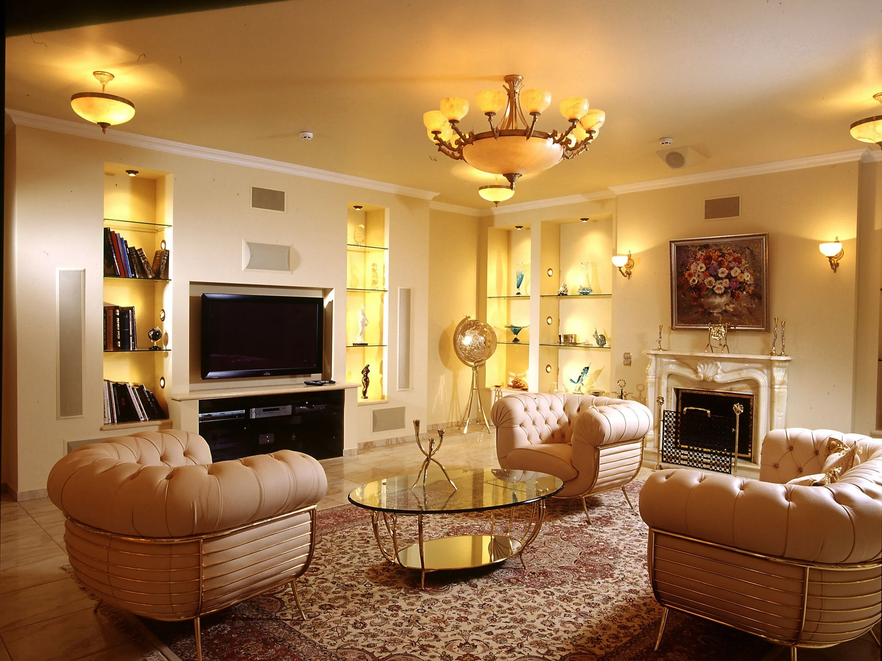
Luxury Living Room Furniture
High-end pieces spanning modern, neo-classical, and Italian Gothic styles — craftsmanship, leathers, and refined artistry.
Read More →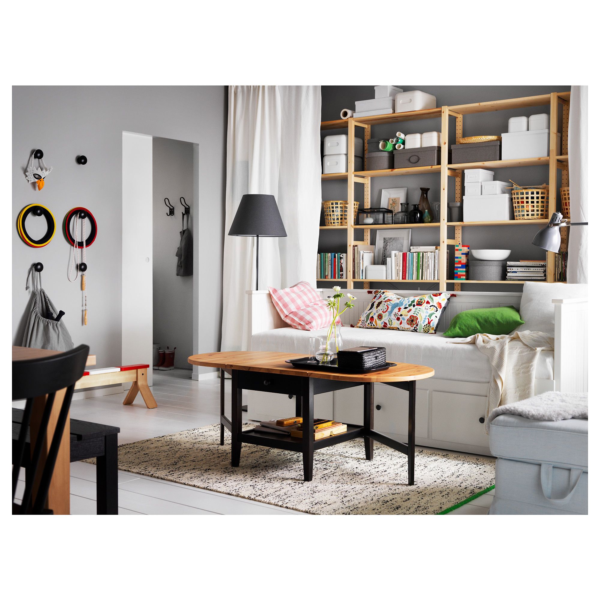
White Living Room Storage Cabinets
Sideboards, curio cabinets, and high-gloss storage units that blend practical organization with decorative appeal.
Read More →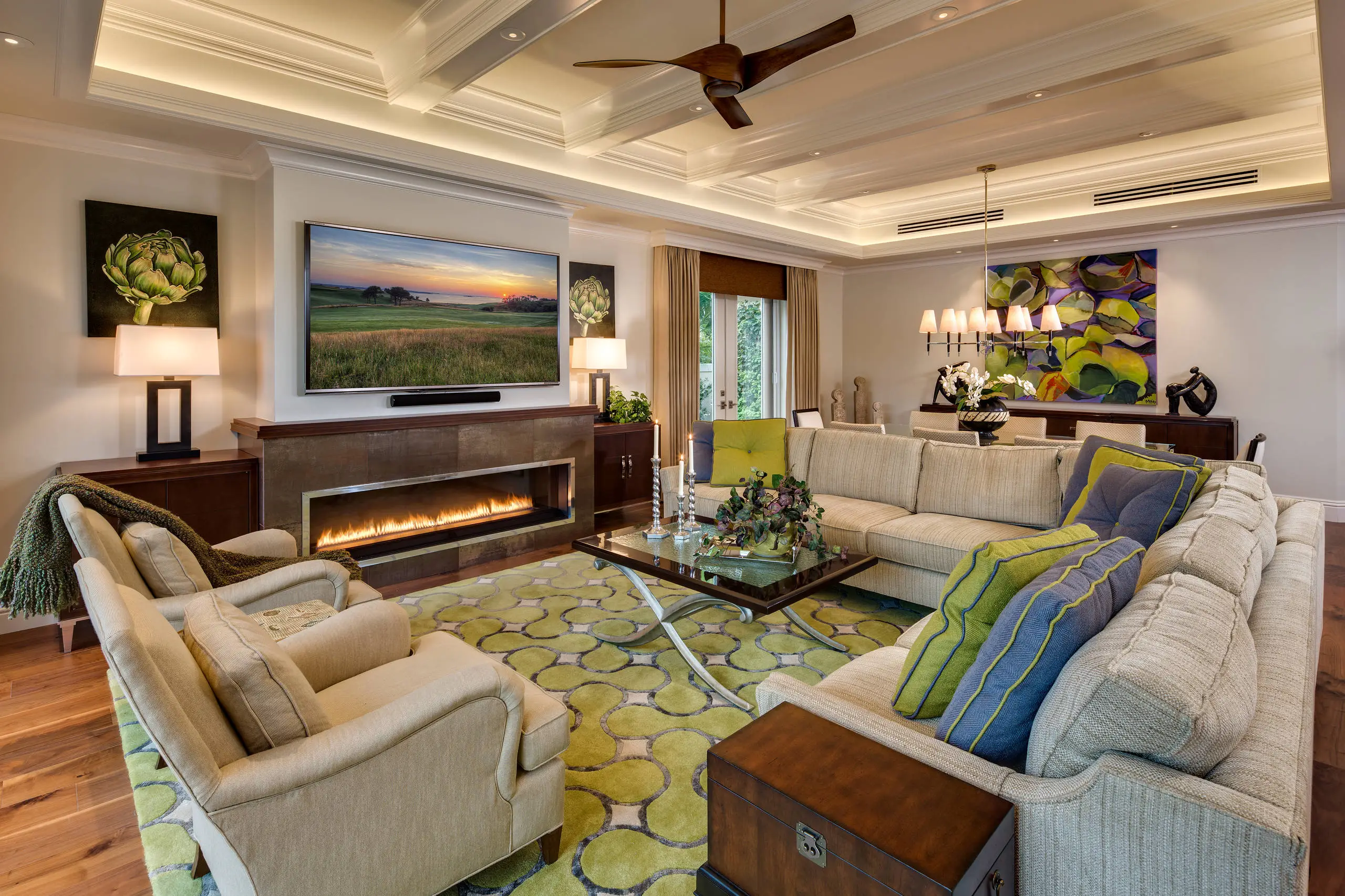
Living Room Decor Essentials
Rugs, pillows, art, lamps, and accent pieces that add layers of color, texture, and personality to any living space.
Read More →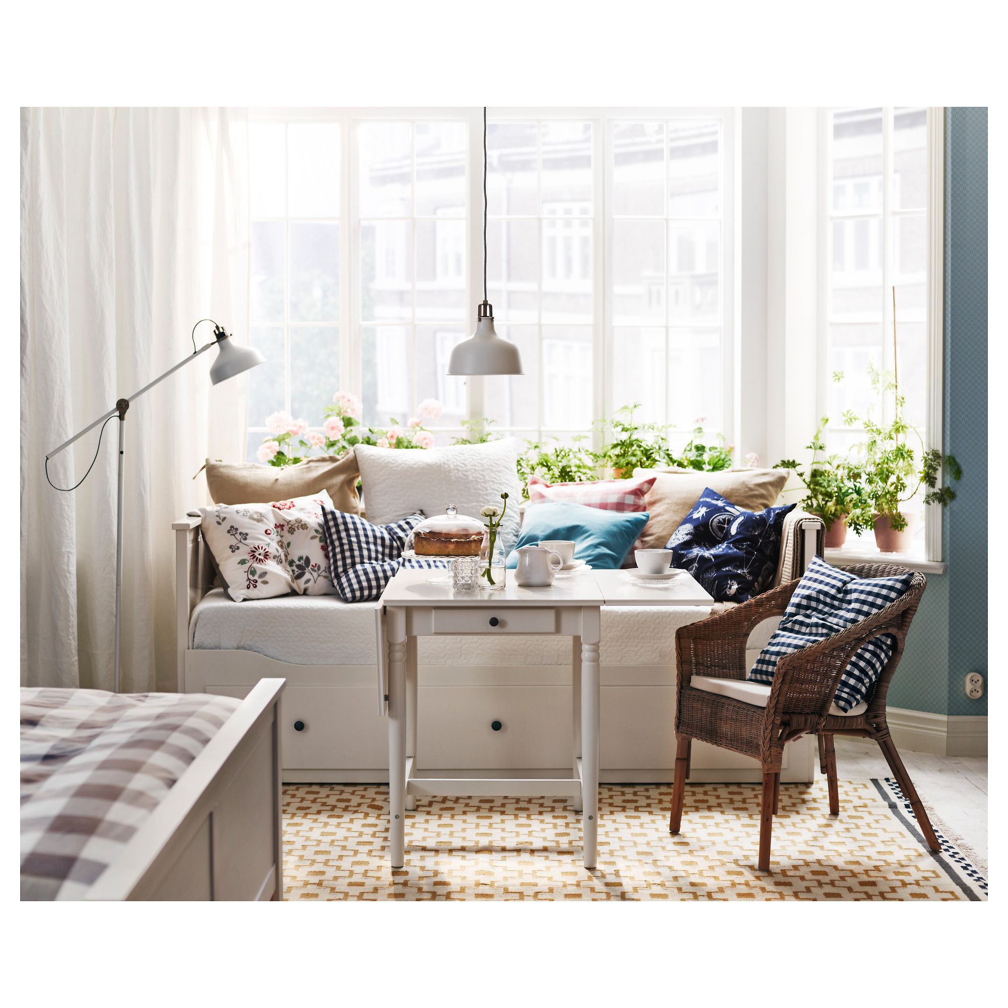
Natural Living Room Decor
Earthy elements, house plants, rustic touches, and organic materials that bring warmth and nature indoors.
Read More →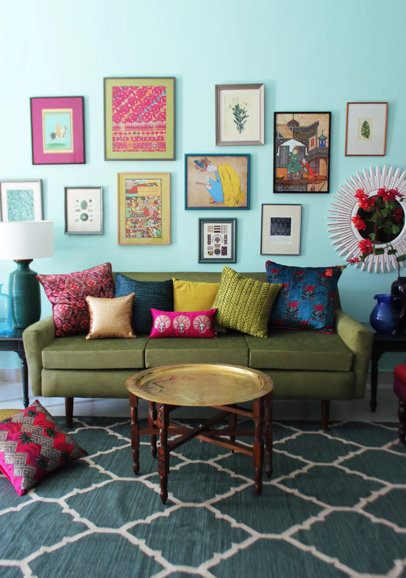
Living Room Ideas: Velvet Sofa
From classic red to trending green and blue, explore how a velvet sofa can transform your living room's character.
Read More →