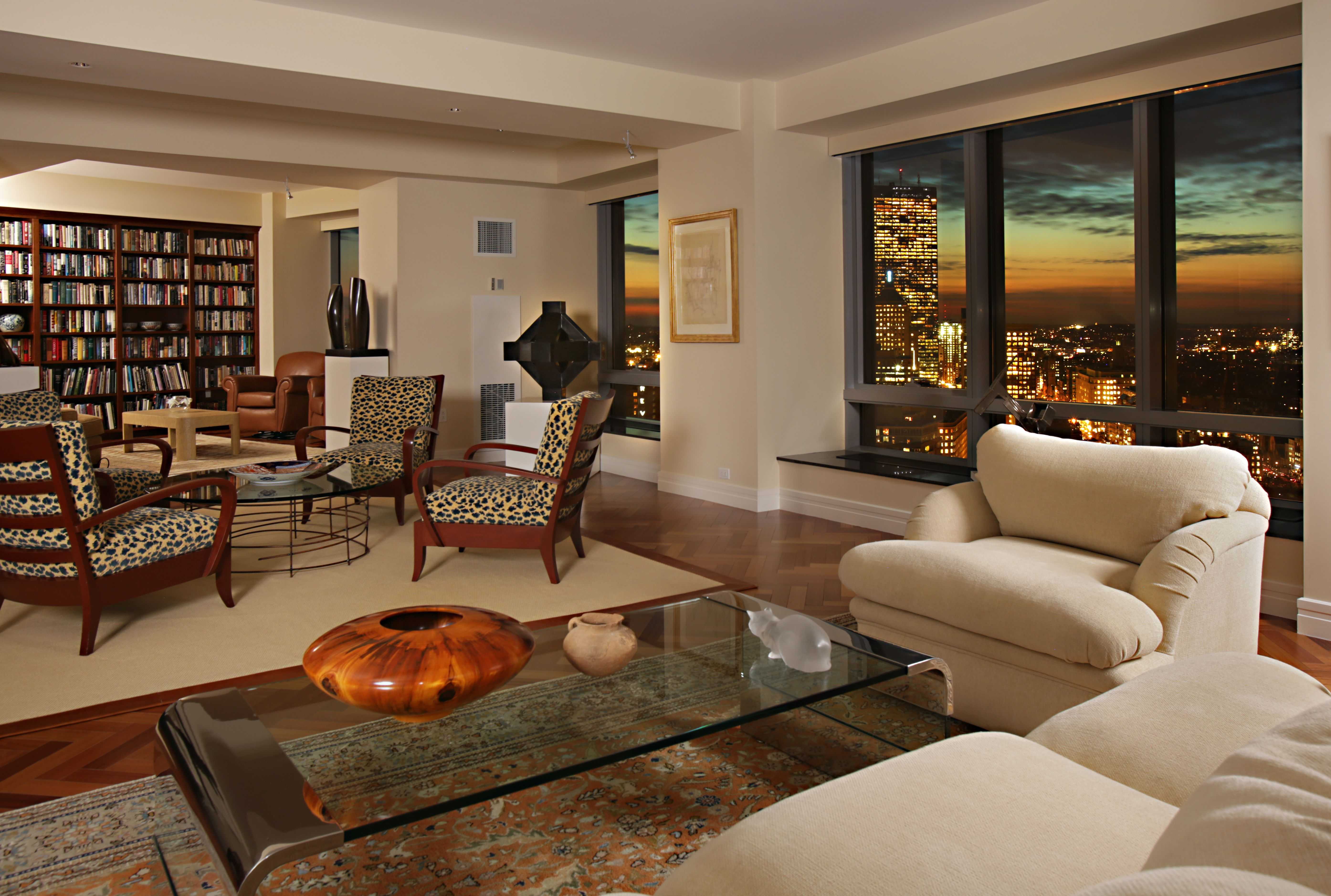
Living Room Design Ideas & Inspiration
Kumpulan Informasi, Tips dan Trik Terlengkap dan Terpercaya — explore curated ideas for sofas, storage, decor, and every style in between.
Explore Ideas →Get Design Inspiration
Tell us what you're looking for and we'll point you to the best articles.
Painting a Living Room Accent Wall With Bold Colors
A bold accent wall can change the character of a living room without requiring a complete redesign. Deep green, clay red, cobalt blue, charcoal, and warm ochre can create a strong focal point, define a seating area, or make a large room feel more intimate.
The best results come from treating color as part of the whole interior scheme. Furniture placement, natural light, flooring, artwork, and nearby walls all affect how a saturated shade will look once it covers a broad surface.
With careful preparation and a few deliberate styling decisions, a dramatic paint color can feel polished rather than overpowering. These practical steps will help you choose the right wall, test the shade, apply it cleanly, and build a balanced living room around it.
Choose the wall that deserves attention
The ideal accent wall usually has a natural architectural purpose. A wall behind the sofa, fireplace, media console, or main artwork can anchor the room and give the eye an obvious place to rest. Painting a wall with no clear relationship to the furniture may make the color feel random.
Look for a surface that is visible from the room’s main entrance and does not contain too many doors, windows, or competing features. A fireplace wall is especially effective because the color can emphasize its structure. In an open-plan home, an accent wall can also help distinguish the living area from the dining or kitchen zone.
Avoid choosing a wall simply because it is empty. Consider how the color will appear from adjoining spaces and whether it will compete with a colorful rug, patterned curtains, or a large piece of art.
Match bold paint to natural light
Light direction has a major effect on strong colors. North-facing rooms tend to receive cooler, softer light, which can make blue, gray, or green paint appear more muted. South-facing rooms receive warmer daylight and can handle cooler shades while making terracotta, mustard, and burgundy feel especially rich.
Check the wall at different times of day before committing. A color that looks elegant in the morning may become much darker at night under warm lamps. Paint sample boards rather than relying only on small paper swatches, since the surrounding wall color and room furnishings can distort your perception.
The finish matters too. Matte and eggshell finishes disguise minor surface flaws and give saturated colors a sophisticated appearance. Satin is easier to clean but reflects more light, which may highlight uneven patches on an older wall.
Prepare the surface before opening the paint
Bold paint colors reveal preparation problems quickly. Fill nail holes, repair cracks, smooth rough areas, and remove dust or grease from the wall. Lightly sand glossy surfaces so the new paint has a reliable base. Protect trim, flooring, and furniture with painter’s tape and drop cloths.
Primer is particularly useful when covering a pale wall with a deep or highly pigmented shade. A tinted primer can reduce the number of topcoats required and help the final color look even. If the existing wall is red, bright yellow, or another intense tone, primer also prevents unwanted undertones from affecting the new paint.
Remove switch plates and outlet covers instead of painting around them. This small step creates sharper edges and makes the finished feature wall look intentional. Allow repairs and primer to dry fully before applying the color coat.
Build a balanced furniture arrangement
A bold wall should support the furniture rather than compete with it. Neutral upholstery in cream, beige, gray, or natural linen creates breathing room around a dramatic backdrop. If the sofa already has a strong color, choose an accent shade that shares a subtle undertone rather than creating an unrelated contrast.
The sofa’s shape can also affect how the wall is perceived. Low, streamlined seating may allow a dark wall to feel modern and architectural, while a rounded or high-backed design can make it feel softer and more layered. These sofa arm styles offer useful inspiration when you are arranging seating against a newly painted focal point.
Leave enough visual space around the main furniture pieces. A sofa pushed tightly into the corners can make a deep paint color feel heavy. A slim console, floating shelves, or a large framed print can break up the wall while preserving its impact.
Apply the paint for an even finish
Use a high-quality angled brush for corners and trim, then cover the broad surface with a roller suited to the wall texture. Work in manageable sections and maintain a wet edge so overlapping areas do not dry into visible bands. Two thin, even coats are usually better than one thick coat.
Start near the ceiling and move downward, checking the wall from different angles as you work. Avoid repeatedly rolling over paint that has begun to set, since this can create texture and uneven sheen. Remove painter’s tape while the final coat is slightly damp for cleaner edges.
The table below can help you compare the visual effect of common bold accent colors before selecting a sample.
| Color family | Atmosphere created | Works well with | Points to watch |
|---|---|---|---|
| Deep green | Calm, grounded, natural | Brass, oak, cream, tan | Can feel dark in low light |
| Navy blue | Classic, structured, elegant | White, walnut, camel, gold | May appear nearly black at night |
| Terracotta | Warm, welcoming, earthy | Linen, rattan, olive, black | Orange undertones can dominate |
| Charcoal | Dramatic, modern, intimate | Pale wood, gray, white, leather | Needs layered lighting |
| Cobalt blue | Energetic, artistic, confident | Warm neutrals, red accents, light wood | Can overpower delicate decor |
| Ochre | Sunny, expressive, retro-inspired | Brown, cream, deep green, denim | Requires careful color coordination |
Layer lighting and decorative contrast
Lighting determines whether a bold accent wall feels rich or oppressive. Combine ceiling fixtures with floor lamps, table lamps, and wall lighting to create several points of illumination. Warm bulbs can soften navy, charcoal, and forest green, while brighter neutral bulbs may preserve the clarity of blue or yellow.
Reflective and pale accessories can keep a dark wall from absorbing too much visual energy. A large mirror, ceramic lamp, light-colored artwork, or metal frame can introduce contrast without undermining the color scheme. Natural materials such as wood, jute, cane, and linen are equally useful because they add texture and warmth.
For a coordinated seating area, consider upholstery collections that provide a restrained base for expressive wall colors. The Ainsley fabric sofa collection can inspire combinations of fabric texture, sofa tone, and accent accessories that feel comfortable rather than overly matched.
Refine the room with deliberate accents
Once the paint is dry, resist the temptation to fill every empty space. A bold wall often needs fewer decorations than a pale one because the color already supplies visual interest. Select a small group of pieces that reinforce the room’s palette and vary their height, texture, and shape.
Use these finishing guidelines to keep the overall design balanced:
- Repeat one undertone from the wall in cushions, artwork, or a rug.
- Choose curtain colors that soften the transition between the accent wall and nearby windows.
- Add pale or reflective details when the room feels visually heavy.
- Keep large furniture pieces simple if the wall color is highly saturated.
- Use plants and natural textures to soften cooler or darker paint shades.
Step back from the room after each addition. The goal is a clear focal point, not a collection of competing statements. If the wall feels too intense, introduce a larger neutral rug or artwork with generous light space rather than immediately repainting.
Make the color part of the home
A successful accent wall should feel connected to the rest of the home. Repeat a related hue in the dining area, hallway artwork, bedroom textiles, or small decorative objects so the living room does not appear isolated. The repetition can be subtle; even a vase, book spine, or patterned cushion may be enough.
Pay attention to how the wall looks beside adjoining paint colors. Crisp white creates high contrast, while warm off-white, greige, or muted beige produces a softer transition. If the bold shade is already warm, a cool neighboring wall may create unwanted tension, so compare paint samples side by side.
Take time to live with the finished color before making further changes. Observe it under daylight, lamplight, and evening shadows, then adjust the surrounding accessories to support its strongest qualities. With thoughtful planning, a vivid wall can become the foundation for a welcoming, expressive living room. Start with a sample board, choose your focal wall, and turn the room’s most ordinary surface into a confident design feature.
What We Cover
Living Room Topics & Ideas
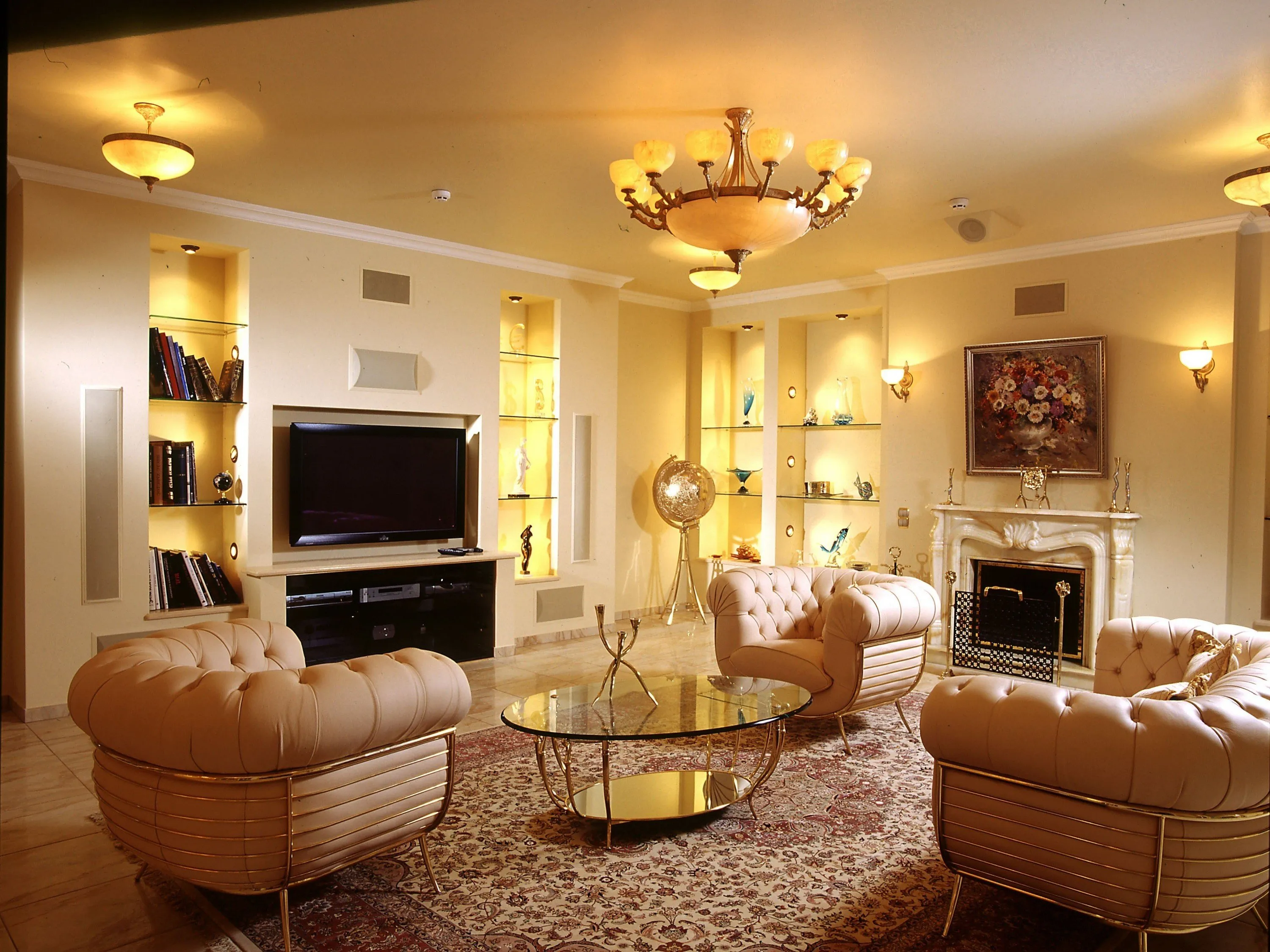
Luxury Living Room Furniture
High-end pieces spanning modern, neo-classical, and Italian Gothic styles — craftsmanship, leathers, and refined artistry.
Read More →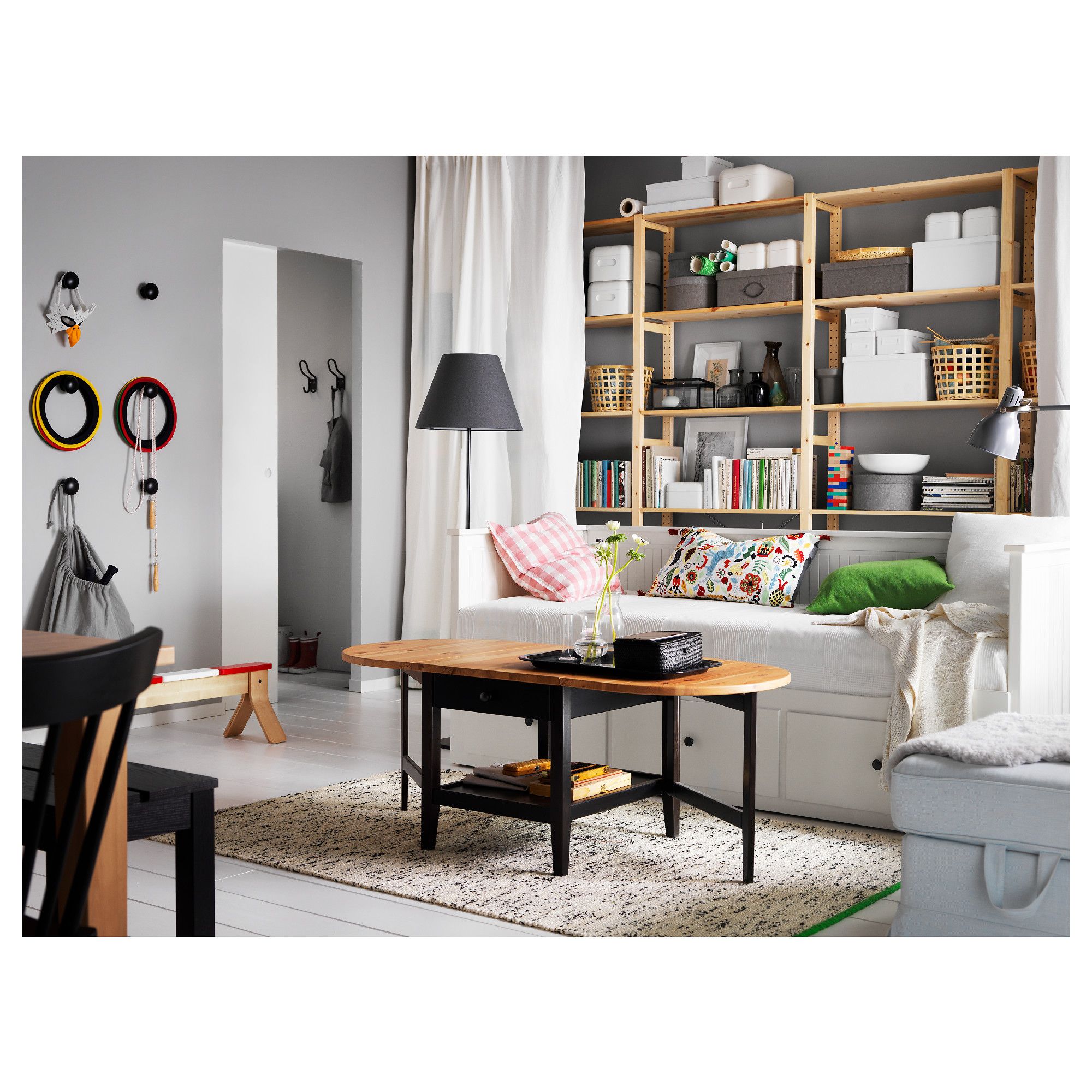
White Living Room Storage Cabinets
Sideboards, curio cabinets, and high-gloss storage units that blend practical organization with decorative appeal.
Read More →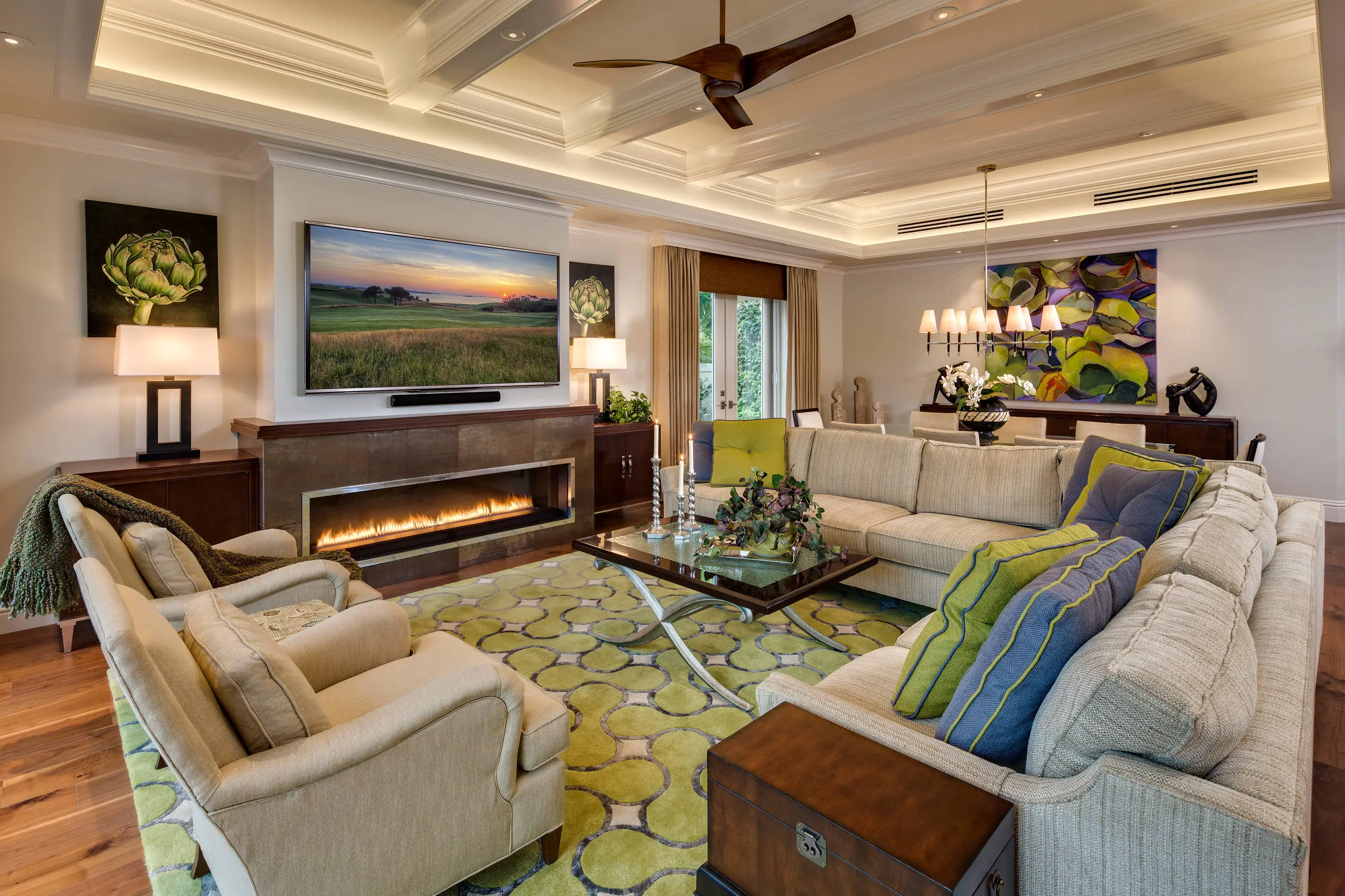
Living Room Decor Essentials
Rugs, pillows, art, lamps, and accent pieces that add layers of color, texture, and personality to any living space.
Read More →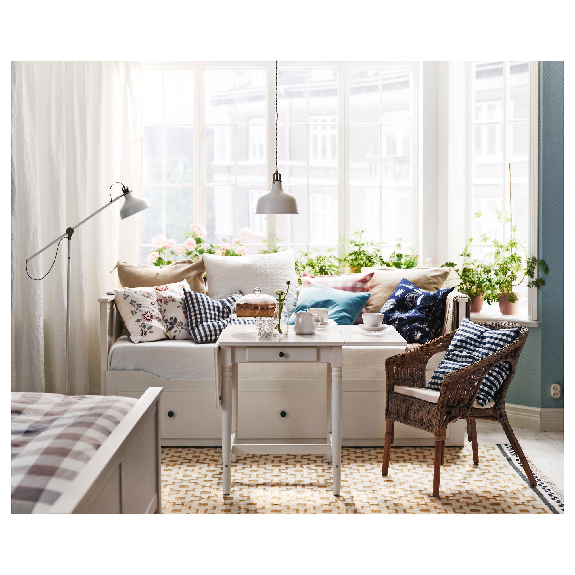
Natural Living Room Decor
Earthy elements, house plants, rustic touches, and organic materials that bring warmth and nature indoors.
Read More →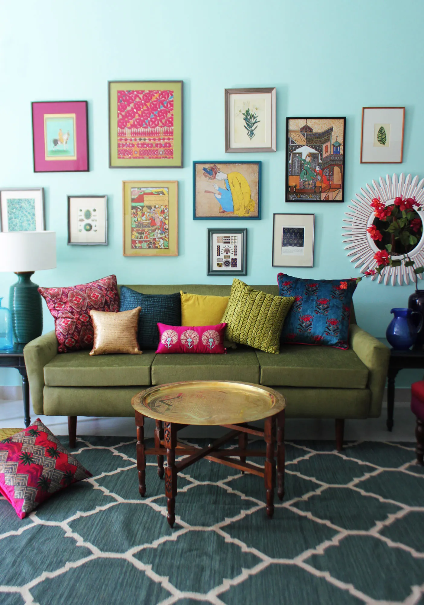
Living Room Ideas: Velvet Sofa
From classic red to trending green and blue, explore how a velvet sofa can transform your living room's character.
Read More →