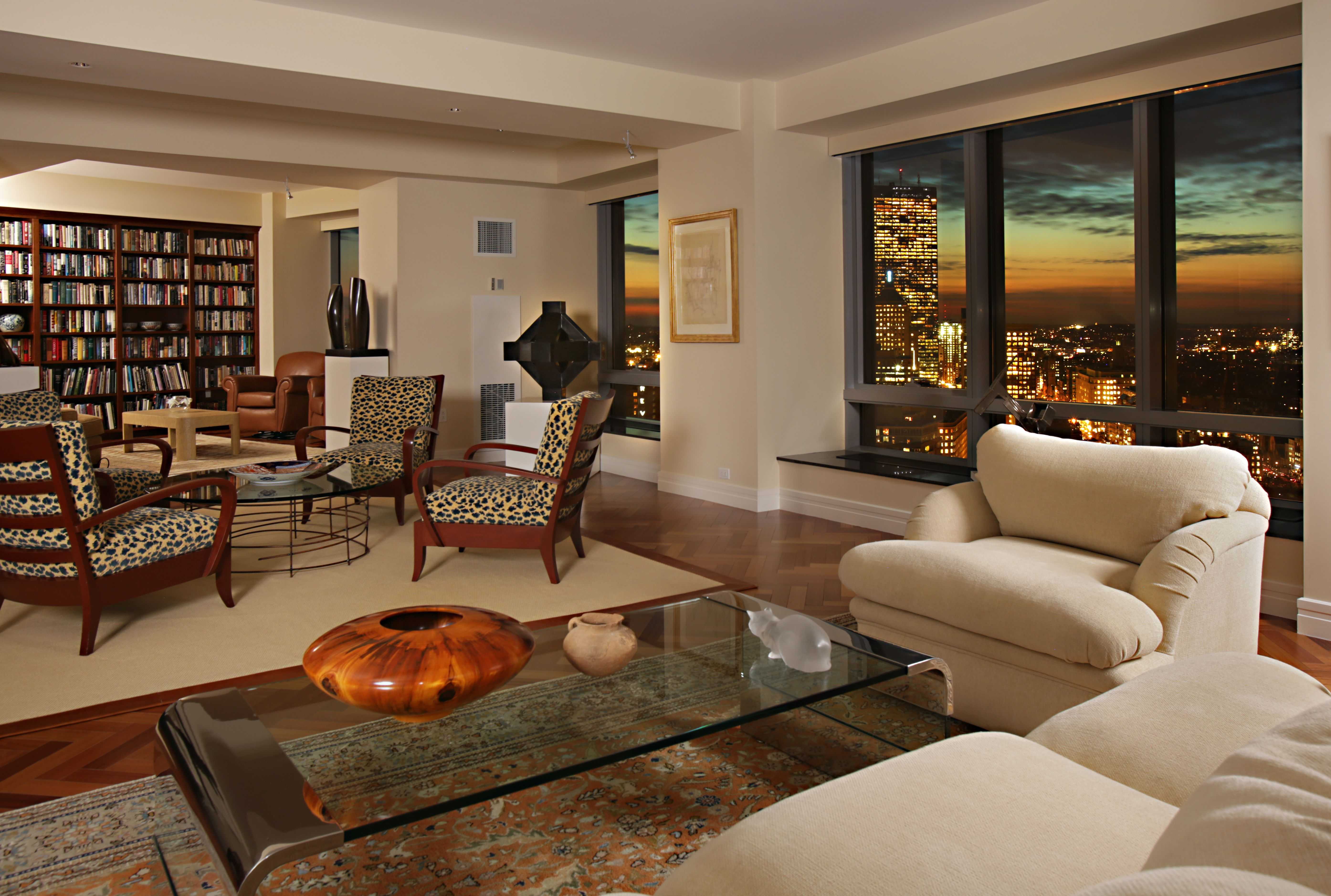
Living Room Design Ideas & Inspiration
Kumpulan Informasi, Tips dan Trik Terlengkap dan Terpercaya — explore curated ideas for sofas, storage, decor, and every style in between.
Explore Ideas →Get Design Inspiration
Tell us what you're looking for and we'll point you to the best articles.
Mixing Wood Tones in Living Room Furniture With Confidence
A living room rarely comes with furniture made from one perfectly matched wood finish. A walnut coffee table may sit beside an oak media console, while a reclaimed-wood accent chair introduces another layer of grain and color. Rather than treating these differences as a decorating problem, use them to create warmth, depth, and a more collected appearance.
The key is to coordinate wood tones through undertones, repetition, scale, and placement. When each finish has a visual relationship with something else in the room, the furniture feels intentionally varied instead of randomly assembled.
This approach works across modern, traditional, Scandinavian, rustic, and transitional interiors. It also makes furnishing more flexible, since you can keep a favorite vintage piece without forcing every new purchase to match it.
Start With the Dominant Wood Finish
Choose the largest or most visually prominent wood element as the foundation. This might be a flooring tone, built-in shelving, media unit, large sectional with wooden legs, or substantial coffee table. The dominant finish establishes the room’s overall temperature and gives the other woods a reference point.
Warm woods such as honey oak, teak, and cherry bring golden, reddish, or amber undertones. Cool woods, including pale ash, gray-washed oak, and some smoked finishes, tend to create a quieter, more contemporary mood. Walnut sits between these categories, though its deep brown color can appear warm or neutral depending on the surrounding palette.
You do not need every piece to match the dominant wood exactly. Instead, let the main finish occupy the greatest visual area, then use lighter, darker, or slightly different woods as supporting accents.
Compare Undertones Before Color
Wood colors can look similar in a showroom and clash once they share a room. Place sample boards, furniture swatches, or clear photographs together in the same natural light. Look beyond lightness and darkness to identify the underlying cast: yellow, orange, red, gray, or neutral brown.
A golden oak table beside a red-toned mahogany cabinet may feel busy because both finishes are warm but pull in different directions. A walnut table paired with a honey-toned oak console can work more easily when a rug, upholstery fabric, or artwork bridges the gap.
Paint and textiles are useful mediators. Cream, camel, olive, terracotta, charcoal, and muted blue can connect contrasting wood finishes without making the room appear overly coordinated. A patterned rug that includes two of the room’s wood-related colors is especially effective beneath mixed-tone furniture.
Build Contrast With Repeated Details
Successful wood mixing depends on repetition. If a dark wood appears only once, it can look accidental. Repeat it through smaller elements such as a picture frame, lamp base, side table, tray, or sculptural accessory. The same principle applies to a pale or rustic finish.
Distribute related finishes around the room instead of placing all dark pieces on one side and all light pieces on the other. A walnut side table near the sofa can be echoed by a dark-framed artwork across the room. A light oak console can relate to pale wood legs on an armchair or a woven basket nearby.
Contrast is easier to control when it occurs in different forms. Pair a smooth, polished wood surface with a matte or wire-brushed finish, but balance both with soft upholstery and tactile textiles. Variation in texture keeps a layered furniture arrangement from feeling flat.
Use Scale, Shape, and Texture as Connectors
The shape of furniture can soften differences in wood color. Rounded coffee tables, curved armchairs, and softened edges make varied finishes feel more relaxed. Straight-lined pieces with highly contrasting grains create a sharper, more graphic effect, which may suit contemporary rooms but requires careful spacing.
Scale matters as well. A very dark, heavy cabinet can dominate a room when placed beside delicate pale-wood furniture. Balance its visual weight with a substantial sofa, large rug, or broad artwork. Conversely, several small wood accessories may create clutter if they compete with one another.
Texture provides another point of connection. Cane, rattan, oak grain, woven baskets, linen, leather, and boucle can bridge the gap between polished walnut and weathered pine. In a room with a low ceiling, keep overhead elements visually light and explore these low ceiling ideas alongside a restrained furniture palette so the mixed woods do not make the space feel top-heavy.
Match Finishes by Mood and Function
The finish itself can determine whether two wood tones belong together. High-gloss surfaces draw attention to color differences, while matte, brushed, distressed, or naturally oiled finishes tend to blend more softly. If two pieces have very different colors, choosing similar sheen levels can make them feel more related.
Consider how each item functions in the room. A durable oak coffee table can provide a practical, lighter centerpiece, while a dark walnut console anchors the wall behind the sofa. A small side table can introduce a third wood tone if its shape is simple and its color appears elsewhere in the space.
| Wood combination | Overall effect | Helpful bridge | Use with care |
|---|---|---|---|
| Walnut and light oak | Refined contrast | Cream upholstery, black accents | Avoid too many reddish accessories |
| Honey oak and painted wood | Warm and casual | Olive, blue, or woven textures | Keep yellow tones from dominating |
| Ash and smoked oak | Calm and modern | Gray, ivory, brushed metal | Add warmth through textiles |
| Teak and rattan | Relaxed and natural | Linen, jute, indoor plants | Limit additional orange woods |
| Reclaimed pine and walnut | Rustic with depth | Leather, stone, aged brass | Balance rough grain with clean shapes |
Keep the Surrounding Palette Restrained
When furniture includes several wood tones, simplify the rest of the room. A controlled color palette allows the grain and finish to become part of the design rather than one competing feature among many. Two or three main upholstery or accent colors are often enough.
Large rugs are particularly useful because they visually gather separate furniture pieces into one arrangement. Choose a design that contains subtle variations of the wood colors without matching them literally. Solid curtains, simple cushions, and restrained wall decor can then provide breathing room.
Metal and stone accents should support the selected mood. Black metal emphasizes contrast, brass enhances warm woods, and brushed nickel complements cooler finishes. Marble, travertine, ceramic, and concrete can add a grounded surface that prevents the room from becoming visually dominated by timber.
A Practical Decorating Sequence
Begin by photographing the room from several angles and identifying the wood pieces you plan to keep. Mark each one as light, medium, or dark, then note whether its undertone is warm, cool, or neutral. This quick inventory reveals whether the room needs another connecting element or simply better distribution.
When adding furniture, bring in one new finish at a time. Place the piece where it can relate to at least two existing elements through color, texture, shape, or scale. Step back from the arrangement rather than judging the finish at close range; wood coordination is about the complete visual composition.
- Select one dominant wood finish before shopping for accent pieces.
- Repeat each important wood tone at least twice when possible.
- Use a rug or large textile to unite furniture with different finishes.
- Balance heavy dark pieces with lighter surfaces and generous negative space.
- Check samples in daylight and evening light before committing.
A small mismatch is often easier to solve with placement than replacement. Move pieces apart, add a textile between them, or repeat one of the tones elsewhere. The goal is a room that feels layered and personal, with enough variation to create interest and enough connection to maintain visual calm.
Bring the final arrangement together with lighting, art, greenery, and everyday objects that echo the room’s established colors. Start with the furniture you love, apply these coordinating principles, and refine the placement until every wood tone feels like part of the same living space.
What We Cover
Living Room Topics & Ideas
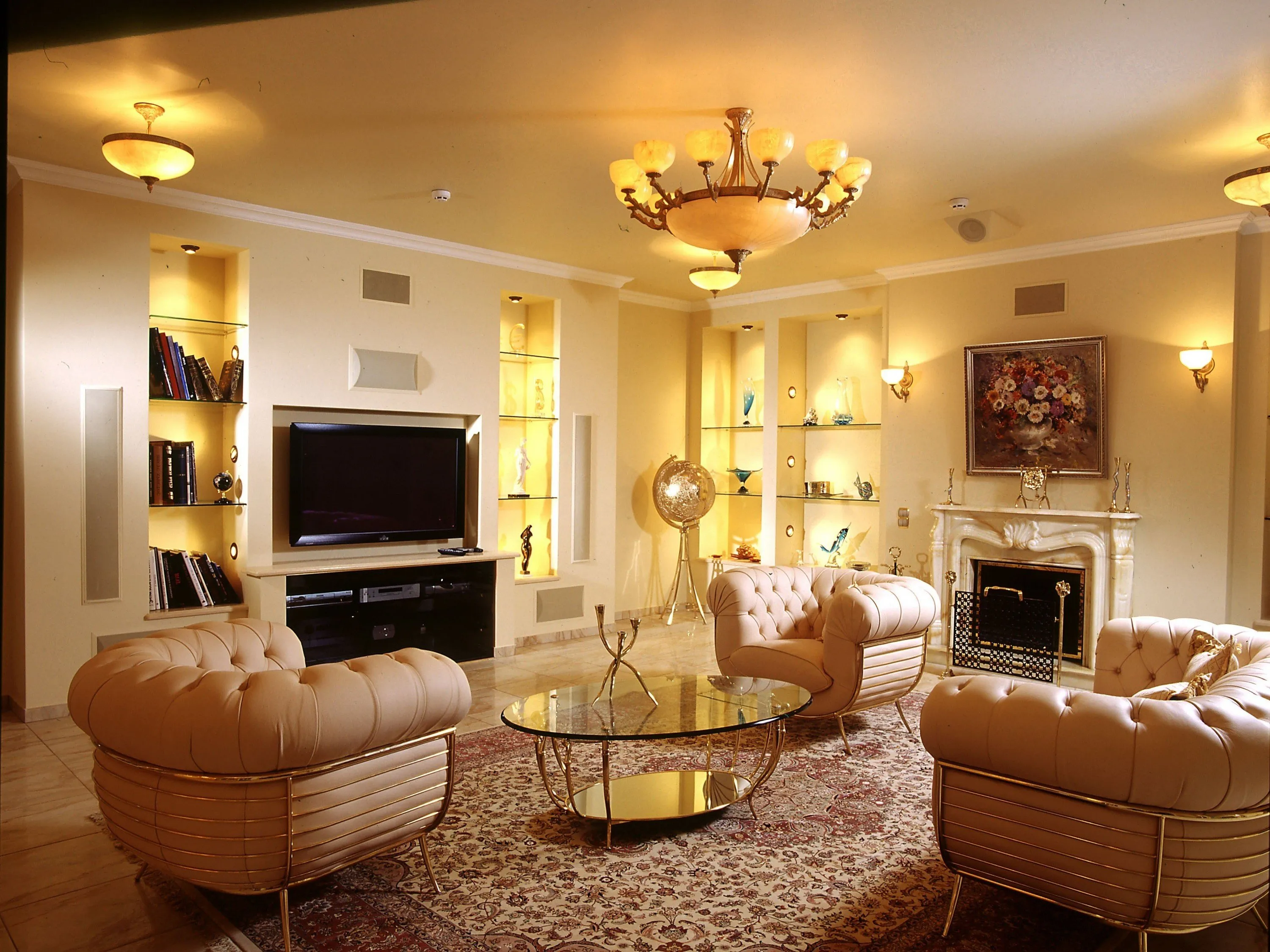
Luxury Living Room Furniture
High-end pieces spanning modern, neo-classical, and Italian Gothic styles — craftsmanship, leathers, and refined artistry.
Read More →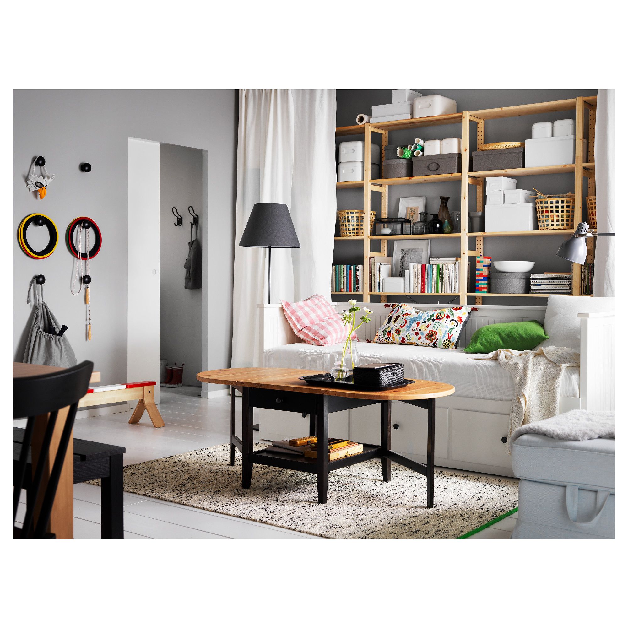
White Living Room Storage Cabinets
Sideboards, curio cabinets, and high-gloss storage units that blend practical organization with decorative appeal.
Read More →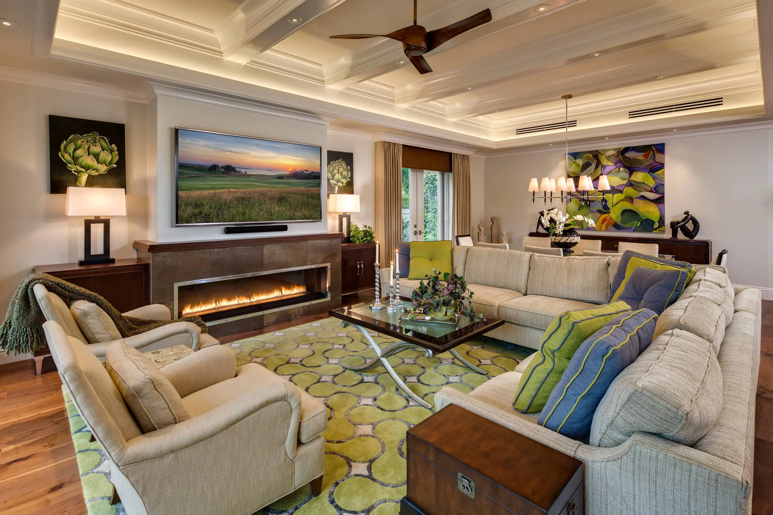
Living Room Decor Essentials
Rugs, pillows, art, lamps, and accent pieces that add layers of color, texture, and personality to any living space.
Read More →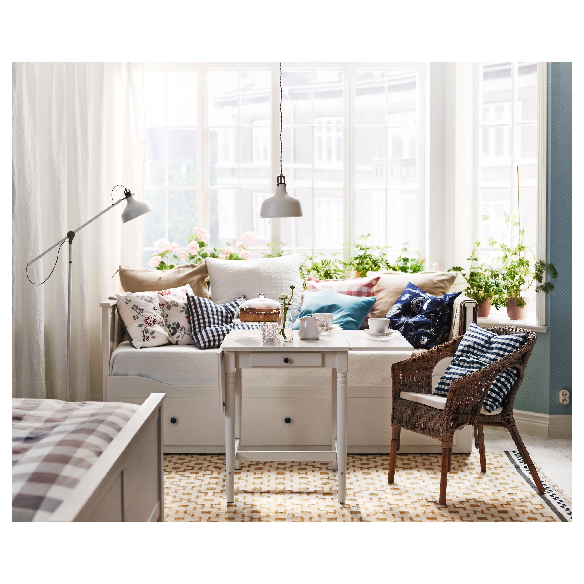
Natural Living Room Decor
Earthy elements, house plants, rustic touches, and organic materials that bring warmth and nature indoors.
Read More →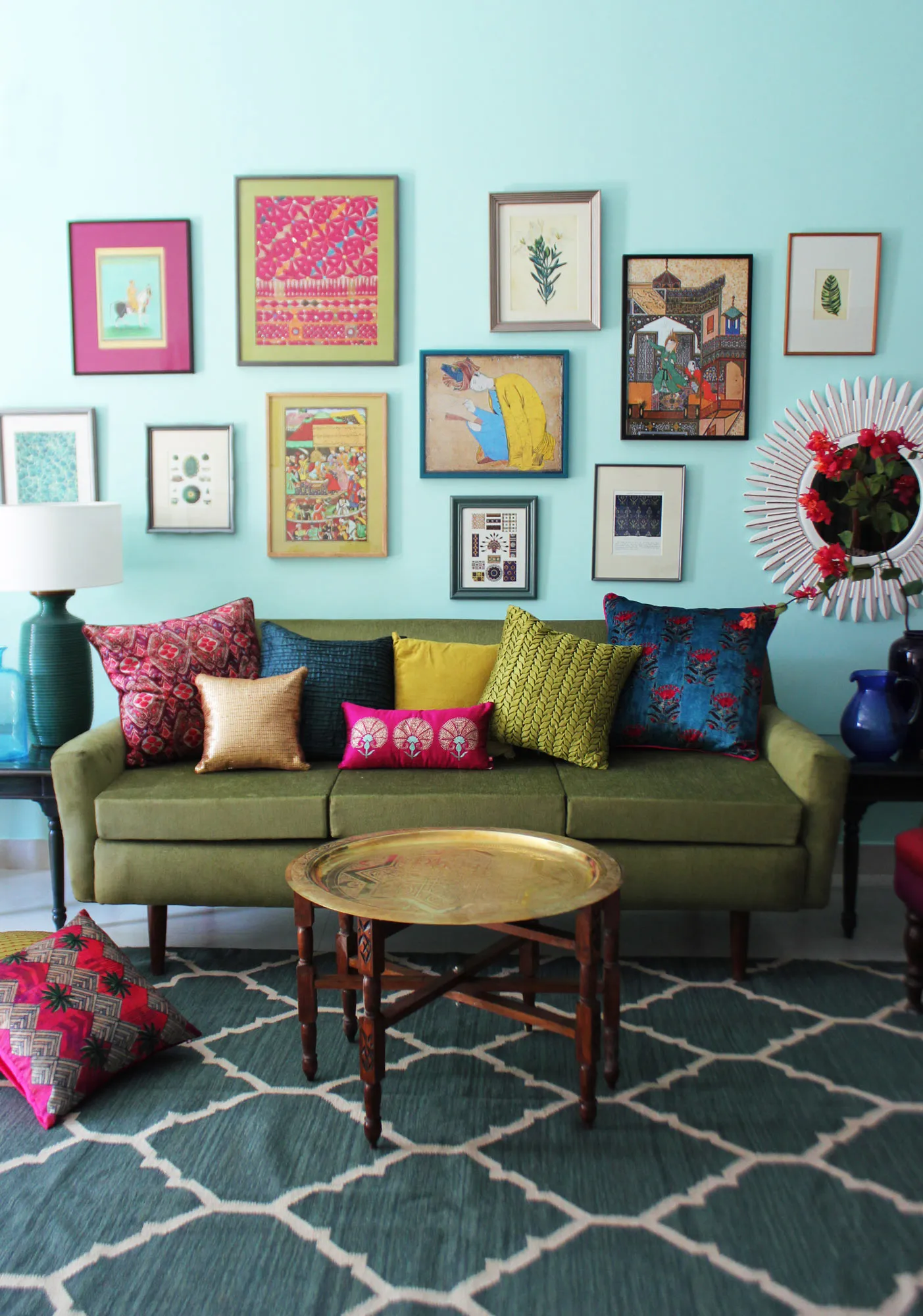
Living Room Ideas: Velvet Sofa
From classic red to trending green and blue, explore how a velvet sofa can transform your living room's character.
Read More →