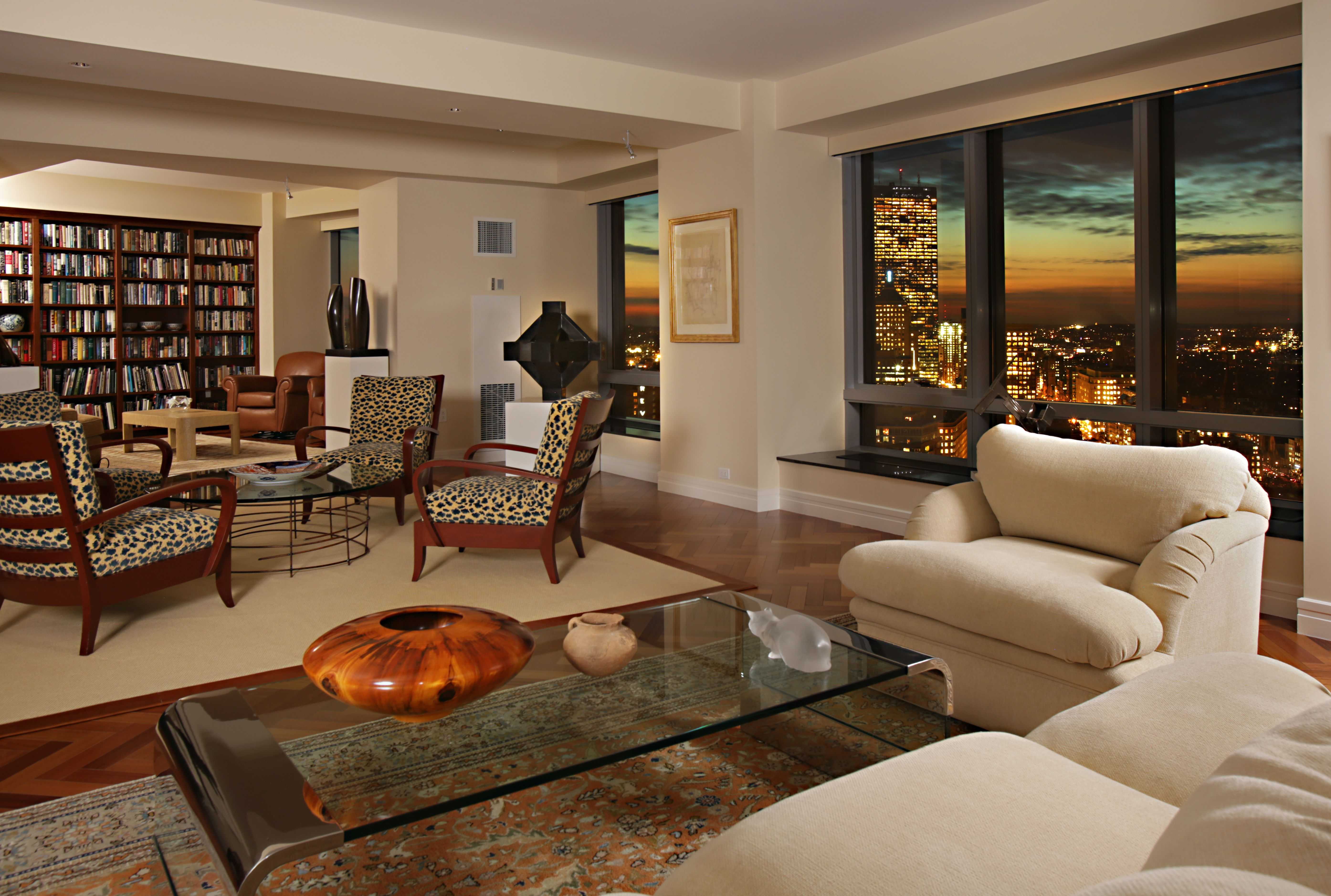
Living Room Design Ideas & Inspiration
Kumpulan Informasi, Tips dan Trik Terlengkap dan Terpercaya — explore curated ideas for sofas, storage, decor, and every style in between.
Explore Ideas →Get Design Inspiration
Tell us what you're looking for and we'll point you to the best articles.
Calming Living Room Color Palettes for a Restful Retreat
A living room can do more than look beautiful. Its colors influence how spacious, warm, quiet, or energetic the space feels throughout the day. The right combination of wall paint, upholstery, flooring, and accents can turn an ordinary seating area into a comfortable retreat for reading, conversation, and rest.
The most calming schemes usually rely on softened tones rather than stark contrasts. Warm whites, muted greens, dusty blues, gentle taupes, and earthy browns create a relaxed foundation that can be adapted to modern, rustic, coastal, Scandinavian, or transitional interiors.
A successful palette also needs to suit the room’s natural light and existing furniture. Before choosing a paint sample, consider the direction of the windows, the color of the floor, and the amount of visual texture already present. Calm design comes from balance, not from using pale colors everywhere.
Start with a soothing color foundation
Soft off-white is one of the most versatile choices for a peaceful living room. Unlike bright white, which can feel sharp in strong daylight, creamy white or ivory adds a subtle warmth. It works well with natural wood, woven baskets, linen curtains, and light-colored sofas.
Greige, a blend of gray and beige, offers another dependable foundation. It has the quiet character of gray while retaining the welcoming quality of beige. Choose a pale greige for an airy room or a deeper mushroom shade when you want the walls to feel enveloping and intimate.
Muted taupe and warm stone are useful when the room needs more depth. These neutral paint colors pair especially well with black accents, aged brass, walnut furniture, and textured cream upholstery. To prevent the scheme from appearing flat, bring in several finishes, such as boucle, wool, ceramic, and lightly grained timber.
Layer warm neutrals for gentle depth
A monochromatic neutral room can feel highly restful when its shades are carefully layered. Begin with a warm ivory wall, then add a beige area rug, a camel accent chair, and cushions in oatmeal, sand, or soft caramel. Keeping the undertones consistent helps the room feel coordinated.
Texture is essential in a neutral living room. A plaster-effect wall, nubby throw, ribbed ceramic lamp, or woven pendant gives the eye something to explore without making the space feel busy. Natural materials also make pale palettes feel grounded rather than overly polished.
For contrast, use small amounts of deeper brown, charcoal, or muted black. A dark wood coffee table or slim black floor lamp can define the seating arrangement while preserving the room’s tranquil mood. The goal is a soft visual rhythm, not a collection of unrelated beige objects.
Compare palette directions before decorating
Different calming palettes create distinct atmospheres. Blue-gray feels cool and reflective, sage green feels connected to nature, and clay introduces a sunbaked warmth. Testing sample cards at different times of day can reveal whether a color becomes too cool, too yellow, or unexpectedly dark.
Use the following combinations as starting points rather than strict formulas. Each one can be adjusted according to the size of the room, the flooring, and the mood you want to establish.
| Palette direction | Main wall color | Supporting tones | Best accents |
|---|---|---|---|
| Soft coastal | Pale blue-gray | Sand, ivory, driftwood | Brushed brass, woven textures |
| Botanical calm | Soft sage | Warm white, olive, natural wood | Terracotta, rattan, aged bronze |
| Earthy retreat | Light clay | Taupe, camel, cream | Walnut, rust, matte black |
| Quiet modern | Warm greige | Charcoal, mushroom, oatmeal | Smoked glass, dark metal |
| Gentle romantic | Dusty rose | Putty, ivory, muted brown | Antique brass, linen, soft green |
Bring in blue and green without coldness
Blue is often associated with calm, but very cool blues can make a living room feel distant. Look for blue-gray, smoky denim, muted slate, or green-leaning mineral blue. These shades work particularly well in rooms with warm wood floors and plenty of natural light.
Sage green and eucalyptus are excellent choices for a nature-inspired sitting room. They create a subtle connection with plants and outdoor landscapes while remaining restrained enough for everyday living. Pair green walls with cream upholstery, oak furniture, and soft tan leather for a balanced organic look.
If you prefer a stronger accent, use deep teal or forest green on a single wall, built-in shelving, or a pair of armchairs. Repeating the color in artwork, cushions, or ceramics keeps the accent intentional. A coordinated sofa can anchor the entire scheme; the Ainsley fabric sofa collection offers a useful reference for combining comfortable upholstery with a calm color story.
Coordinate furniture and lighting with the palette
Furniture color should support the wall shade rather than compete with it. A pale room can handle a medium-toned sofa or wood coffee table, while a darker wall may benefit from lighter upholstery and reflective details. Keep large pieces relatively quiet, then use smaller items to introduce personality.
Lighting changes how every color appears. Warm bulbs around 2700K usually complement beige, cream, clay, and wood tones. In a blue or green room, warm lighting prevents the scheme from feeling icy in the evening. Layer ceiling lighting with table lamps, wall lights, and a floor lamp to create a softer atmosphere after sunset.
Window treatments also influence the final effect. Linen or cotton curtains in ivory, flax, or muted gray filter daylight without adding strong contrast. If privacy allows, keep the treatment simple so that the wall color and natural view remain part of the room’s restful composition. For tailored guidance about a specific space, the Sibabeh contact team can be a helpful point of reference.
Balance calm colors with personal character
A peaceful living room should still feel lived in. Add visual interest through artwork, books, collected ceramics, plants, or a patterned rug with two or three colors from the existing scheme. Gentle patterns, such as narrow stripes, small checks, or abstract botanical motifs, bring movement without overwhelming the room.
Use the 60-30-10 approach as a flexible guide: roughly 60 percent for the dominant wall and large surfaces, 30 percent for furniture and secondary textiles, and 10 percent for accents. The proportions do not need to be exact. They simply help prevent every element from receiving equal visual weight.
Before committing to a full repaint, place fabric swatches and color samples beside the sofa, flooring, and curtains. Live with them through morning, afternoon, and evening light. This small step can prevent a palette from looking attractive in a showroom but unsuitable in your own home.
A practical palette planning checklist
Once you have selected a general color direction, refine it with a few deliberate choices. Calm rooms tend to feel more successful when every prominent color appears at least twice, even if one repetition is very subtle.
- Choose one dominant neutral or muted hue for the walls and largest surfaces.
- Select a secondary color for the sofa, rug, curtains, or occasional chair.
- Repeat one accent shade in cushions, artwork, ceramics, or greenery.
- Check undertones under both natural daylight and warm evening bulbs.
- Add contrast through texture and material before adding another strong color.
A restrained palette does not mean the room must be plain. It means the eye can move comfortably through the space without competing focal points. When color, lighting, furniture, and texture support one another, even a compact living room can feel spacious, settled, and deeply inviting.
Choose a few sample colors, arrange them beside your existing furnishings, and build the room gradually. With a thoughtful foundation and carefully repeated accents, your living space can become a calming retreat that feels personal from every angle.
What We Cover
Living Room Topics & Ideas
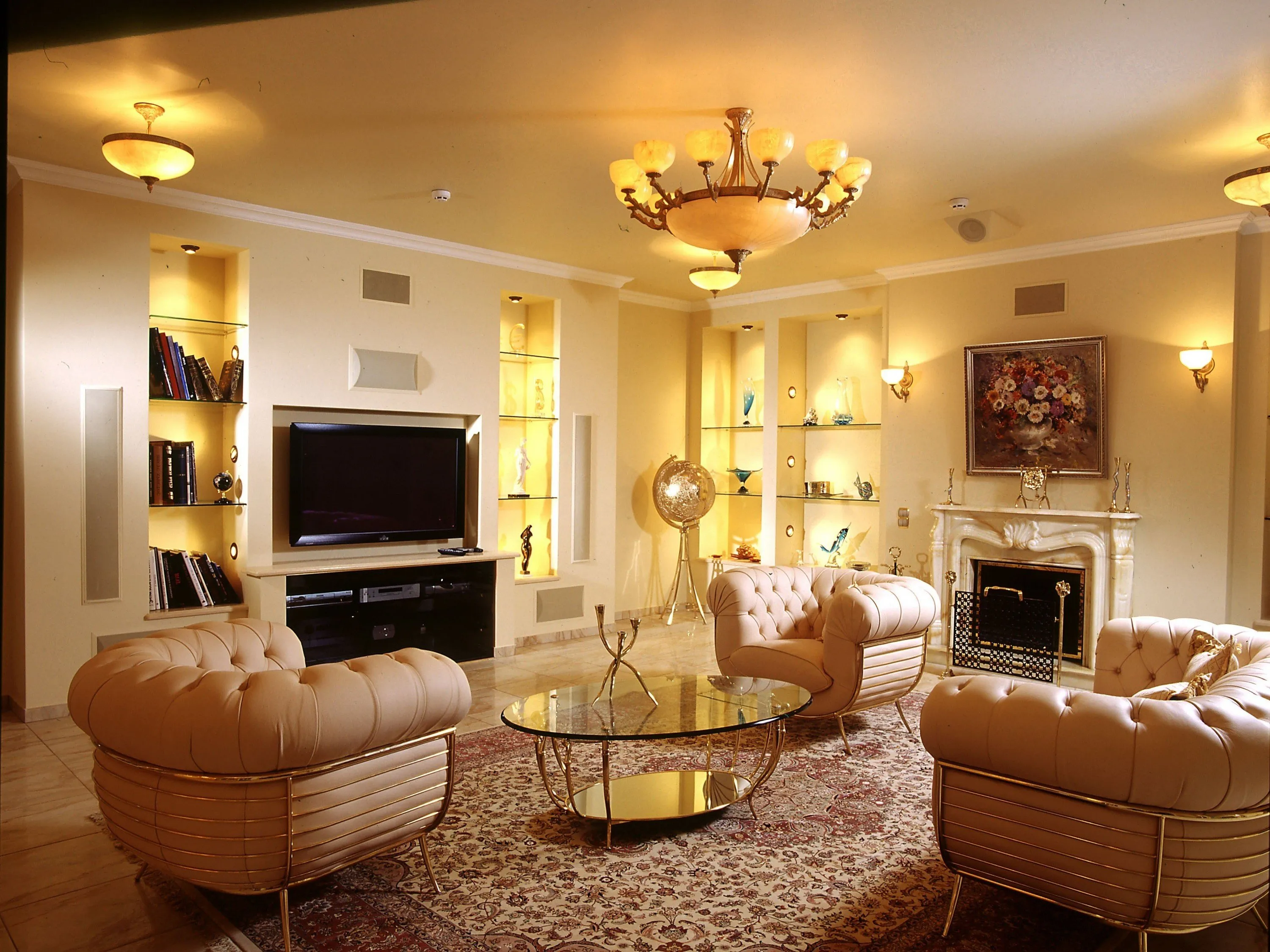
Luxury Living Room Furniture
High-end pieces spanning modern, neo-classical, and Italian Gothic styles — craftsmanship, leathers, and refined artistry.
Read More →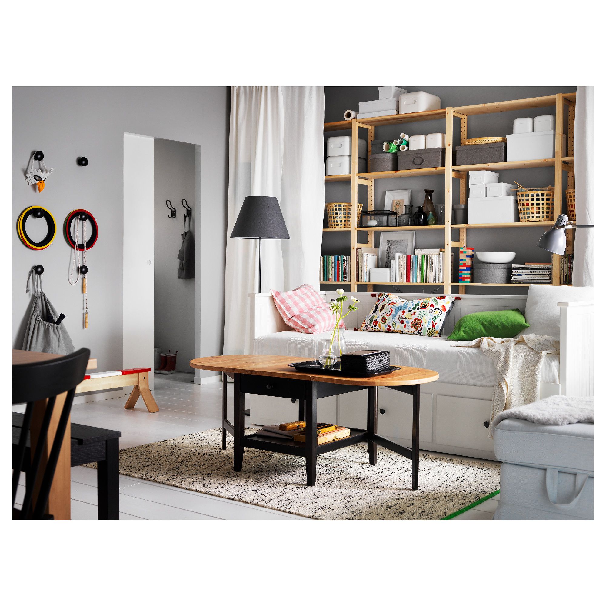
White Living Room Storage Cabinets
Sideboards, curio cabinets, and high-gloss storage units that blend practical organization with decorative appeal.
Read More →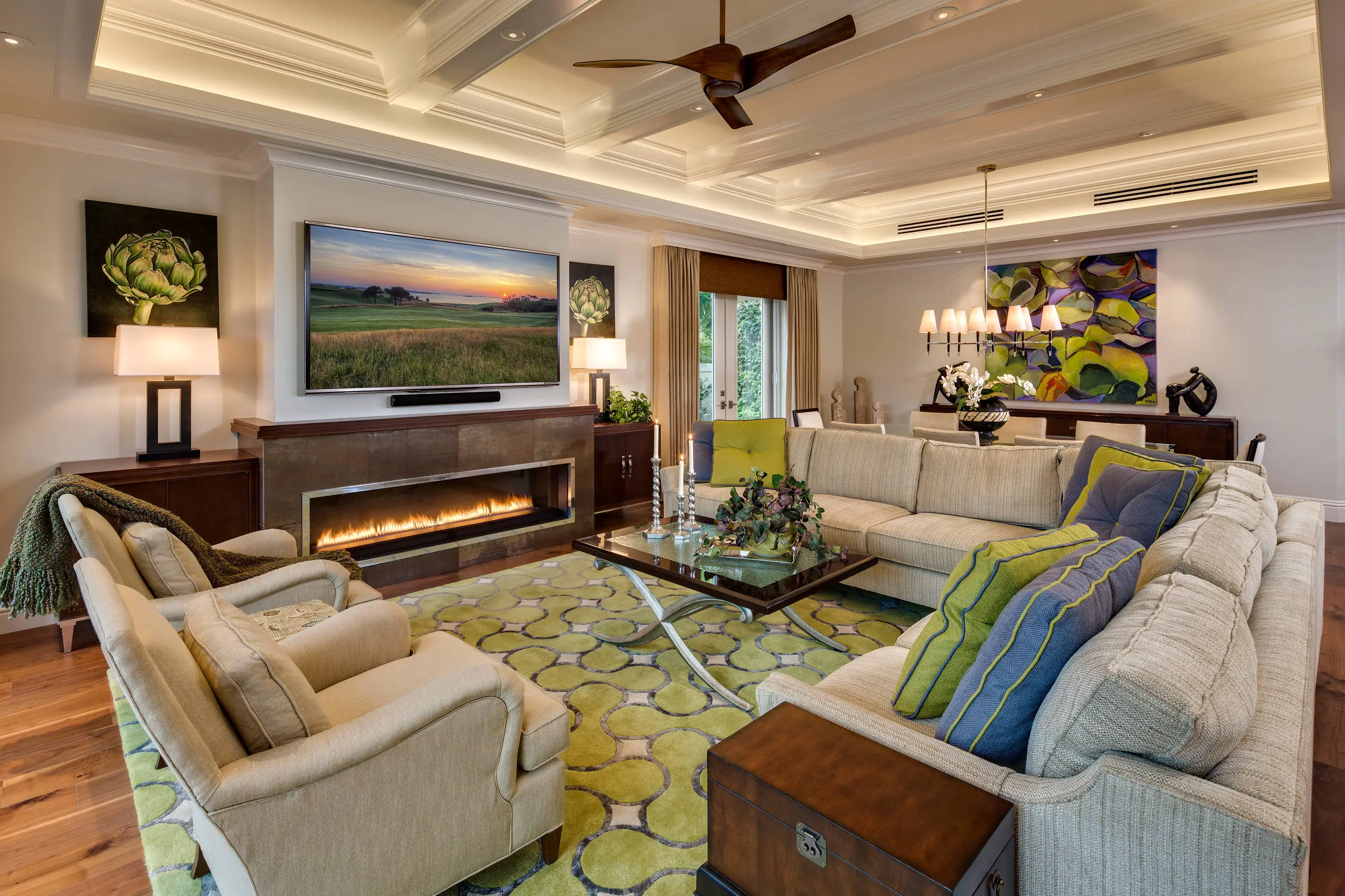
Living Room Decor Essentials
Rugs, pillows, art, lamps, and accent pieces that add layers of color, texture, and personality to any living space.
Read More →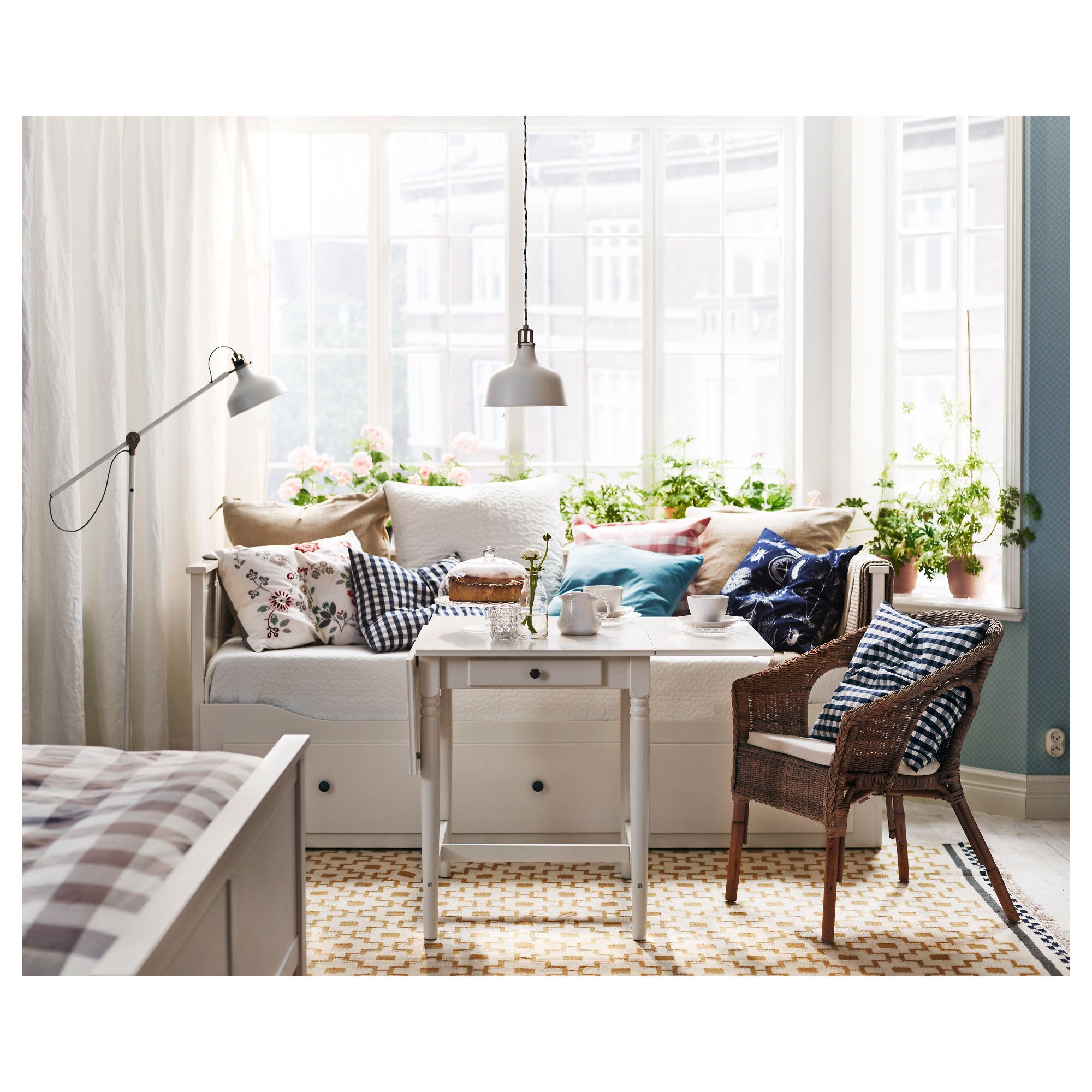
Natural Living Room Decor
Earthy elements, house plants, rustic touches, and organic materials that bring warmth and nature indoors.
Read More →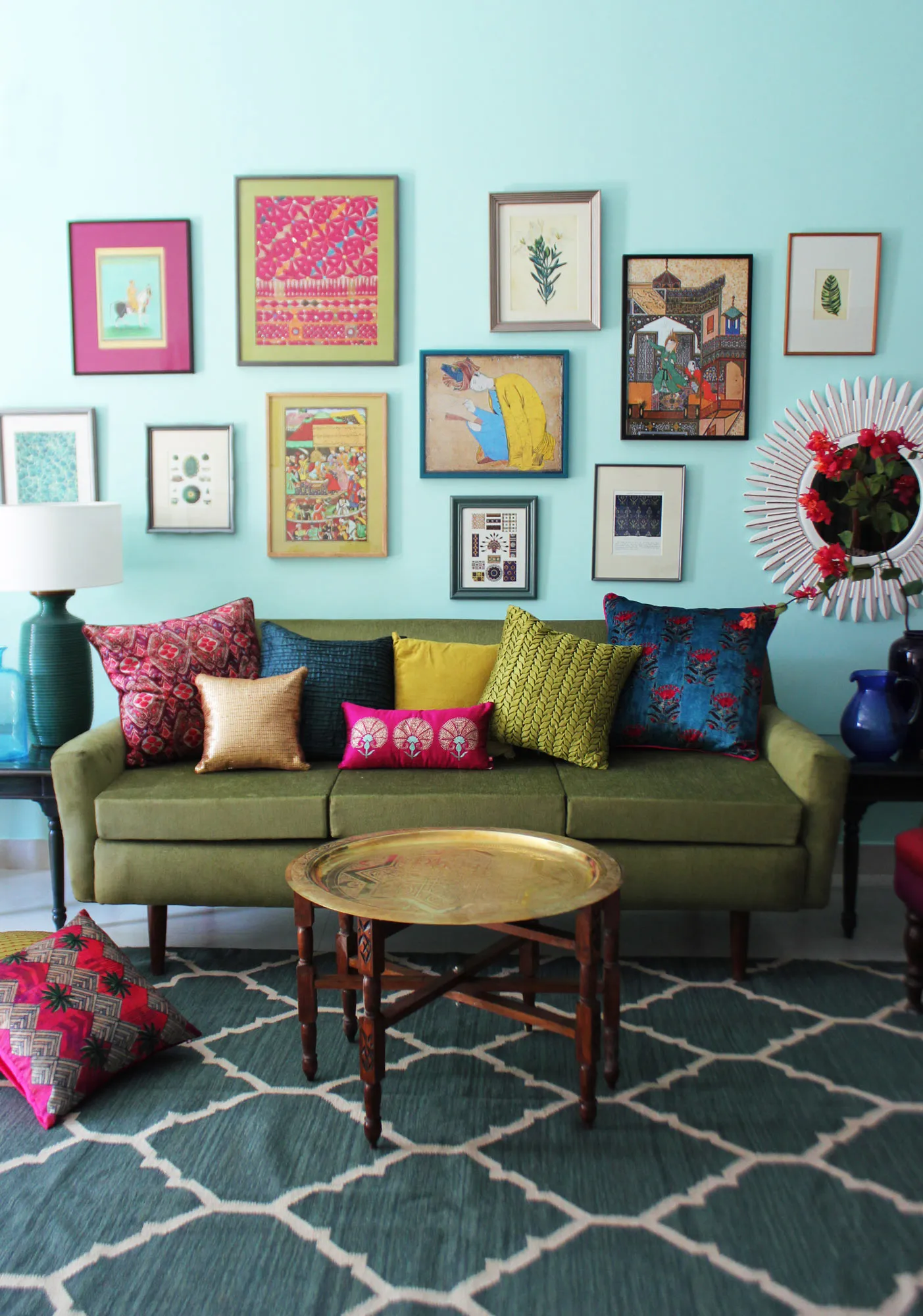
Living Room Ideas: Velvet Sofa
From classic red to trending green and blue, explore how a velvet sofa can transform your living room's character.
Read More →